 V1: 4 5 5 5 5 6
 V2: 3 4 5 5 6 7
V3: 0 1 2 8 9 104 Learning About Variables
As introduced in Chapter 2, a variable is a particular measurement or piece of information about the unit of observation, which is collected for each observation in the dataset. The name variable refers to the fact that the collected values in a variable can vary from observation to observation. This means that the values of a variable are distributed across a range of possible values and form what is referred to as a distribution.
Each variable in a dataset will have its own unique distribution, and in this chapter, we introduce the process of studying and describing a variable’s distribution using a combination of numerical and visual summaries. This step of data analysis can be seen as a more informal exploration of variation in the data. It is done in preparation to (try to) more formally explain and quantify variation in the data later in the analysis.
The variable type—numerical or categorical—largely determines which numerical and visual summaries an analyst will use to learn about a distribution. Therefore, the remainder of this chapter is divided into two main parts. The first part focuses on learning about numerical variables, and the second part focuses on learning about categorical variables.
As each numerical and visual summary is introduced, the focus will be on what information that particular summary does and does not provide about the variation in the data. What we will see is that no one numerical or visual summary tells us all that we want to know about the variation in the data. Rather, we can use these different summaries together to generate a more comprehensive understanding of a variable’s distribution.
4.1 Numerical Variables
The focus of this section is numerical variables. As a reminder, there are two types of numerical variables: continuous and discrete. Continuous variables can take on any real number within an interval, while discrete variables represent counts and typically take on whole numbers. The numerical and visual summaries introduced in this section are applicable to both continuous and discrete variables.
4.1.1 Mean and Median
When learning about a numerical variable, there are two key numerical summaries to begin with: the arithmetic mean (hereafter, this is simply referred to as the mean) and the median. The mean is the sum of the values in the variable divided by the number of values in the variable. The median is the middle value in the variable, when the values are ordered from smallest to largest; for variables containing an even number of values, the median is the arithmetic mean of the two middle values.
Both tell us about the average of the distribution. The average might not represent a value that was actually observed during data collection. For example, suppose to find the median of a variable with an even number of values, you must take the mean of the two middle values, which happen to be 10 and 12. The median would be 11, a value not in that variable. Regardless, calculating an average answers an important starting question about the variation in the data: What “central” value do the data vary around?
Because we know that the values of a variable can vary, we also know that whatever the mean or median is, likely not every value in the variable will be equal to it, if any values at all. For the mean, so long as the values in a variable are not all the same, we know that one or more data points will be less than the average and one or more data points be greater than the average. For the median, we know that at least 50% of the data are less than or equal to the median and that at least 50% of the data are greater than or equal to the median. How far the data vary around the average (mean or median) remains an open question, though, so let’s shift our focus to exploring that now. To do so, let’s suppose we have the following three variables: V1, V2, and V3.
Each variable contains six data values, and the mean and median are both equal to five for all three variables. But how far the values are spread out, or dispersed, around the mean and median is different for each variable. In other words, each of these variables has a different spread, or dispersion.
Looking at V1, we can see that the values cluster tightly around the mean and the median. In fact, four out of the six values are equal to the mean and median. Meanwhile, V2 is not as tightly clustered around the mean and median. V3 has the largest spread of the three, as its data values range from zero to ten, with half of the values sitting close to zero and the other half sitting close to ten. This example illustrates that the average alone does not tell us about the spread of a variable. Variables can have the same average but different spreads. Therefore, we need additional numerical summaries that provide information about the extent of the variation around the average.
One common measure for learning about the spread around the mean is the standard deviation. The formula for the standard deviation is below. In the formula, \(x_i\) refers to a data value in the variable of interest, and \(\bar{x}\) is the mean of the variable. The \(n\) in the formula refers to the number of data values in that variable. In short, to find the standard deviation, you take the difference between each data value and the mean. Then, you square and sum those differences. Lastly, you divide that sum by \(n-1\) and take the square root.1
\[ s = \sqrt{\frac{\sum_{i=1}^{n}(x_i - \bar{x})^2}{n - 1}} \]
Thus, large differences between data values and the mean lead to a large standard deviation. As a result, a large standard deviation indicates to us that the data are more spread out around the mean, and a small standard deviation indicates that the data are less spread out around the mean. The standard deviation is reported in the same units as the variable. Therefore, an analyst can identify and interpret a large versus small standard deviation in the context of each variable.
Using the formula to calculate the standard deviations for V1, V2, and V3, we get 0.63, 1.41, and 4.47, respectively. As expected, V1 has the smallest standard deviation, while V3 has the largest standard deviation. Let’s now also consider the standard deviation for a fourth variable, V4.
V4: -2 4 5 5 6 12At first glance, seeing the -2 and 12 (the most extreme values, yet), we might jump to the conclusion that V4 will have the largest standard deviation, yet. However, the standard deviation is 4.47, the exact same standard deviation as V3. While there are more extreme values in V4, the majority of the values are more closely clustered around the mean than in V3. In other words, the standard deviation only tells us so much. For instance, a large standard deviation could indicate to us that values are consistently far from the mean or that there are some outliers. It could also be the case that both of these things are happening. Ultimately, this is where visualizing the data comes into play; we will discuss visual summaries in more detail shortly.
For the median, one measure of spread is the median absolute deviation (MAD).2 The median absolute deviation is calculated using the following formula, where \(x_i\) refers to a data value in the variable of interest. In short, to calculate the MAD, you find the median of the absolute deviations from the variable’s median.
\[ \text{MAD} = median(|x_i-median(x)|) \]
The median absolute deviations for V1, V2, V3, and V4 are 0, 1.48, 5.93, and 1.48, respectively. Like with the standard deviation, a larger result indicates greater spread around the median. However, looking at the median absolute deviation for V4, we can see that this measure of spread is less influenced by extreme values than the standard deviation.
The standard deviation and median absolute deviation represent two common measures of spread, but it is worth noting that there are other helpful measures as well. For example, finding the range—the minimum and maximum values in the variable—can be helpful for better understanding variation in the data. We will also look at another important measure of spread, the interquartile range, when discussing the box plot next.
It is also worth noting that so far we have been looking at examples with very few data values. The example variables from before contained only six data values, meaning we could easily see all of the data values at once. The point of this was to illustrate exactly what the numerical summaries are capturing about the data. However, in a data analysis, an analyst often needs to use numerical summaries because it is not feasible to look at all of the data at once. For example, suppose a variable contains 1,000 values instead of six. Then it would not be feasible to simply print out all of the values and look at them to see what is happening in the data. Some type of summary is required to better understand the distribution.
A more realistic example using the mean, median, standard deviation, median absolute deviation, and range is included at the end of this section.
4.1.2 Box Plots
Visual summaries also play an important role in learning about the variation in data. One visual summary a data analyst can use to learn about a variable’s distribution is the box-and-whisker plot. The plot name refers to the fact that the visualization is composed of one box and (usually) two “whiskers” sticking out from each end of the box. Often, though, the plot is simply referred to as a box plot.
To introduce a box plot, we must first discuss quartiles. Quartiles—or Q1, Q2, and Q3—refer to the percentile values that divide a variable into approximately four equal parts, when the values of the variable are arranged from smallest to largest. Q1, the lower quartile, refers to the 25th percentile. Below this value, there is approximately 25% of the data in the variable. Q2, the middle quartile, refers to the 50th percentile, or the median. On either side of this value there is approximately 50% of the data. Q3, the upper quartile, refers to the 75th percentile. Below it there is approximately 75% of the data, and above it there is approximately 25% of the data.
There are different methods for calculating percentiles. One common approach is to first find the position of the percentile (relative to the ordered data values) using a formula like the one below. In the formula, \(k\) is the position of the percentile and \(n\) is the number of data values. After determining the position of the percentile, you can then find the corresponding value for that position; this may require linear interpolation between two data values.
\[ p_k = \frac{k-1}{n-1} \]
Let’s look at some example percentile calculations using the above approach. Suppose we wanted to find the 25th percentile of the following variable, V1, which contains 15 values in ascending order.
V1: -8 -7 -5 -5 0 0 0 3 4 8 9 10 14 18 19We would start by setting \(p_k\) equal to 0.25 and solving for \(k\). The result is \(k=4.5\), meaning Q1 will be the value halfway between the values in positions 4 and 5, i.e., -5 and 0, respectively. Thus, Q1 is -2.5. If \(k\) had instead been equal to, say, 4.4, then Q1 would have been equal to -3.0 (40% of the way between -5 and 0). For Q2 (the 50th percentile), the position \(k\) is 8, so Q2 is simply equal to the 8th data value, which is 3. Q3 (the 75th percentile) is 9.5.
In a box plot, the size and placement of the box are determined by Q1 and Q3. Box plots can be oriented either horizontally or vertically. In a horizontal box plot, Q1 determines the left side of the box, and Q3 determines the right side of the box. In a vertical box plot, Q1 determines the bottom of the box, and Q3 determines the top of the box. The box then visualizes the range of the middle 50% of the data. This range is called the interquartile range and is calculated as \(Q3-Q1\). It is another common measure of spread. Q2, the median, is plotted as a line through the box.
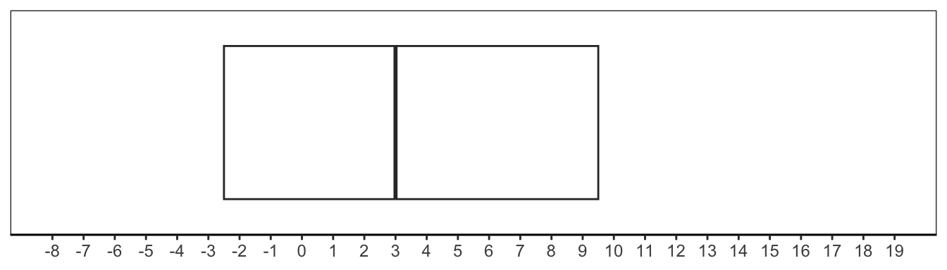
Thus, for V1, the box would span -2.5 to 9.5, and the IQR would be 12. The median line would be located at 3. Figure 4.1 shows this box, oriented horizontally.
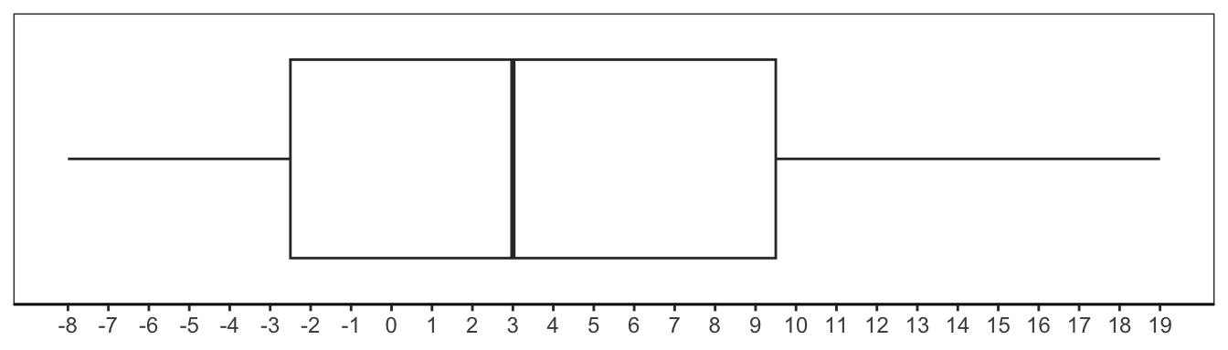
There are a couple of different ways to construct the whiskers of the box plot. In one method, the whiskers extend from either end of the box to the minimum and maximum values of the variable. In another method, one whisker extends to the minimum data point within \(Q1 - (1.5 \times IQR)\), and the other whisker extends to the maximum data point within \(Q3 + (1.5 \times IQR)\). In this latter method, any data points beyond the whisker boundaries are plotted as dots and interpreted as “outliers” in the distribution. Figure 4.2 is constructed using the latter method, which is the method used throughout the remainder of this book.
To see what an outlier would look like in a box plot, let’s change the 15th data value in V1 from 19 to 29. The new box plot is shown in Figure 4.3.
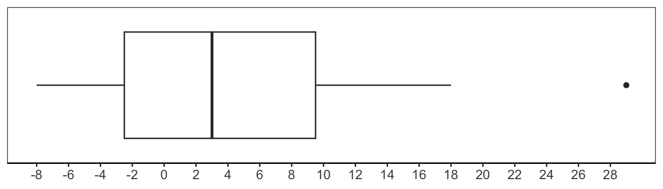
Ultimately, the box plot is a very useful visual summary that an analyst can use to better understand the distribution of a variable. From the box plot, an analyst can see what the full range of the data is. An analyst can also see the range of certain portions of the data. For instance, an analyst can see what the range is for the middle 50% of the data and whether it is small or large, i.e., whether the data are clustered tightly around the median or spread out.
The box plot is also limited in what it can tell an analyst about the distribution of a variable. For example, when looking at the box plot in Figure 4.2, an analyst cannot know how the values are distributed between, say, Q1 and Q2. The majority of the values could be negative two, or the majority of the values could be zero. Or the values could be distributed evenly between Q1 and Q2. It is not possible to tell from the box plot alone. In general, it is not possible to know how values are distributed within the different segments of a box plot, such as the whiskers or portions of the box. However, next we introduce another visual summary, the histogram, designed to explore this exact aspect of a distribution.
4.1.3 Histograms
The histogram is another popular plot type for visualizing the distribution of a variable. Building a histogram involves three main steps.
Divide the variable into intervals, or bins, usually of equal width.
Count the number of values that fall in each bin.
Plot the counts using bars, with bins on one coordinate axis and counts on the other.
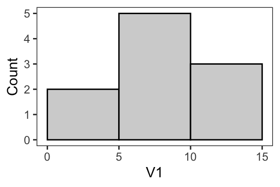
Let’s begin by walking through these steps to construct a histogram for a variable called V1, which contains ten values ranging from 0-14.
V1: 0 8 7 9 14 14 12 5 6 2First, we divide the variable into bins. An analyst is responsible for choosing the bin width. It is an important choice that we will discuss in detail next, but for now let’s select three five-unit bins: [0-5), [5, 10), and [10, 15). Once the bins are created, we count how many values fall in each bin. Two values—0 and 2—fall in the first bin, [0-5). Five values—8, 7, 9, 5, and 6—fall in the second bin, [5, 10). Three values—14, 14, and 12—fall in the third bin, [10, 15). Finally, we plot these counts (2, 5, and 3) using bars. The result is shown in Figure 4.4. This plot shows us that half of the values in V1 fall between [5–10).
As mentioned above, building a histogram requires an important decision by analysts: choosing the bin width. This decision has a large impact on what the final plot looks like, and ultimately, how much information the plot provides. When trying to select a bin width, one question an analyst can ask themselves is: What bin width results in a histogram that accurately captures the shape of the distribution, without being too noisy?
Consider the four example histograms in Figure 4.5. All of the histograms visualize a variable called V2, which contains 1,000 values. The only difference is the bin width. In the histogram that has a bin width of 15, the key takeaway is that most values fall in the range of 45–90. However, as the bin width decreases, it starts to become clear that the distribution is multimodal, meaning it has more than one peak. More specifically, it appears that V2 is bimodal, i.e., it has two peaks. A distribution with one peak is called unimodal.
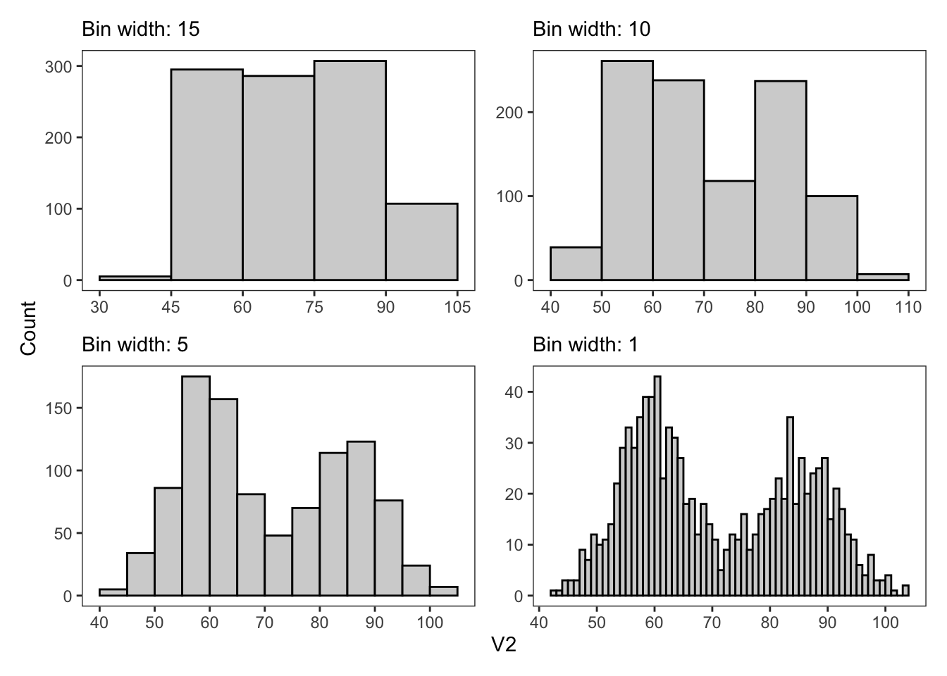
Peaks are important to capture accurately, as they tell us what values are most common in a distribution. For V2, it appears that there is one peak at around 60 and another at around 85. The first bin width of 15 is too large to reveal the bimodal aspect of the distribution, making it a suboptimal bin choice. Meanwhile, the bin width of 1 is quite small in this context and results in some large fluctuations between neighboring bars. One question an analyst might ask themselves in this situation is: Is the distinction between, say, 60 and 61 meaningful, in the context of V2? If the answer is no, then a bin width of 1 may also be a suboptimal bin choice. Of the histograms in Figure 4.5, the one with a bin width of 5 seems to best capture the distribution without being unnecessarily noisy.
Importantly, the histogram provides information about the distribution that other numerical and visual summaries do not. For instance, as shown in Figure 4.6, the box plot does not capture—nor even indicate to us—the bimodal nature of the distribution for V2. Meanwhile, the mean and median are 70.9 and 67.6, respectively. As previously discussed, these averages tell us a “central” value for the distribution, but as illustrated in the histogram, these values do not necessarily align with a common value. For V2, both the mean and median are located in/near the dip between the two peaks in the histogram, and we can see that the most common values actually sit to the left and right of the averages.
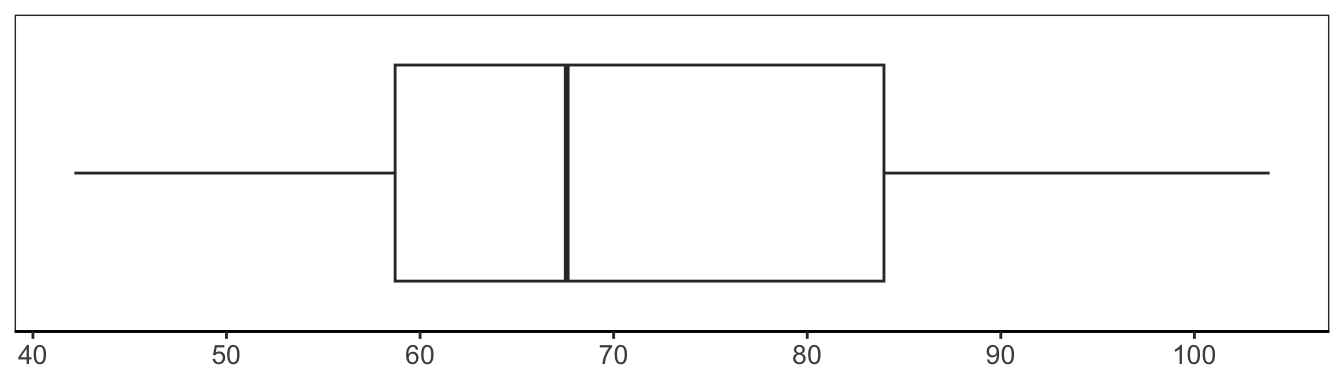
V2.
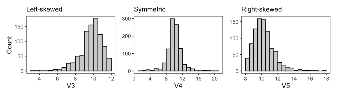
In addition to helping analysts visualize the most common values in a distribution, histograms are also very helpful for visualizing extreme values, or outliers, in a distribution. Figure 4.7 shows three histograms for three different variables—V3, V4, and V5—with extreme values. All three distributions are unimodal, yet each appears to have a different shape.
In the histogram on the left, the majority of values cluster to the right. However, there are also some extreme values that extend out to the left. Distributions with a long left “tail” are called left-skewed distributions. Alternatively, if the extreme values extend to the right, resulting in a long right tail (as shown in the rightmost histogram in Figure 4.7), the distribution is right-skewed. The histogram in the middle of Figure 4.7 has some extreme values on either side of the peak, i.e., two long tails. If we were to slice this histogram in half, vertically, at the peak, the resulting halves would be approximately mirror images of each other. In other words, this distribution does not have a skew. Rather, it is symmetric.
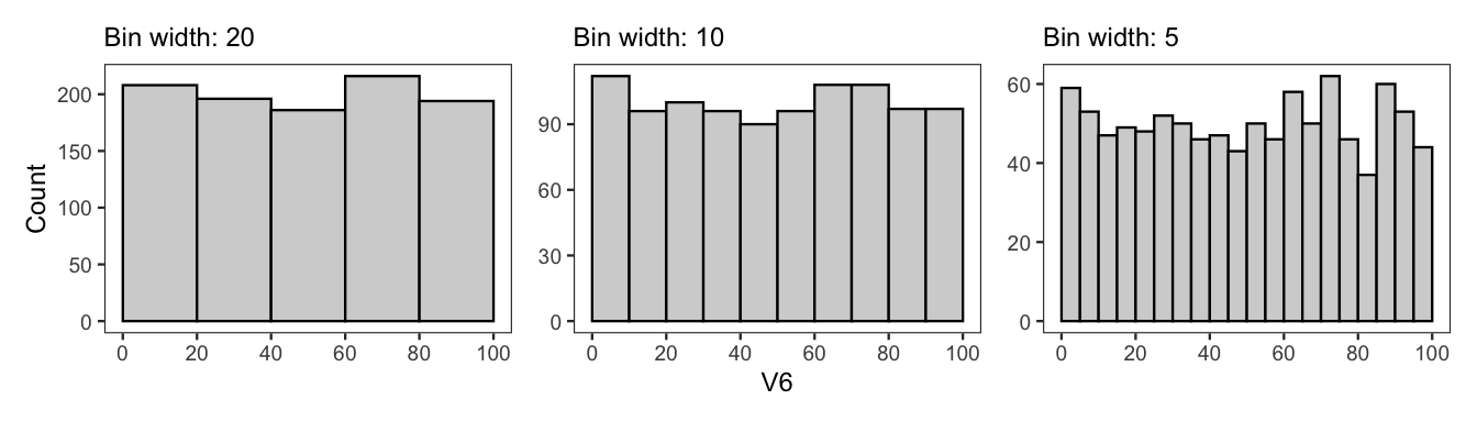
It is important to note that not every symmetric distribution will have peaks or tails. For example, consider the histograms in Figure 4.8 for a variable called V6. In each histogram, all of the bins contain approximately the same number of observations. Several different bin widths are plotted, to demonstrate that this lack of peaks and tails is not simply an artifact of the bin width.
4.1.4 Example: College Scorecard Data
In this example, we demonstrate how to use the numerical and visual summaries just introduced to learn about a numerical variable. The variable of interest comes from the College Scorecard data first discussed in Chapter 3. The variable is called UGDS and contains 2025 undergraduate enrollment numbers at 4-year public institutions in the United States.
The variable UGDS contains 580 data values. The first data value is 6,124, the undergraduate enrollment at Alabama A&M University. The second data value in UGDS is 11,635, the undergraduate enrollment at the University of Alabama at Birmingham. Because these values represent student counts, UGDS is a discrete numerical variable.
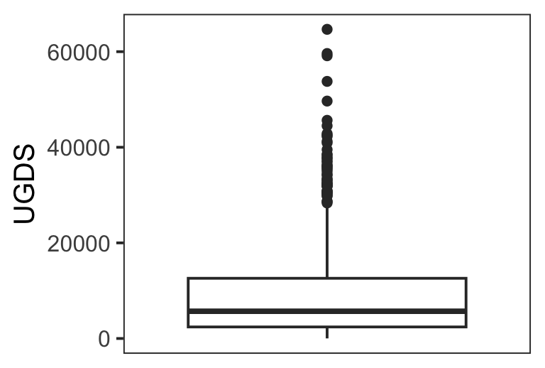
The first step is to calculate the mean and median of UGDS, which are 9,749 and 5,700, respectively. What is immediately notable about these two values is how different they are from each other. In particular, the difference of 4,049 seems large and provides us with some clues about the distribution that will be important to investigate further. In particular, because the mean is more sensitive to outliers than the median, the difference between the two raises the following question: Are there some extremely high enrollments pulling the mean to the right? We can start to investigate this by checking the maximum value in UGDS, which is 64,674, the enrollment at Arizona State University. That value is substantially higher than either the mean or median, providing further evidence of extreme values on the right side of the distribution.
The standard deviation and median absolute deviation also point to a right-skewed distribution. The standard deviation is 10,780, and the median absolute deviation is 6,042. Both are larger than the average values themselves. And given that values in this variable can only be positive (undergraduate enrollment cannot be negative), these values indicate that the data are spread out far to the right of the averages.
We now turn to visual summaries such as the box plot and histogram. These plots can help to confirm whether the distribution is right-skewed and provide more information about how the data are distributed across the full range of UGDS values.
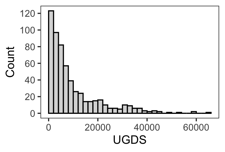
The box plot in Figure 4.9 shows that around 75% of schools had an undergraduate enrollment of less than 15,000. However, there are a number of schools with undergraduate enrollments greater than 30,000, plotted as points, or “outliers,” in the box plot. These “outliers” suggest a right-skewed distribution. The histogram in Figure 4.9 confirms a right-skewed distribution. In fact, there is no left-tail at all. Rather, the histogram shows a unimodal distribution, with the peak pressed against the minimum boundary for student enrollment. It is interesting to see that the first bin alone (0–2000) contains around 120 schools, representing approximately 20% of the data.
In summary, enrollment numbers vary dramatically, with enrollments as high as around 60,000. However, the majority of schools have an enrollment of less than 10,000, meaning the distribution is highly right-skewed.
UGDS variable.
4.2 Categorical Variables
In addition to learning about numerical variables, an analyst will also need to learn about the categorical variables in their analysis. A categorical variable is arguably more straightforward to learn about than a numerical variable. There is one primary numerical summary to generate: the count for each category. Then the visual summary—a bar plot—displays these counts.
4.2.1 Counts
For a categorical variable, there are three main questions of interest. How many distinct categories does the variable contain? What are the distinct categories? And how many observations are in each category?
Suppose we have a variable called Group that contains ten values.
Group: B A C A B B C A B CTo learn about this variable, we can first determine how many distinct categories there are and what those distinct categories are. An analyst might do this by looking at the dataset documentation or exploring the data directly. For Group, we can see that there are three distinct categories: A, B, and C. We can then count how many values there are for each category. In this example, there are three A values, four B values, and three C values.
An analyst may also choose to apply a variety of different operations to these counts to learn more about the variable. This could include putting the categories in ascending or descending order, based on their counts, to more readily see which are the least and most common categories, respectively. An analyst may also choose to reformat the counts as proportions by dividing each count by the total number of values.
4.2.2 Bar Plots
After the counts are computed, it is often helpful to visualize them using a bar plot because bar plots can make comparisons of the counts easier. In the bar plot, the categories will be positioned across either the x-axis or y-axis, and then the counts go along the other axis. Figure 4.10 shows two example bar plots. The bar plot on the left has the groups positioned along the x-axis and ordered alphabetically. The bar plot on the right has the groups positioned along the y-axis and ordered based on the counts, so that the group with the highest count is at the top of the plot.
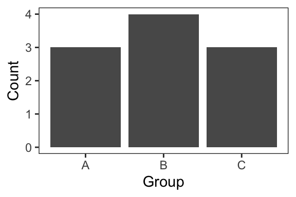
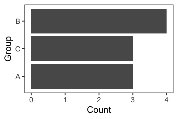
Often, one of the key things that an analyst will look for in a bar plot is whether or not there is “balance” among the categories. A categorical variable is considered balanced if the counts are approximately equal across the different categories. From Figure 4.10, we can see that Group is fairly balanced. We will look at an imbalanced categorical variable in the following example.
4.2.3 Example: College Scorecard Data
In the previous section on numerical variables, we looked at the U.S. Department of Education College Scorecard data. Specifically, the focus was on a numerical variable called UGDS, which contained undergraduate enrollment numbers for 4-year public institutions in the United States. Now let’s consider a categorical variable from this same dataset. The variable is called REGION, and it contains data on where each school is located in the United States.
The values in the REGION variable are the integers 0–8, and each of the nine integers represents a different region. For example, the first value in REGION is for Alabama A&M University and is 5, which stands for Southeast (AL, AR, FL, GA, KY, LA, MS, NC, SC, TN, VA, WV). The complete mapping between integers and region names can be found in Table 4.1. These mappings were found in the data dictionary provided on the College Scorecard website. Note that one of the regions, U.S. Service Schools, does not refer to a geographic region.
REGION.
REGION | NAME | COUNT |
|---|---|---|
0 | U.S. Service Schools | 5 |
1 | New England (CT, ME, MA, NH, RI, VT) | 39 |
2 | Mid East (DE, DC, MD, NJ, NY, PA) | 103 |
3 | Great Lakes (IL, IN, MI, OH, WI) | 75 |
4 | Plains (IA, KS, MN, MO, NE, ND, SD) | 53 |
5 | Southeast (AL, AR, FL, GA, KY, LA, MS, NC, SC, TN, VA, WV) | 154 |
6 | Southwest (AZ, NM, OK, TX) | 67 |
7 | Rocky Mountains (CO, ID, MT, UT, WY) | 26 |
8 | Far West (AK, CA, HI, NV, OR, WA) | 58 |
Table 4.1 also presents the counts for each category in REGION, and these counts are plotted in Figure 4.11. From the table and plot, we can see that the number of schools in each region varies. In other words, the variable REGION is not balanced, as certain regions have substantially more 4-year public schools than others.
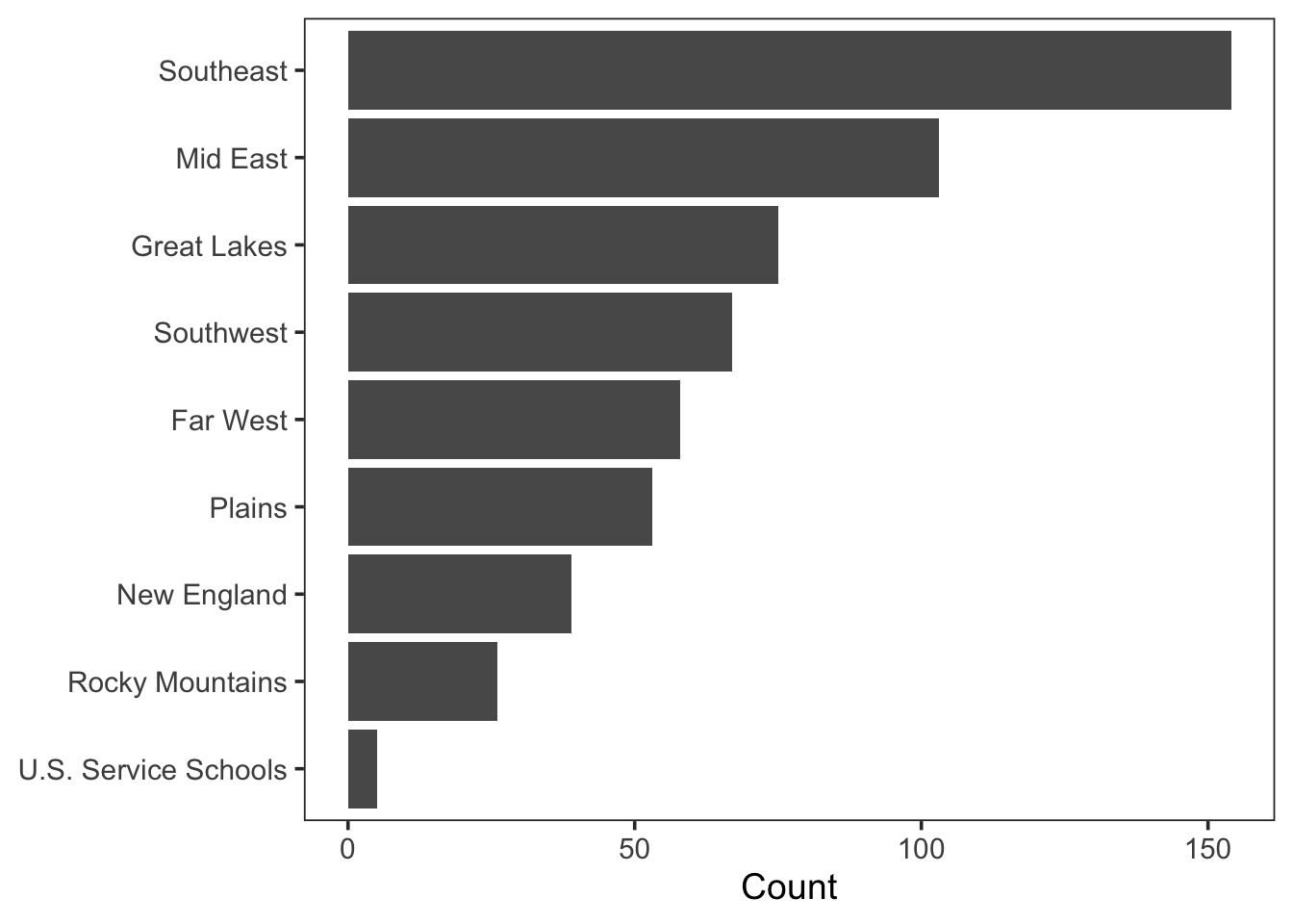
REGION counts.
4.3 Summary
Learning about the variables in your dataset is a crucial step in data analysis. The goal in this step is to develop a thorough understanding of what the distribution for each variable looks like. And you can do this using different numerical and visual summaries.
For numerical variables, some key summaries include averages, measures of spread, box plots, and histograms. When used collectively, these summaries provide a comprehensive picture of a numerical distribution, such that an analyst can readily answer important questions like the following. What is the shape of the distribution? What is the spread of the distribution? What are the most and least common values in the distribution? What is the overall range of the distribution?
To learn about a categorical variable, an analyst can calculate the number of observations belonging to each category. These counts can then be visualized in a bar plot. Bar plots make it easier to compare the counts and determine whether a distribution is balanced or not.
As will become evident in later chapters, having this thorough understanding of each variable’s distribution can help you to make good modeling choices and interpret model outputs with greater clarity, later in the analysis.
4.4 Exercises
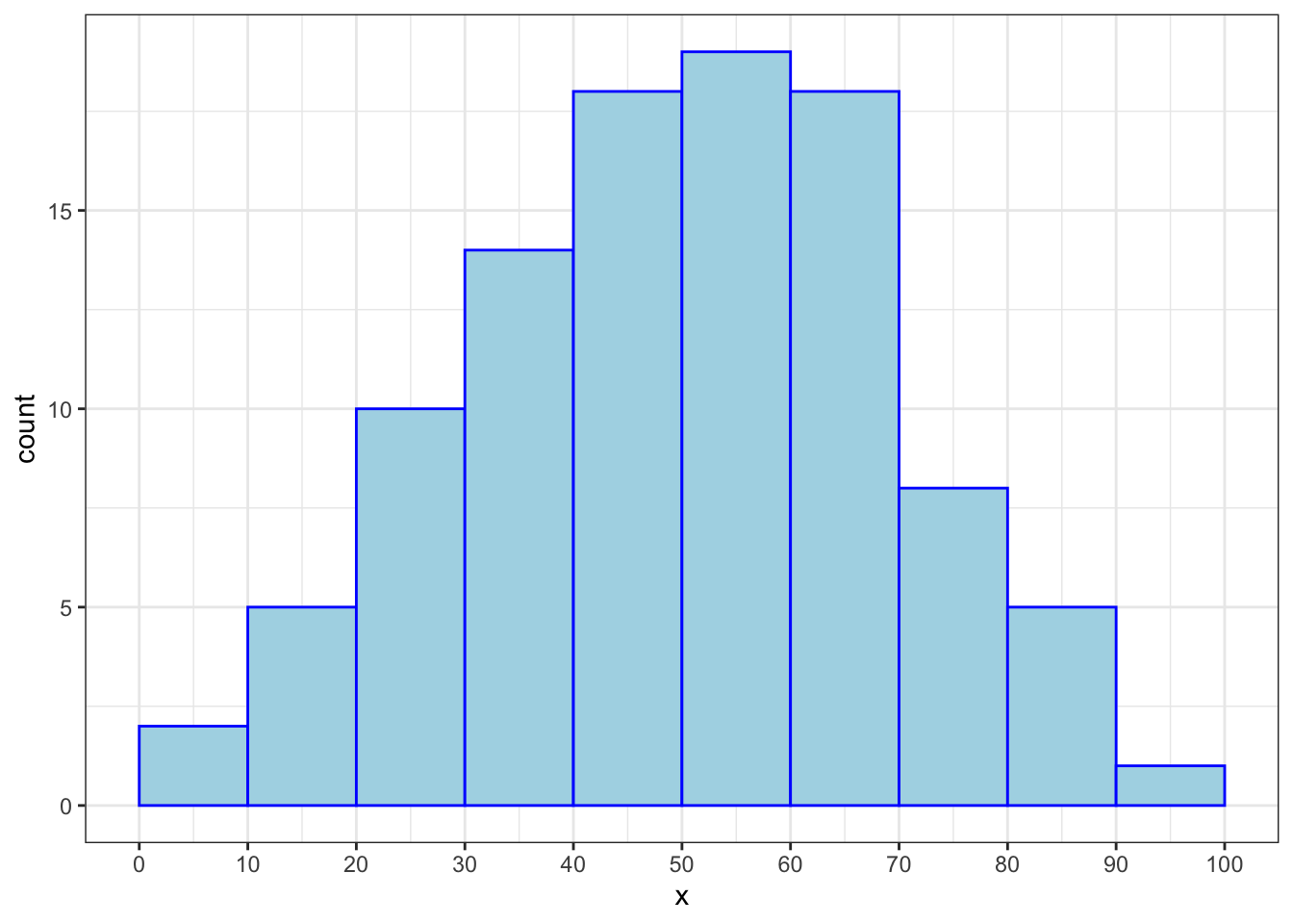
- You have been tasked with analyzing data from an urgent care clinic. The dataset has 100 observations, or patient visits, and two variables: reason and minutes. The reason variable refers to the reason for visiting the urgent care clinic, while minutes refers to how many minutes the patient spent at the clinic. Below is a histogram for minutes. Each bin is a 10-minute interval, e.g., [10-20). Approximately what proportion of patients spent between 40 to 59 minutes at the clinic?
This formula is for the sample standard deviation, not the population standard deviation. If an analyst had data on the entire population of interest, in the formula, they could simply divide by \(N\) (the population size) instead of \(n-1\).↩︎
Note that sometimes that acronym MAD is used to refer to the mean absolute deviation, a different measure of spread.↩︎