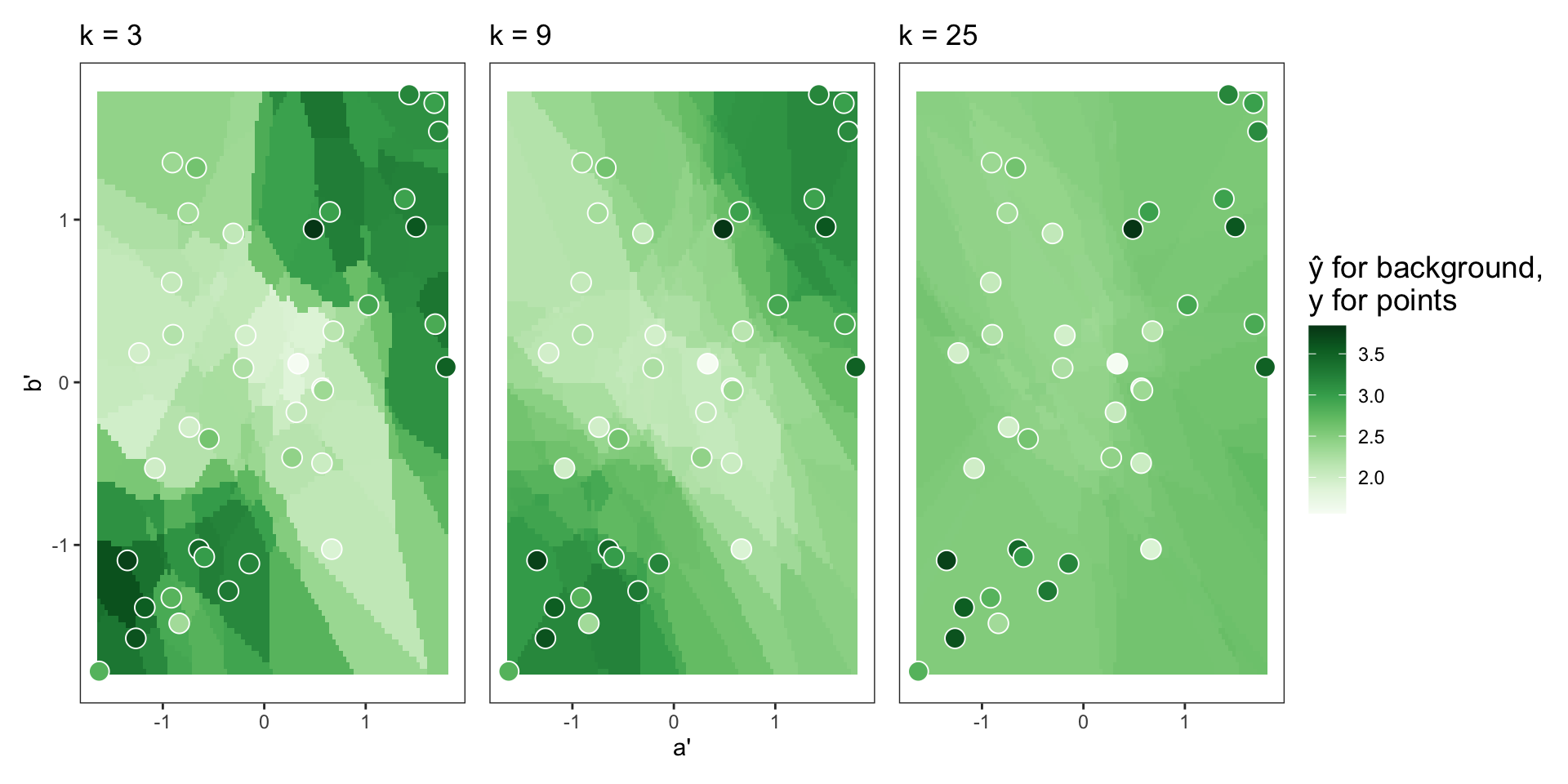
a' and b' for different selections of \(k\), with training data overlayed as points.
In this chapter we introduce three nonparametric models: \(k\)-nearest neighbors, decision trees, and random forests.
To get started, though, let’s first revisit a parametric model introduced in Chapter 6—the simple linear regression model—to establish a point of comparison. Recall that the simple linear regression model has the following functional form: \(y = \beta_0 + \beta_1x_1 + \varepsilon\). In other words, we assume there is a linear relationship between our predictor variable \(x\) and our outcome variable \(y\). Our goal then is to quantify that relationship, i.e., estimate the parameters \(\beta_0\) and \(\beta_1\) from the data. In a prediction setting, estimating these parameters enables us to then use \(x\) to predict \(y\), when \(x\) is known but \(y\) is unknown.
Conversely, nonparametric approaches do not make assumptions about the functional form of the model. Rather, the model represents a series of steps or rules that can be used to make predictions given some data. There is an algorithm for making predictions. Thus, this chapter is all about diving into the details of the \(k\)-nearest neighbors algorithm, the decision tree algorithm, and the random forest algorithm (in that order). All three of these models can be used for either regression or classification, so we discuss both types of prediction for each model.
One recurring theme throughout this chapter is tuning parameters, sometimes also referred to as hyperparameters. Tuning parameters are algorithm “settings” selected by you, the analyst. Learning about the tuning parameters for each model is crucial, as they can have a large impact on model performance. This chapter focuses on introducing the role and effect of key tuning parameters, while the next chapter focuses on selecting them effectively.
Prediction with \(k\)-nearest neighbors (\(k\)-NN) is unique. Typically when trying to make predictions using data, the majority of the work is done in the fitting of a model to the training data. Then once the model is fit, inputs can be “plugged” into the model to get outputs, or predictions, for observations of interest. In \(k\)-nearest neighbors, however, there is not much work to be done in the modeling stage. The “model” is simply all of the training data, and the work occurs after the target observation (i.e., the observation you want to make a prediction for) is specified.
In this section on \(k\)-NN, we first outline the steps of the \(k\)-NN algorithm. We then discuss the tuning parameter \(k\) as well as other model specifications that can be made.
Let’s start by exploring the general idea behind the \(k\)-nearest neighbors algorithm. Figure 8.1 presents two scatter plots, each visualizing three variables: a, b, and y. Suppose the goal is to predict y based on a and b. In the left plot, this is a regression problem because y is a continuous numerical variable. In the right plot, this is a classification problem because y is a binary categorical variable.
Each plot has an open dot in it, for which the true value of y is unknown. If we were tasked with guessing the true value of y for the open dot, one plausible approach might be to look at the points nearby to inform our guess. In the left plot, it looks like the points nearby have lower y values, so we might reasonably guess that the open dot has a lower y value, too. In the right plot, it looks like the open dot is surrounded by points equal to TRUE, so we might reasonably guess that the open dot is equal to TRUE, too. This is the intuition behind \(k\)-NN: to make a prediction for an observation, look at the observations nearby, i.e., the “nearest neighbors.”
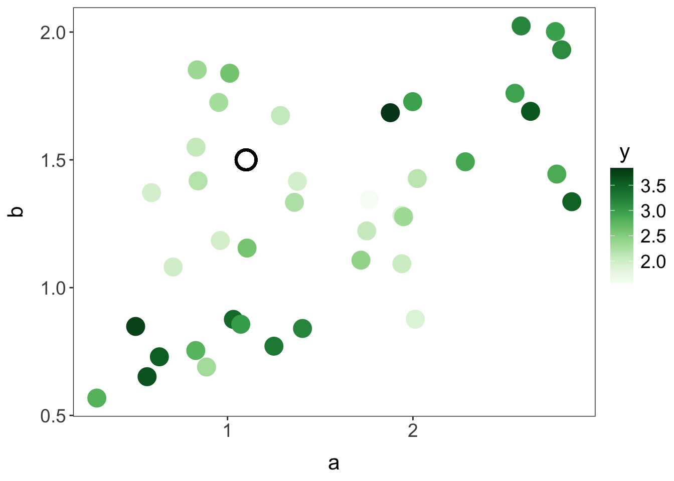
y is a continuous numerical variable
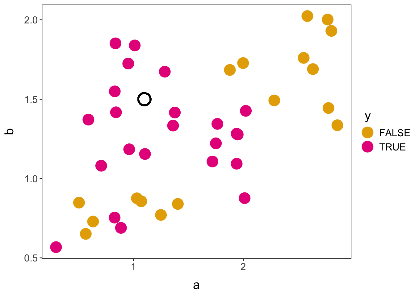
y is a binary categorical variable
a and b and outcome variable y.
There are four key steps involved in using \(k\)-NN to make a prediction.
Given a training dataset, specify the outcome variable and one or more predictor variables. All predictor variables must be implemented as numbers. Furthermore, an analyst will typically want to scale (or standardize) the continuous and discrete predictor variables at this stage, such that each variable has a mean of zero and a standard deviation of one. Scaling ensures that the distance calculations in the third step of \(k\)-NN are not biased by different variable scales.
Select a value for \(k\), the number of nearest neighbors on which to base the prediction.
Select a distance metric (e.g., the Euclidean distance), and use it to find the \(k\) nearest neighbors to the target observation, based on the predictor variables.
To get the predicted value for a regression problem, calculate the mean of the outcome values for the nearest neighbors. To get the predicted value for a classification problem, find the most common class (or category) of the outcome values for the nearest neighbors; this is known as a plurality vote. For a classification problem, an analyst may also predict the probability of the outcome being a certain class, rather than the class itself.
Note that in this fourth step it is possible to apply a weighting function, to give closer neighbors more influence in prediction. However, we start by focusing on unweighted \(k\)-NN and discuss weighting later.
Let’s now walk through these four steps for the regression problem first presented in Figure 8.1 to see how predictions are made for a continuous outcome using \(k\)-NN.
In this regression problem, the outcome variable is y, and the predictor variables are a and b. The predictor variables must be scaled by subtracting off the mean and dividing by the standard deviation (SD). For example, the mean and SD of variable a are 1.51 and 0.75, respectively. Therefore, to scale the first value of a, which is 0.50, we subtract 1.51 from 0.50 and then divide by 0.75, getting -1.35. The scaled variables a and b—denoted by a' and b'—are plotted in Figure 8.2(a). Notice that, while the scale changes, the relative location among data points is preserved.
Given the small size of our dataset (n = 40), let’s select \(k=3\), meaning each prediction is based on the outcome values of the three nearest neighbors. We can refer to this as 3-NN regression. Later in this section we discuss the effect of \(k\) on model performance, and in the next chapter we introduce a procedure for tuning a model, to find the optimal value of a tuning parameter such as \(k\).
For the distance metric, let’s use the most common option for \(k\)-NN: the Euclidean distance. In our example, we have two scaled predictor variables a' and b', so the distance between two points is defined as \(\sqrt{(a'_1-a'_2)^2 + (b'_1-b'_2)^2}\). In Figure 8.2(a), the three nearest points to each of our target observations are indicated with connecting line segments.
Once the nearest neighbors have been identified, the prediction can be made by finding the mean of the nearest neighbors’ y values. For example, the three nearest neighbors to observation 1 in Figure 8.2(a) have y values of 2.067, 2.190, and 1.954. The mean of these values is 2.070. Thus, 2.070 is the predicted value of y for observation 1.
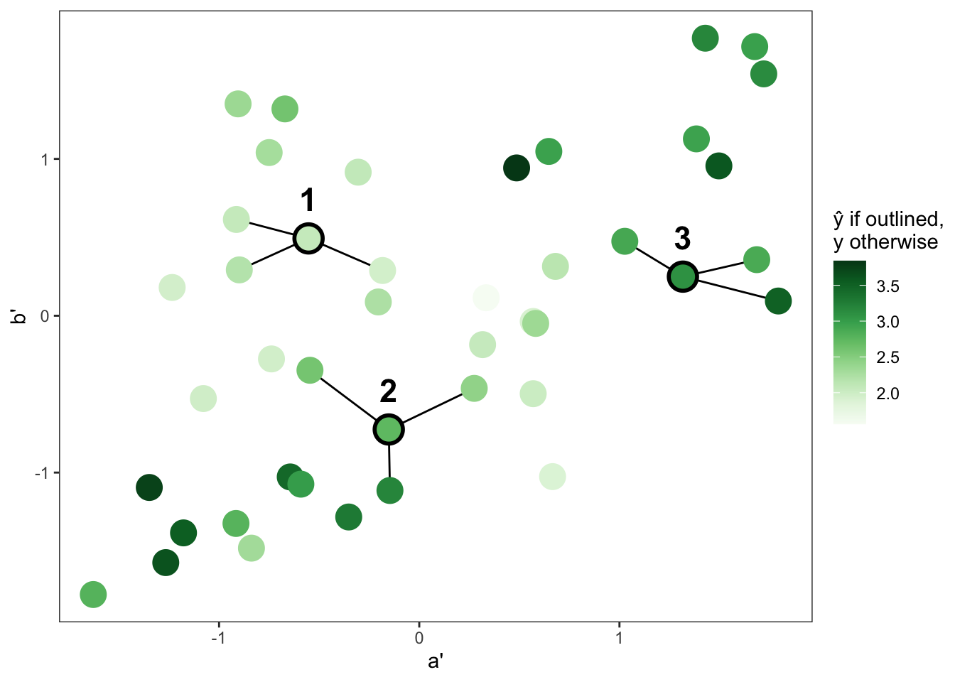
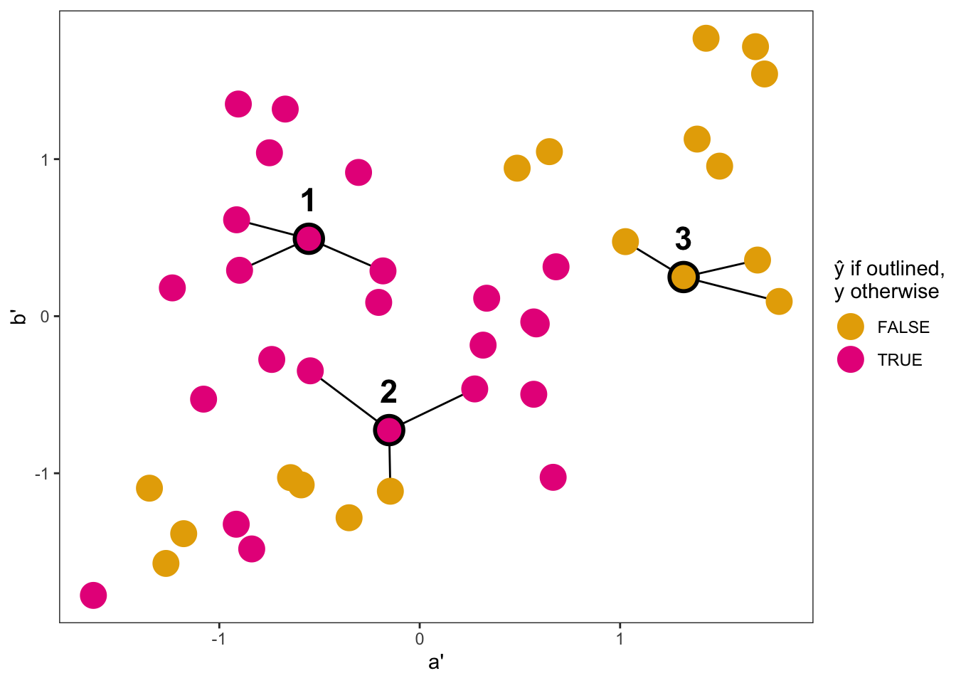
a and b have been scaled and in turn are denoted by a' and b'. The three nearest neighbors, based on the Euclidean distance, are indicated by connecting line segments.
Alternatively, Figure 8.2(b) shows 3-NN classification. The prediction process is similar to 3-NN regression in the previous example. However, now a plurality vote among the nearest neighbors is used to make the prediction. For example, for observation 2, more of the nearest neighbors are TRUE than FALSE. Thus, TRUE wins the plurality vote and is the prediction for observation 2.
One logical next question might be: Are these predictions good? Because we do not know the true value of y for observations 1–3, we can only attempt to answer that question by getting a sense for how well the \(k\)-NN model performs on our dataset, where y is known. We can do this using the same metrics and methods introduced in Chapter 7. To evaluate \(k\)-NN regression, we can use metrics like the root mean squared error (RMSE) or \(R^2\). To evaluate \(k\)-NN classification, we can use a metric like accuracy. Moreover, we can split our dataset into training and testing datasets to get more unbiased estimates of model performance.
For example, Figure 8.3 shows training and testing on 90% and 10% of the dataset, respectively. In Figure 8.3(a), we can see from the residuals that the model over-predicts—by varying amounts—for all four test observations. In Figure 8.3(b), the model accurately predicts for three out of four observations.
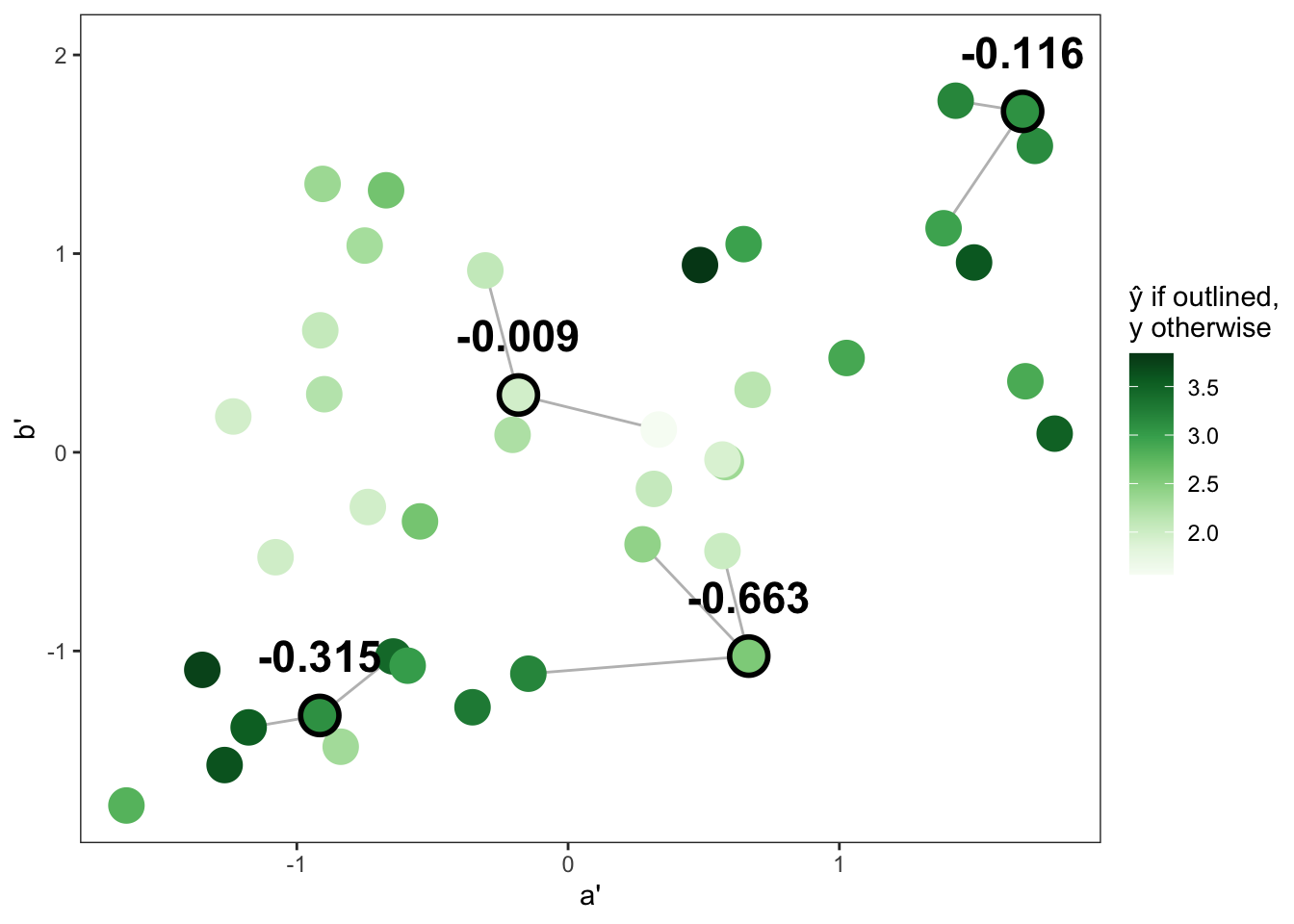
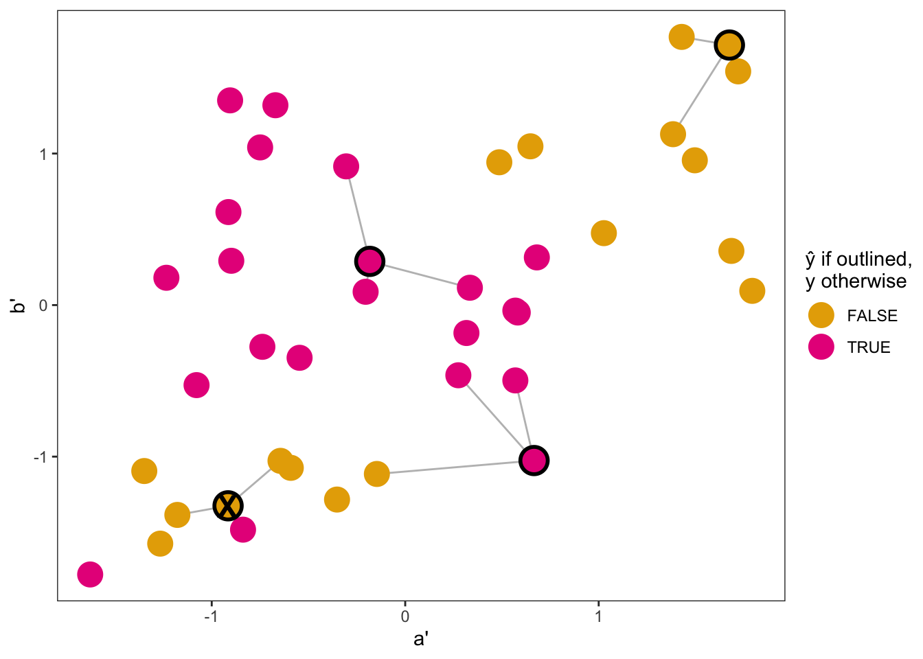
One aspect of \(k\)-NN that can have a large impact on model performance is the tuning parameter \(k\), or the number of nearest neighbors on which to base a prediction. A value of \(k\) that is too small can result in a model that is overfit, while a value of \(k\) that is too large can result is a model that is underfit. As an extreme example of a small \(k\) value, imagine prediction when \(k=1\). The prediction would simply be equal to the outcome value of the nearest observation. Alternatively, considering the other extreme, imagine prediction when \(k=n\), where \(n\) is the size of your dataset. The prediction for every observation would be exactly the same. Namely, for a regression problem, the prediction would always be the mean of the outcome variable. And for a classification problem, the prediction would always be the most common class of the outcome variable.
Ultimately, the goal is to select a value of \(k\) that strikes a balance between underfitting and overfitting the model to the training data. As previously mentioned, in Chapter 9 we will introduce a procedure that can be used to systematically find an optimal value of \(k\). For now, though, let’s further explore the effect of \(k\) on prediction, returning to our previous regression and classification problems involving variables a, b, and y. In Figure 8.4 and Figure 8.5, each panel shows the predicted value of y across the ranges of a' and b' for a \(k\)-NN model with a different \(k\). Specifically, \(k\) increases from 3 to 9 to 25, moving left to right across the panels.
For the regression problem in Figure 8.4, when \(k=3\) (left panel) there is greater variation across the prediction space, including noticeable jumps in the predicted values of y among nearby observations. The predictions fit the training data very closely. As \(k\) increases, though, that variation in prediction lessens. The prediction space starts to appear smoother overall. This is especially the case when \(k=25\), where each prediction represents an average across more than 60% of the dataset. In this model, there is significant overlap in the “nearest neighbors” used to make a prediction, for much of the prediction space. In the end, the 25-NN model produces many predictions that are noticeably different than the training data near them, indicating to us that the model is underfit.
a' and b' for different selections of \(k\), with training data overlayed as points.
For the classification problem in Figure 8.5, we can assess differences in the decision boundaries across the three panels. Decision boundaries refer to the lines that separate the prediction space into sub-spaces, in which observations are predicted to be of a particular class. Scanning left to right across the panels, we can see that as \(k\) increases, the number of decision boundaries decreases. In particular, when \(k=3\), the decision boundaries follow the training data closely, creating four notable sub-spaces (two for TRUE and two for FALSE). When \(k=9\), we get three main sub-spaces. The prediction is TRUE except in the bottom-left corner and the top-right corner. When \(k=25\), the prediction is almost always TRUE, even around clusters of FALSE training data, indicating to us an underfit model.
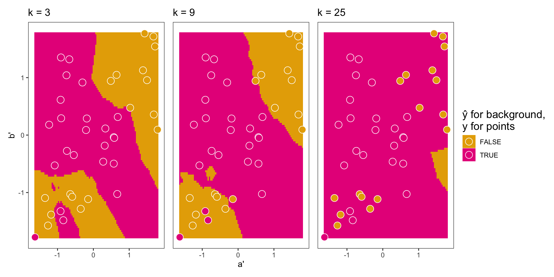
a' and b' for different selections of \(k\), with training data overlayed as points.
In this introduction to \(k\)-NN, we focused on a very standard model set up. However, it is important to clarify that this is not the only set up for \(k\)-NN. For instance, an analyst may choose to use a distance metric other than the Euclidean distance. Suppose the analysis involves both numerical and categorical predictors. Then a metric like the Gower distance—designed to handle different variable types—might be an appealing and effective choice. Additionally, an analyst may choose to apply weights to the nearest neighbors (i.e., implement weighted \(k\)-NN) so that closer neighbors have more influence on the final prediction. One way to generate weights is with the formula \(1/d\), where \(d\) is the distance between two observations; the closest neighbors end up with the largest weights and thus the most influence. Ultimately, these are the types of decisions that you as an analyst must make during the modeling step of a data analysis.
The next machine learning model that we focus on is the decision tree. It is a model in its own right, but this section on decision trees functions primarily as a precursor to the next section on random forest models. A random forest model is an ensemble of decision trees, so understanding random forests hinges on understanding decision trees.
Decision trees are structures that partition a predictor space into regions. These regions are defined by a hierarchy of decision rules, or conditions related to the predictor variables. A prediction is then based on the region that a target observation falls into. Namely, in a regression problem, the prediction is the mean outcome value of the region. In a classification problem, the prediction is the most common outcome class of the region. In the remainder of this section, we discuss both regression and classification trees in more detail. We start with regression trees.
To introduce regression trees, we work backwards. We first introduce how to read a regression tree diagram that visualizes the regression tree model. We then introduce what happens under the hood when a regression tree model is fit.
Let’s begin with an example regression problem, in which we have two continuous predictors a and b and a continuous outcome y. We limit the example to two predictor variables so that we can visualize the entire predictor space and see exactly how it is partitioned in the decision tree model. However, in practice it is common to have more than two predictor variables.
Figure 8.6(a) shows the decision tree diagram, visualizing the decision tree model fit to the data. Each node in the tree has a condition related to one of the predictor variables. We can frame each of these conditions as a question. For example, the first condition is a < 1.8, so we ask the following: For my target observation, is a less than 1.8? If the answer is yes, we go left in the tree. If the answer is no, we go right in the tree. We repeat this process at each node until we get to a terminal (or leaf) node, which tells us our predicted value.
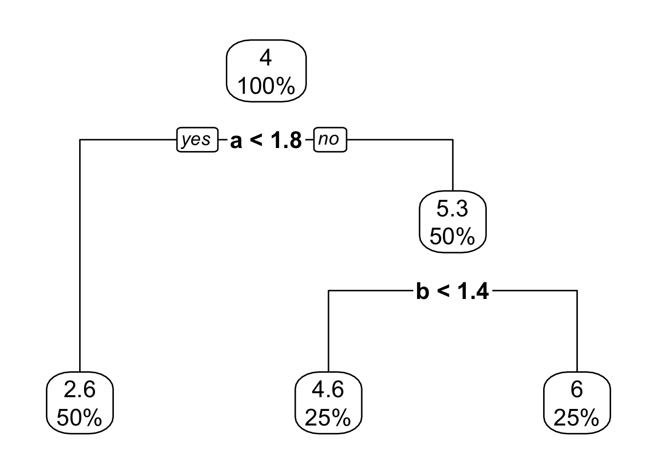
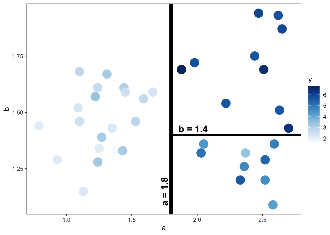
Suppose we have a target observation with an a value of 2.1 and a b value of 1.6. To get the predicted value of y, we start at the top of the tree and ask: Is a less than 1.8? The answer is no, so we go right. For the next condition, we ask: Is b less than 1.4? Again, the answer is no, so we go right, which brings us to a terminal node. The predicted value of y for this terminal node is 6. In the terminal node, the “25%” listed below the “6” tells us that 25% of the training data falls into this region.
As shown in the tree diagram, this model only makes three distinct predictions. These predictions correspond with the means of the y values in the three regions shown in Figure 8.6(b). We can see how the predictor space was first divided into a left and right region at an a value of 1.8 (the first condition). The right region was then further divided into a top and bottom region at a b value of 1.4 (the second condition). Note that our target observation with an a of 2.1 and b of 1.6 would be located in the top right region. The mean of the y values in this region is 6.
At this point you might be wondering how the predictor space is partitioned. The general idea is to partition the space into regions that have similar outcome values. In Figure 8.6(b), we can see that the first split into a left and right region divides the space into lower and higher y values, respectively. The second split then results in a top region that appears to have, on average, slightly higher y values than the bottom region.
To find these splits, we return to a measure first introduced in Chapter 6: the residual sum of squares (\(RSS\)) defined as
\[
RSS = \sum_{i=1}^{n}(y_i-\hat{y}_i)^2
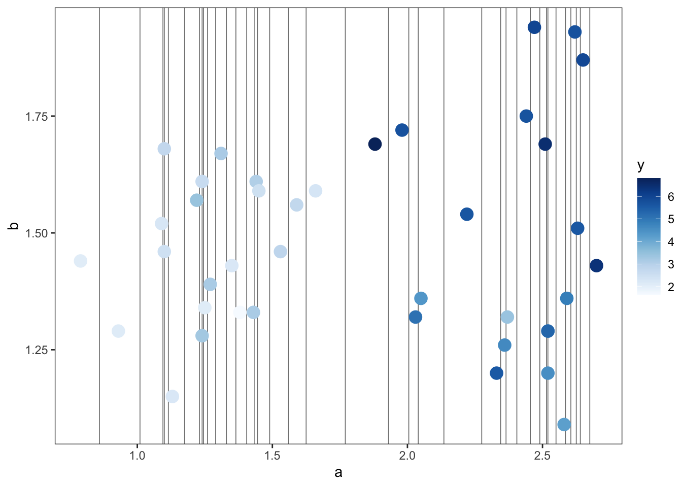
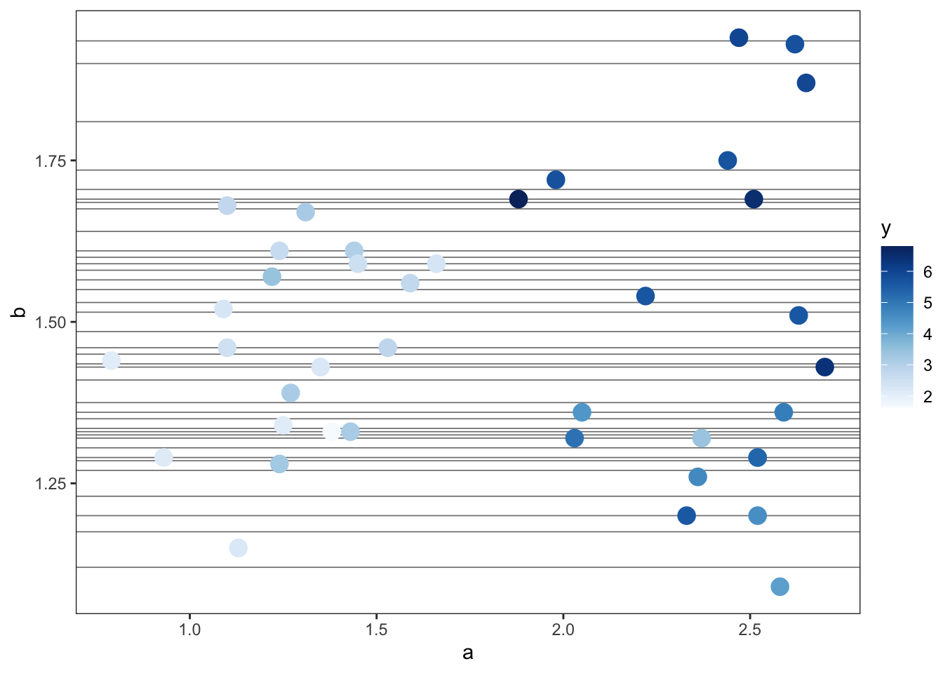
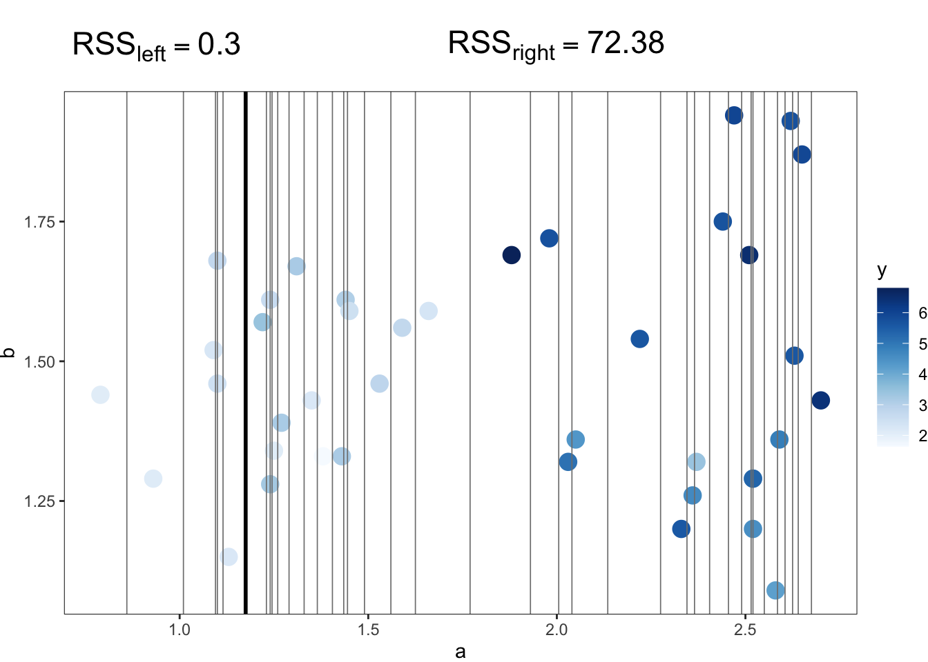
\] where \(y_i\) is the true value and \(\hat{y}_i\) is the predicted value for observation \(i\) from a sample of size \(n\). In short, we want to find the split point that results in the largest reduction in the \(RSS\). We make comparisons in the \(RSS\) by calculating the \(RSS\) for the region before the split (\(RSS_{start}\)) and the \(RSS\) after the split (\(RSS_{new}\)), which is equal to the sum of the \(RSS\) of each new region resulting from the split. For example, before the first split is made, the \(RSS_{start}\) for our running regression example is 91.5. This value represents the sum of the squared differences between each observation and the mean of y. From here, there are many first possible split points to consider, as shown in Figure 8.7. Note that each split point is the midpoint between two data points.
a
b
For each possible split point, we can calculate the \(RSS\) for the observations on either side of the split point and sum these two \(RSS\) values to get \(RSS_{new}\). In Figure 8.8, we show these calculations for two possible split points, related to predictor variable a. The split point in Figure 8.8(a) results in an \(RSS_{new}\) of 72.68 (0.3 + 72.38). The split point in Figure 8.8(b) results in an \(RSS_{new}\) of 18.91 (4.56 + 14.35). Thus, this latter split point is the better option, as it leads to a much greater reduction in the \(RSS\), which was originally 91.5. In fact, it is the best split point overall and corresponds with the first condition in Figure 8.6(a), which has been rounded to one decimal place.
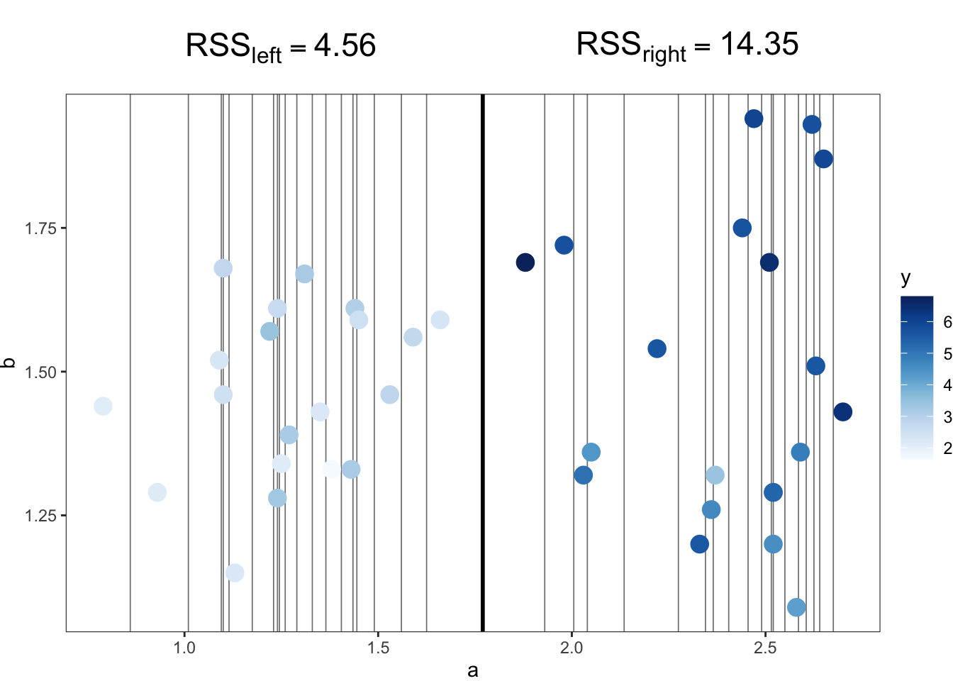
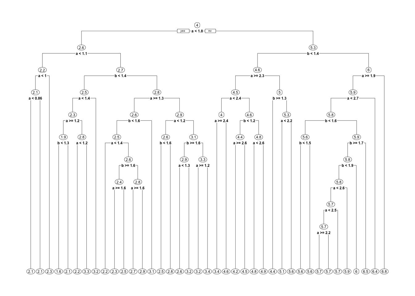
This process then repeats in each newly created region, now with an \(RSS_{start}\) of 4.56 on the left and an \(RSS_{start}\) of 14.35 on the right. When does the process stop? If we let it run its course, we end up with the decision tree in Figure 8.9. That decision tree has 40 terminal nodes, one for each observation. In other words, the decision tree model has partitioned the predictor space such that every single observation has its own region, and the \(RSS\) of each region is zero. However, that decision tree is extremely overfit to the training data. To prevent this from happening, we can place constraints on how much the tree grows. We can do this via the tuning parameters, which we discuss later in this section.
We now introduce classification trees, which are very similar to regression trees but with two main differences. Firstly, the prediction for the categorical outcome variable is made using a plurality vote. Secondly, optimal split points are not identified using the residual sum of squares (RSS) but instead a different measure, such as the Gini impurity measure. To introduce classification trees, we focus first on the interpretation of the tree diagram and then on how the model is fit.
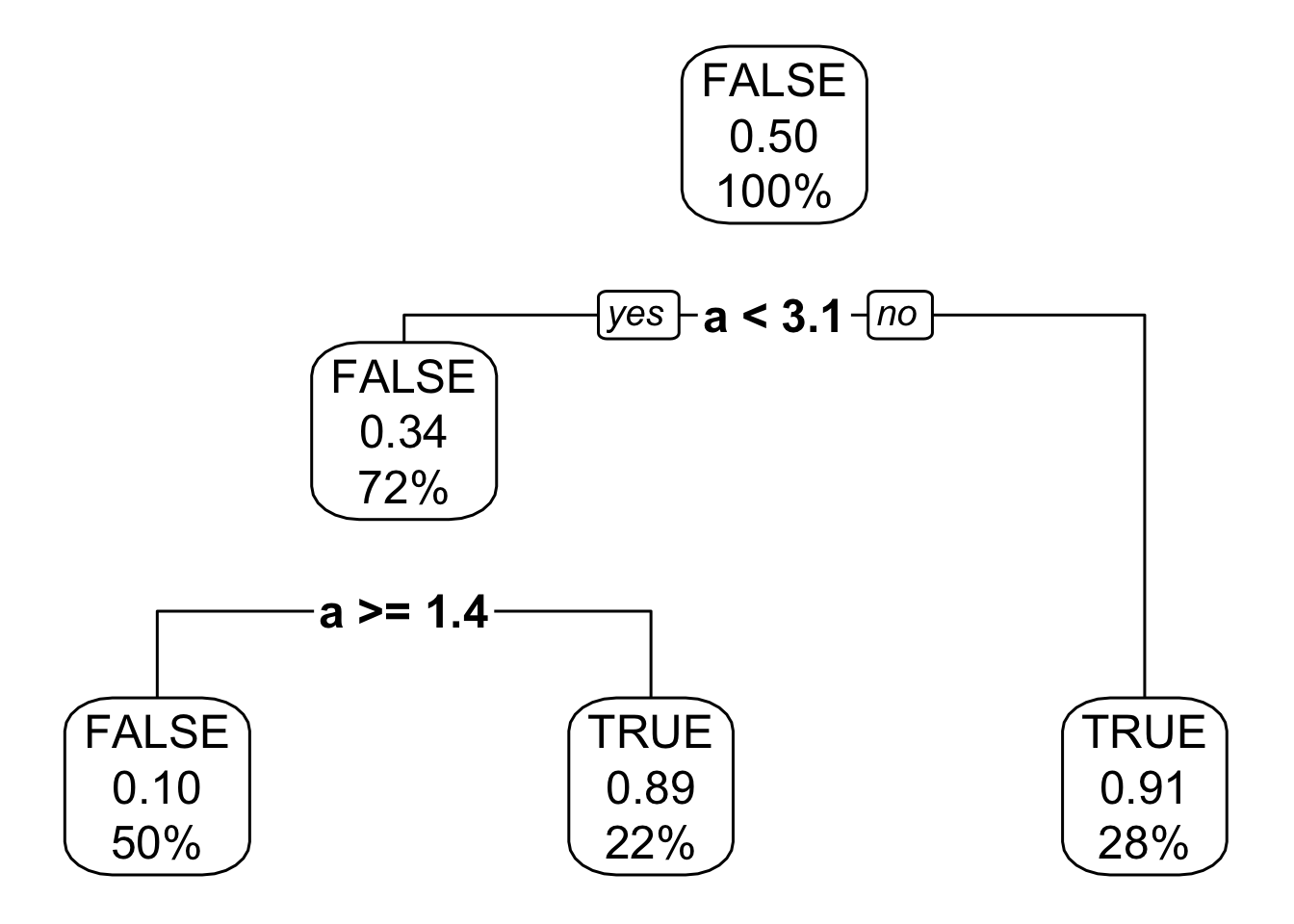
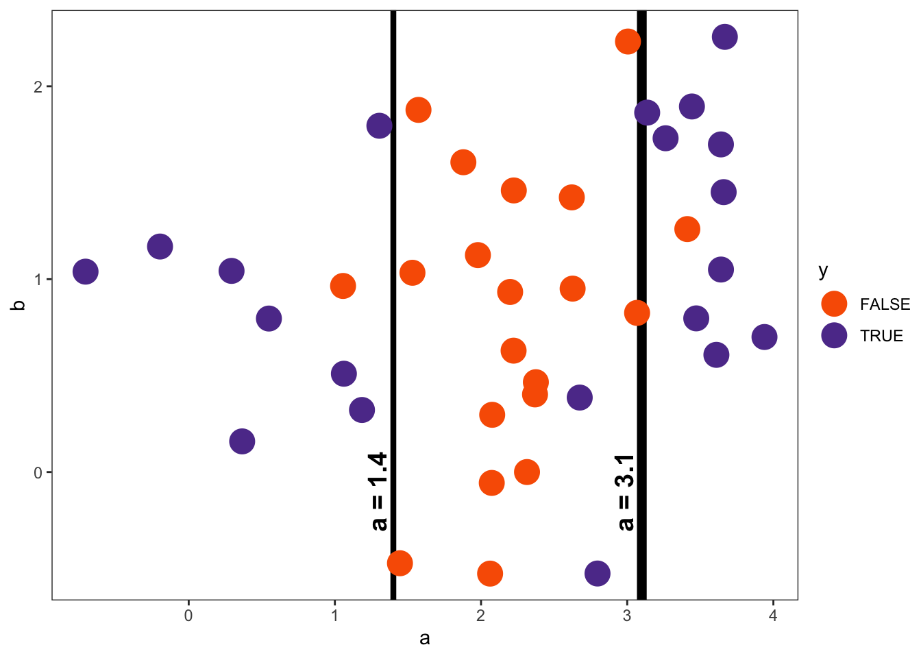
Let’s begin with an example classification problem, in which we have two continuous predictors a and b and a binary outcome y, containing values TRUE and FALSE. The classification tree fit to the data is visualized in Figure 8.10. From the tree diagram in Figure 8.10(a), we can see that there are two conditions. Interestingly, both conditions pertain to predictor variable a. There are no conditions related to predictor variable b. When fitting a decision tree model, it is not guaranteed that every predictor variable will be used to partition the data.
The classification tree diagram is read in the same way as the regression tree diagram. We can frame the condition presented at each node in the tree as a question. If the answer to the question is yes, we go left in the tree. If the answer to the question is no, we go right in the tree. We move through the tree until we reach a terminal node, which tells us the final prediction. Note that it is also possible to see at each intermediate node what the prediction would be if you were to stop there.
Let’s walk through an example. Suppose we have a target observation with an a value of 1.9 and a b value of 1.0. To get the predicted value of y, we start at the top of the tree and ask: Is a less than 3.1? The answer is yes, so we go left. For the next condition, we ask: Is a greater than or equal to 1.4? Again, the answer is yes, so we go left, which brings us to a terminal node. The predicted value of y for this terminal node is FALSE. In addition to the predicted class, the terminal node also tells us the probability of being TRUE in that region (0.10) as well as the percentage of training data in that region (50%).
Looking at the partitioned predictor space in Figure 8.10(b), we can see that our target observation falls into the middle region, where FALSE is by far the most common class.
When it comes to fitting classification trees, the general idea is the same as regression trees: partition the predictor space into regions with similar outcome values.
To find the split points that partition the space, the Gini impurity measure is commonly used.1 The Gini impurity is defined as
\[ Gini = \sum_{k=1}^{K}p_k(1-p_k) \]
where \(k\) is a class of the outcome variable and \(p_k\) is the probability for that class in a given region. Thus, a Gini impurity of zero means that all observations in a region are of the same class. As the number of classes and the presence of different classes in a region increases, so does the Gini impurity. For example, suppose you have four classes, and in a given region, each class occurs with equal probability (i.e., 0.25); the Gini impurity for that region would be 0.75. Now suppose you have five classes, and in a given region, each class occurrs with equal probability (i.e., 0.20); the Gini impurity for that region would be 0.8. In short, this measure can be used to quantify how similar the outcome values are in a given region and identify optimal split points.
In particular, we want to find the split point that results in the largest reduction in the Gini impurity, hereafter referred to as \(Gini\). We calculate differences in \(Gini\) by calculating \(Gini\) for the region before the split (\(Gini_{start}\)) and \(Gini\) after the split (\(Gini_{new}\)), which is equal to the weighted sum of the \(Gini\) of each new region resulting from the split. For example, before the first split is made, the \(Gini_{start}\) for our running classification example is 0.50. This is because half of the observations are TRUE (20/40) and half of the observations are FALSE (20/40), making the probability of each class 0.5. The exact calculation is as follows.
\[ Gini_{start} = .5(1-.5) + .5(1-.5) = .5 \]
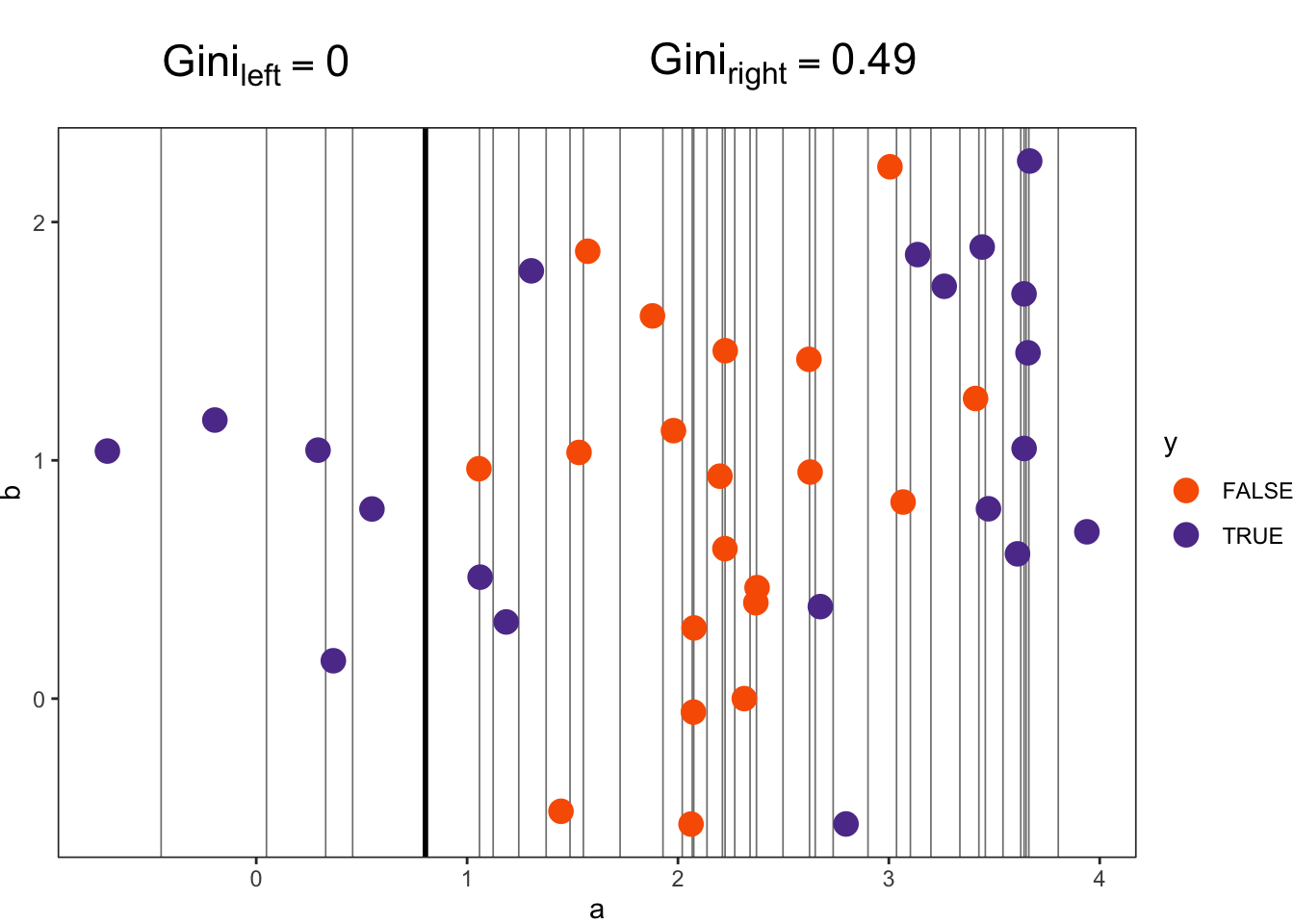
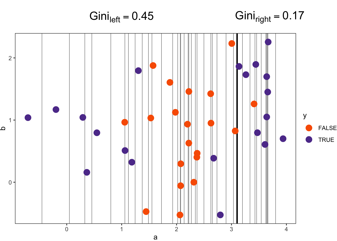
From there, we can compare candidate split points. In Figure 8.11, we show calculations for two possible split points, related to predictor variable a. The split point in Figure 8.11(a) results in a \(Gini_{new}\) of 0.43. This is a weighted sum accounting for the number of observations in each region. Specifically, \(Gini_{left}\) is multiplied by 0.125 (5/40), and \(Gini_{right}\) is multiplied by 0.875 (35/40). These values are then added to get \(Gini_{new}\). The other split point in Figure 8.11(b) results in a \(Gini_{new}\) of 0.37. Thus, this latter split point is the better option, as it leads to a larger reduction in the \(Gini\), which was originally 0.5. Note that this split corresponds with the first condition in Figure 8.10(a).
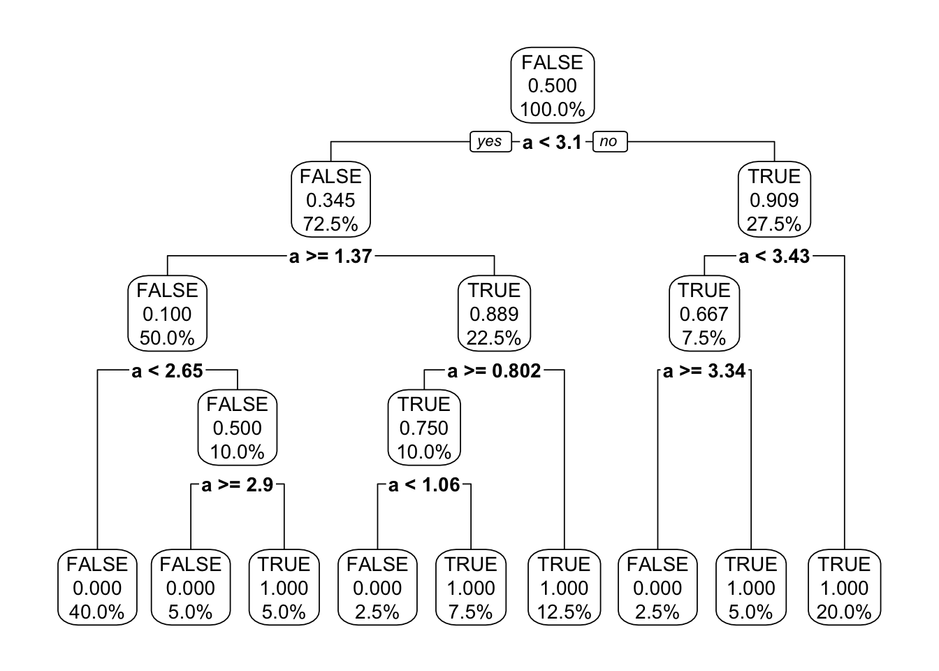
Once the optimal split point is identified, the process repeats in each newly created region. And, if we let it, that process will continue to repeat until the space is partitioned into regions with a Gini impurity of zero. If we let that happen for our example, we get the classification tree Figure 8.12. Looking carefully at the terminal nodes, we can see that the probability of TRUE is either zero or one, meaning each region has either all FALSE values or all TRUE values, respectively. What is also notable about this tree is that it creates some extremely narrow regions to isolate individual FALSE values located among clusters of TRUE values. For instance, on the right side of the tree, we can see that a narrow region is created in which a is less than 3.43 but greater than or equal to 3.34. This is to isolate a single FALSE value from surrounding TRUE values. Ultimately, this tree is overfit to the training data.
One question you may have at this point is: Why was the initial classification tree that we looked at in Figure 8.10 different (or “shorter”) than the tree in Figure 8.12? The answer relates to tuning parameters. Specifically, in the first tree, we set the tuning parameters so that the tree was not allowed to keep growing past a certain point. We discuss these tuning parameters next.
There are a variety of tuning parameters that control the size of a decision tree. The complexity tuning parameter requires that, for a split to be made, the split must result in a certain level of improvement in the relative error. The tree depth tuning parameter sets the maximum number of conditions it can take to get to a terminal node. The minimum node size refers to the minimum number of observations that must be in a node for the node to be split further.
An analyst may choose to adjust one or more of these tuning parameters. It is generally not necessary to specify all of them because their purpose is largely the same: to prevent the overfitting of a model to the training data. Figure 8.13 shows the effect of these tuning parameters for the previous regression example. Note that the original regression tree in Figure 8.6 was fit with common defaults for the tuning parameters. For example, a common default for complexity is 0.01. In our regression example, that means that each split must reduce the relative error (\(1-R^2\)) by at least 0.01.
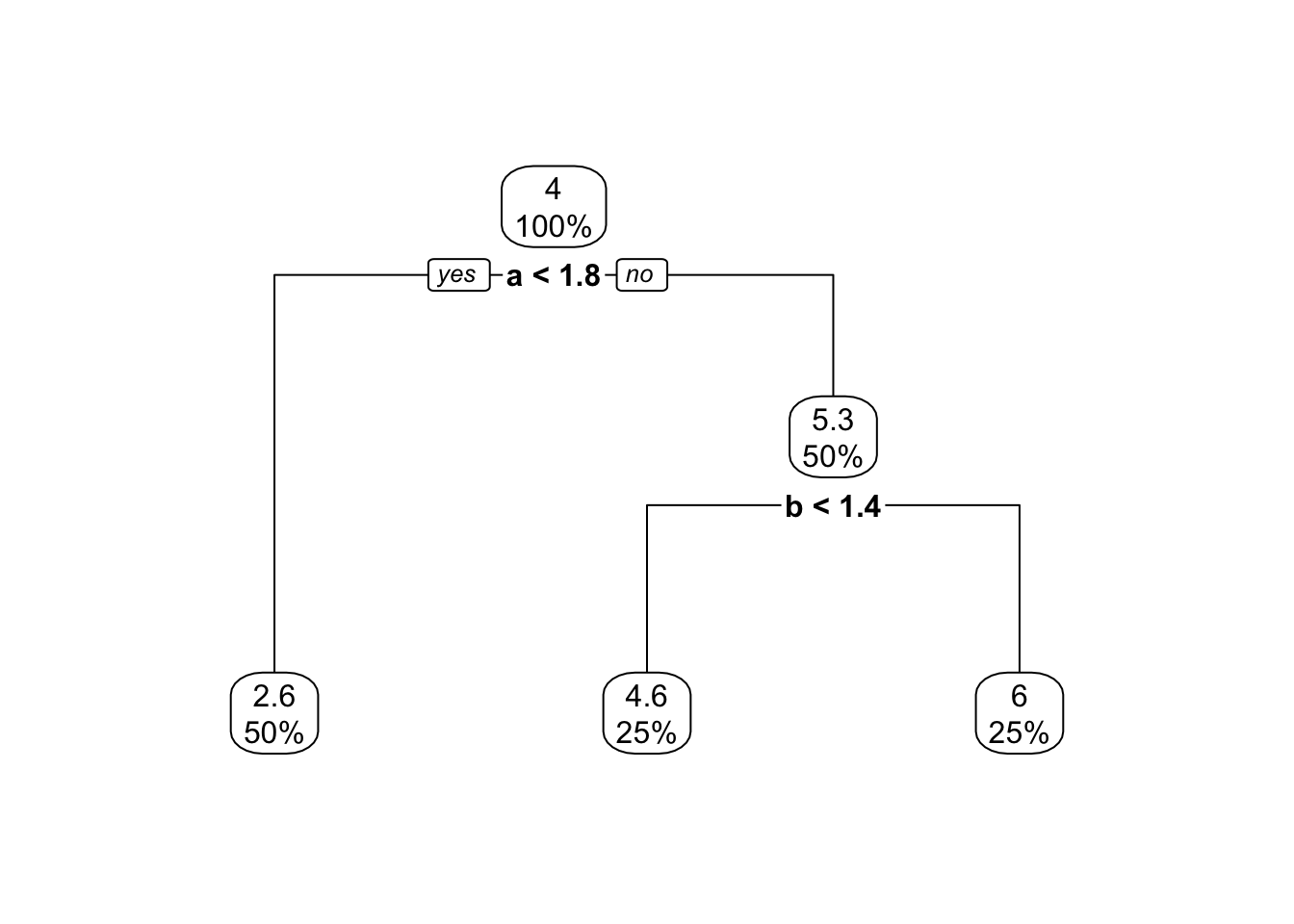
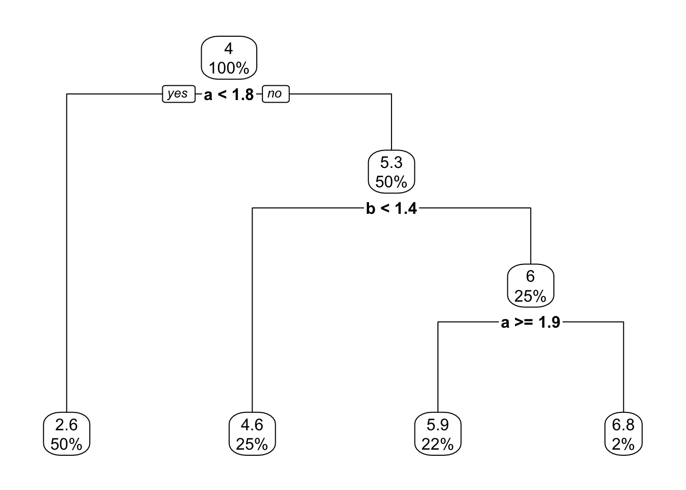
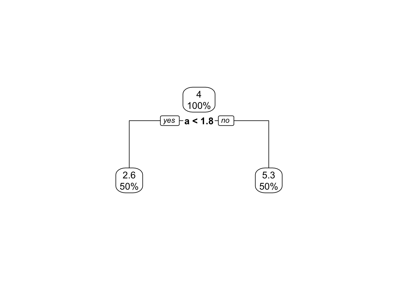
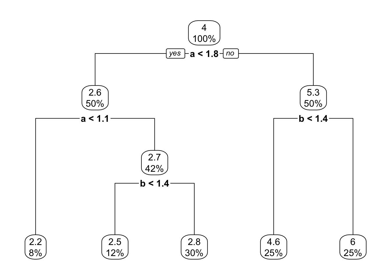
In Chapter 9 we introduce a procedure to find optimal tuning parameter values. Alternatively, an analyst may choose to mitigate the risks of overfitting—associated with a single decision tree—by instead fitting a random forest model, which is an ensemble of decision trees. We discuss random forests next.
As previously mentioned, a random forest model is designed to overcome the issue of overfitting associated with an individual decision tree. It does this by fitting an ensemble of decision trees and then producing a prediction based on many decision trees rather than just one. However, if we were to simply fit many decision trees with the same observations, same predictors, and same tuning parameter values, we would get the same tree again and again. This is not the desired outcome, as it would be no different than fitting a single decision tree. Thus, the random forest algorithm introduces some variation into the process—through the bootstrap sampling of observations and the sub-sampling of predictor variables—to get a diverse set of decision trees that capture different aspects of the predictor space.
There are five key steps involved in fitting a random forest model.
Given a training dataset, specify the outcome variable and one or more predictor variables.
Define your tuning parameter values. Namely, select the total number of decision trees to fit; generally, hundreds of trees are fit. Also select \(m\), the number of predictors to sample at each node in the tree; \(m\) should be less than the total number of predictor variables.
Take a bootstrap sample from the training dataset. A bootstrap sample is of size \(n\) (the size of the training dataset) and is sampled with replacement, meaning that each observation can be sampled more than once.
Fit a decision tree to the bootstrap sample, only considering split points for a random sample of \(m\) predictors at each (splittable) node in the tree.
Repeat steps 3 and 4, fitting the total number of trees specified for the random forest.
Once the trees have been fit, you use all of them to make a prediction for a target observation. For a regression problem, the prediction is the mean of the predictions across all regression trees. For a classification problem, the prediction is the most common prediction across all classification trees.
One interesting by-product of bootstrap sampling is that not all observations are used to fit each decision tree. In turn, a “left-out” observation becomes a viable testing observation for all of the trees that did not see it during training. In the context of random forests, these “left-out” observations are referred to as out-of-bag (OOB) observations. We can evaluate model performance using OOB observations. Specifically, we predict for an OOB observation using all trees that were not fit based on that observation. Then, we average the prediction errors for all OOB observations, to get what is referred to as the OOB error.
The Capital Metropolitan Transportation Authority (CapMetro) is the public transportation provider for Austin, Texas. One service provided by CapMetro is a bikeshare program. People can rent and return CapMetro bikes at a large number of kiosks around the city.
In this example, we explore how a random forest model can be built to predict whether the duration of a CapMetro bike trip will be short. Specifically, will it be under ten minutes long? We use 2022 trip-level data provided on the City of Austin’s open data portal. For each bike trip, there is data on the trip duration as well as the renter’s CapMetro bikeshare membership, the type of bike rented (classic or electric), the rental kiosk, and the departure month, day of week, and hour. Three example rows of data are printed in Table 8.1. The predictors are membership_type, bike_type, kiosk, month, day_of_week, and hour. The outcome is short_trip, which contains two values: yes and no.
| membership_type | bike_type | kiosk | month | day_of_week | hour | short_trip |
|---|---|---|---|---|---|---|
| Local365 | classic | Rainey/Cummings | 5 | Sat | 8 | no |
| Student Membership | electric | 22nd/Pearl | 8 | Mon | 14 | yes |
| Student Membership | classic | 22nd/Pearl | 8 | Fri | 20 | yes |
We fit a random forest model with 500 trees, an \(m\) of 2, and a minimum node size of 20. Recall that each tree is fit on a bootstrap sample, so the trees are fit using “different” data. For example, the first observation in Table 8.1 was not sampled in the first bootstrap sample, while the second observation was sampled twice. However, in the second bootstrap sample, the first observation was sampled four times, while the second observation was not sampled at all. The most that any observation was sampled—in either of the bootstrap samples—was eight times. And in both bootstrap samples, approximately 37% of the observations were not sampled.
We can also inspect information about the variables used in our model. Recall that only split points for a sample of \(m\) predictors are considered at each (splittable) node (i.e., nodes with at least 20 observations). As a result, the trees are composed of different decision rules. For example, the first classification tree starts with a decision rule related to kiosk, while the second tree starts with a decision rule related to membership_type.
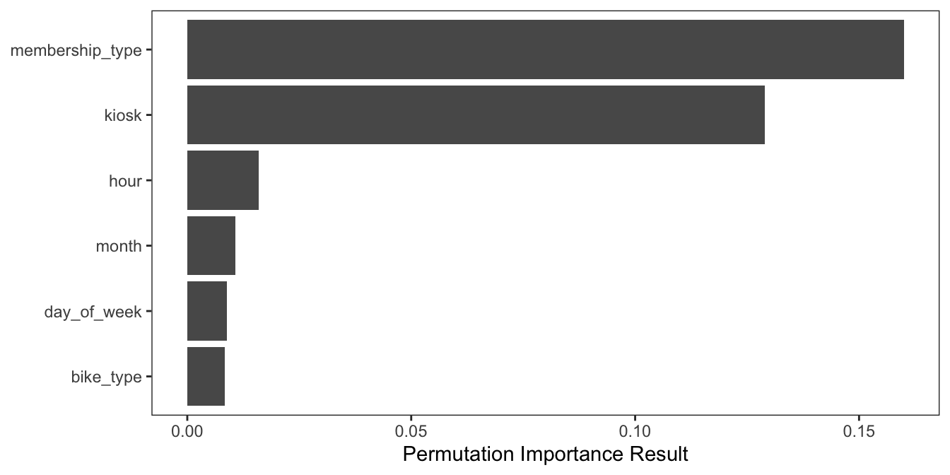
We can also look at which variables were most important in the random forest model with permutation importance. This technique quantifies the drop in model performance when the values of a particular variable are permuted, or randomly shuffled. A large drop signals an important feature. Namely, there was important predictive power that was lost when the values of that variable were permuted. The permutation importance results for our random forest model are shown in Figure 8.14. We can see that the most important variables were membership_type and kiosk.
Using the model, we can input values for the predictors and get a prediction for the question: Will the trip be short (under ten minutes)? For example, suppose we want to make a prediction for the first observation in Table 8.2: a renter who has a U.T. Student Membership, selects an electric bike, and rents from the kiosk at Dean Keeton/Speedway at 8 AM on a Monday in September. In the random forest model, 463 of the classification trees predict yes (that it will be a short trip), and 37 trees predict no. Thus, the final prediction is yes—that it will be a short trip under ten minutes—because that is the most common prediction across the 500 classification trees.
Alternatively, the prediction for the second observation in Table 8.2 is no. The difference between these two observations is their membership type. The second renter has the “Explorer” membership. In the random forest model, 389 of the classification trees predict no and 111 predict yes. Thus, no wins the plurality vote.
| membership_type | bike_type | kiosk | month | day_of_week | hour | short_trip |
|---|---|---|---|---|---|---|
| U.T. Student Membership | electric | Dean Keeton/Speedway | 9 | Mon | 8 | ? |
| Explorer | electric | Dean Keeton/Speedway | 9 | Mon | 8 | ? |
You might be wondering whether these predictions are good. We can evaluate the random forest model using the OOB observations. The OOB error was 20.7%, meaning that 20.7% of the OOB observations were misclassified. This means the accuracy was 79.3%, or 79.3% of OOB observations were correctly classified as either a short trip or not. The confusion matrix is shown in Table 8.3. From the confusion matrix, we can also calculate the true positive and true negative rates: 79.1% and 79.5%, respectively. The model performs equally well for both classes. We can also calculate the false positive and false negative rates: 20.5% and 20.9%. In the context of predicting bike trips, these error rates may be acceptable. For each class, approximately one in five predictions was incorrect. However, note that if we were instead trying to predict fraudulent credit card transactions or medical diagnoses, these error rates might be considered far too high.
| Predicted: No | Predicted: Yes | |
|---|---|---|
| Actual: No | 119268 | 30718 |
| Actual: Yes | 34820 | 132169 |
In this chapter we introduce three flexible models for prediction: \(k\)-nearest neighbors, decision trees, and random forests. These are nonparametric models that do not require strong assumptions about the functional form of the “true model,” or data-generating process. All three models can be used for either regression or classification. Additionally, all three models have one or more tuning parameters. A tuning parameter is a model “setting” that must be decided by an analyst.
With \(k\)-nearest neighbors, a prediction is made using training observations close to the target observation. Here, “close” is defined by a distance metric, such as the Euclidean distance. In a decision tree model, the predictor space is first partitioned into regions containing training observations with similar outcome values. Then a prediction is made based on the region that the target observation falls into. In a random forest model, a prediction is made based on many decision trees, fit using bootstrap samples and only a sub-sample of predictors at each decision tree node. For all three models, an analyst is responsible for setting tuning parameter values that strike a balance between underfitting and overfitting the model to the training data. The goal is to fit a model that makes accurate predictions for new observations with an unknown outcome.
Wind is 10.9 and Temp is 85?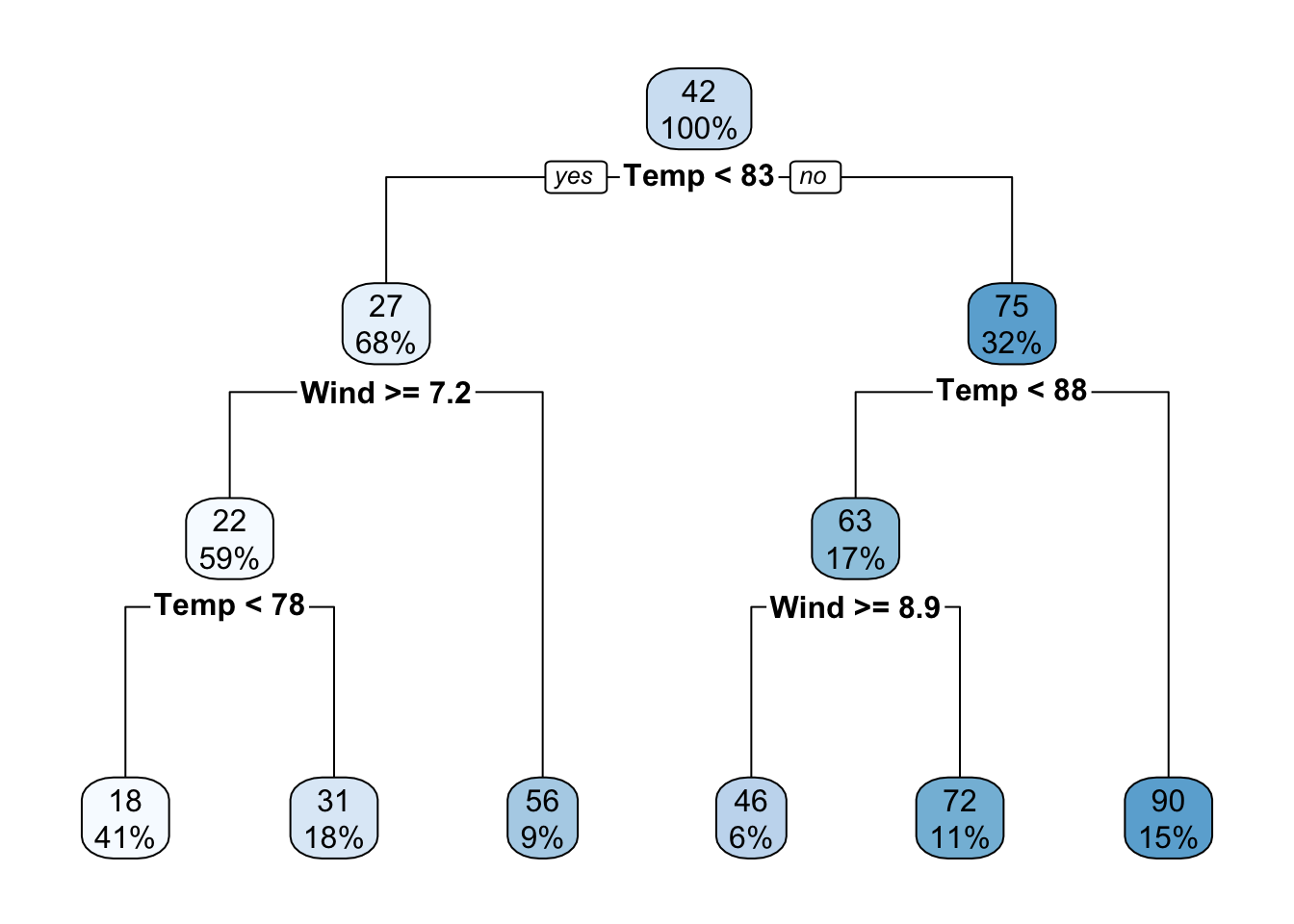
Using the regression tree model above, how many unique predicted values are produced by this regression tree?
Using the regression tree model above, what percentage of the observations in the training dataset had a Temp value less than 83?
Suppose we are trying to classify an outcome \(y\) which has two classes (class 1 and class 2) and there are 50 observations in each class (for a total of 100 observations). We are using a continuous predictor \(x\) to predict \(y\). In the training dataset, when we split \(x\) at \(x=0\), we find that when \(x \geq 0\), all of the values of \(y\) are equal to class 1 and when \(x < 0\) all of the values of \(y\) are equal to class 2.
What was the Gini impurity of the outcome \(y\) before using \(x\) as a predictor?
What is the Gini impurity after splitting the data using \(x\)?
We are using a \(1\)-NN algorithm to predict a continuous outcome \(y\). What would the RMSE be when evaluating the \(1\)-NN algorithm on the observations in the training dataset?
Some classification trees are instead fit using a measure called entropy.↩︎