11 Causal Inference: Analysis Methods
In the previous chapter, we talked about the basic ideas and definitions behind causal inference and the framework we use for defining causal effects. In particular, we discussed estimating the average treatment effect of a treatment or intervention from observed data from multiple units. We also discussed the key assumptions that need to be made in order to draw causal inferences from data: stable unit treatment value assumption, positivity, and ignorability. This chapter will focus primarily on the ignorability assumption and the statistical methods that we can use to assess the validity of that assumption in a given data analysis.
The assumption of ignorability is the assumption that when examining a given causal relationship, say between a treatment variable and an outcome, there are no hidden confounders. If this is true, then we can look at the differences in the outcomes between the study groups and draw a causal inference about those differences. In a controlled experiment, it might be possible to generate data for which there are no hidden confounders. But in many other real-world settings, it is impossible to control every possible factor that might confound a given relationship.
11.1 Visualizing Causal Relations
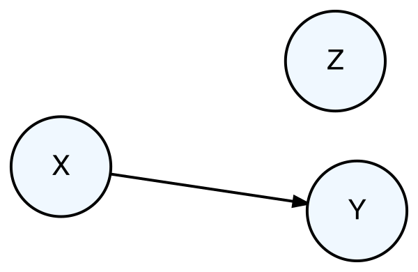
One tool that can be useful for visualizing the causal relationships between different variables is the directed acyclic graph, or DAG. DAGs show variables that are causally connected via arrows to indicate the direction of causality between variables (the “directed” part). In addition, the arrows are not allowed to create a path that returns to a given variable (the “acyclic” part). An example of a DAG is shown below in Figure 11.1.
This graph above indicates that variable X causes a change in variable Y because the arrow goes from X to Y. In addition, there is a third variable Z that is not causally related to either X or Y.
If the DAG shown above represented the true state of nature, i.e. that changes in X cause changes in Y, then we would expect that data taken on variables X and Y would be correlated with each other (the DAG doesn’t say whether the correlation would be positive or negative). Furthermore, we would not expect there to be any relationship (correlation or otherwise) between X and Z or between Y and Z.
Now consider the following DAG showing three variables, X, Y, and Z.
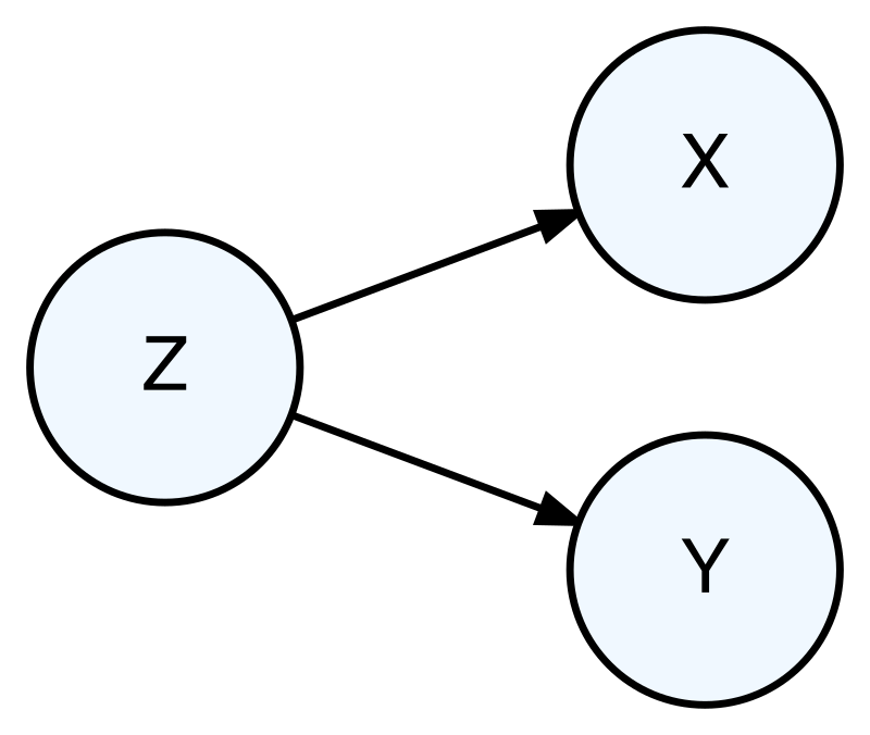
Here we see that the DAG illustrates the relations “Z causes X” and “Z causes Y”. However, in this DAG we do not have X causing Y directly.
Even though X and Y are not directly causally related, because of their mutual connection to Z, it may be true that observations of X and Y are correlated with each other. This is the challenge of a confounding relationship. If we do not know about Z here, and we simply examined the the data on X and Y, we might observe a correlation between them and therefore conclude that X causes Y, as illustrated in the first DAG (Figure 11.1). However, a correlation between X and Y is also consistent with the second DAG, where there is a third variable Z causing variation in both X and Y. In order to determine which DAG better represents the underlying reality, we would need to do a different analysis that some how controls for the variation in Z.
What is the difference between the DAGs in Figure 11.1 and Figure 11.2 since they can both result in data where X and Y are correlated? Suppose we decided we wanted to intervene and manipulate values of X in order to make changes in Y. If Figure 11.1 were a true reflection of reality, then we could expect changes in Y to occur because there is a causal relationship between X and Y. However, Figure 11.2 represents the true relationships, then modifying X will have no impact on Y and we will have wasted time and resources. Therefore, before designing and implementing interventions to cause changes in specific outcomes, we want to make sure that we have a good understanding of the true underlying causal relationships.
As a quick example, consider the first five rows of the dataset shown below, which shows three variables, x, y, and z.
x, y, and z (first few rows).
| y | x | z |
|---|---|---|
| 1.05 | 5.69 | 1 |
| -0.24 | 5.00 | 1 |
| -1.26 | 0.19 | 0 |
| -0.14 | 5.24 | 1 |
| 0.65 | 0.31 | 0 |
A scatter plot of x and y is shown below, and appears to have a positive correlation, consistent with the first DAG indicating that X causes Y.
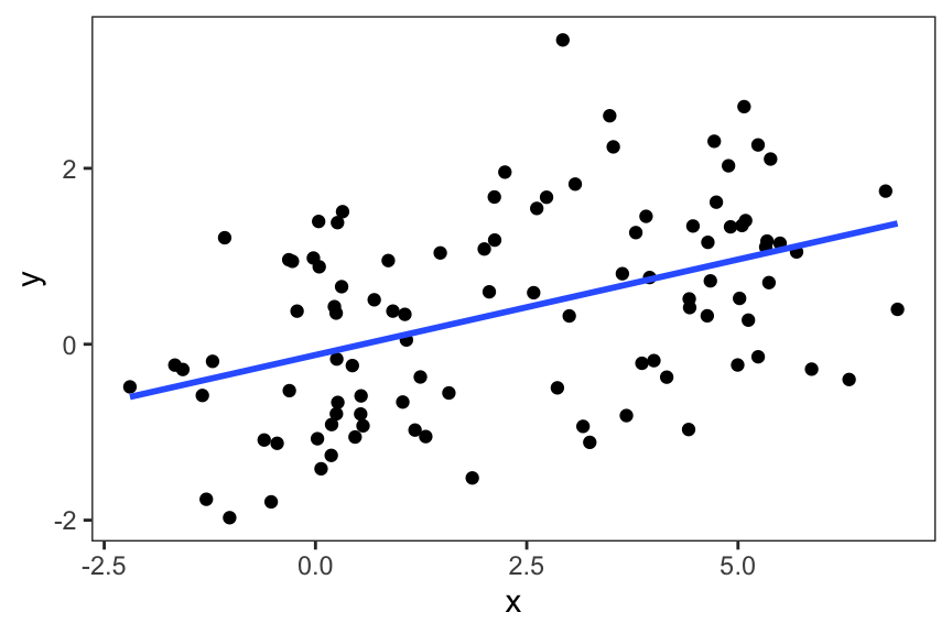
However, the dataset has a variable z that appears to be a binary variable. If we make a plot of x and y for each of the two levels of z (0 and 1), we get the following plot.
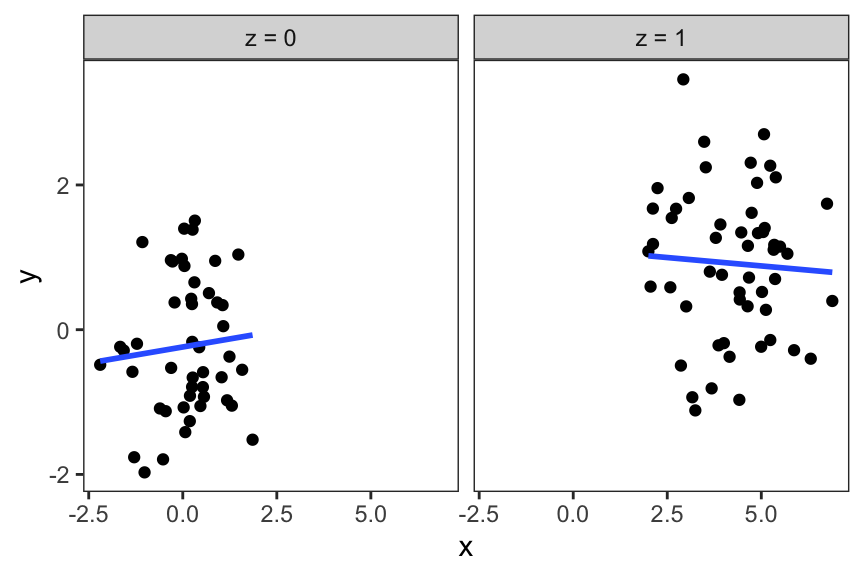
Within each of the panels, we see that x and y are relatively weakly correlated with each other. In this plot, we have “controlled” for the variable z because within each of the panels, we know that there is no variation in z. In each of the panels z is either fixed at 0 or at 1. This second plot in Figure 11.4, which incorporates the z variable, suggests that the second DAG is more likely than the first DAG, given that when we control for z, we do not show any strong correlation between x and y.
11.1.1 Example: Air Pollution, Health, and Urban Living
Since the passage of the Clean Air Act in the United States in 1970, there as been regulation of outdoor air quality for the purposes of protecting the public’s health. As a result, there is an interest in understanding to what extent air pollution affects human health. In studying air pollution’s affect on health, there are a number of challenges because of the presence of many potential confounder variables. Because it is very difficult to do a controlled study of air pollution and human health, we often have to deal with the possibility of confounding variables being present.
If we believed that air pollution exposure caused harmful health impacts directly, we could illustrate that with a simple DAG.
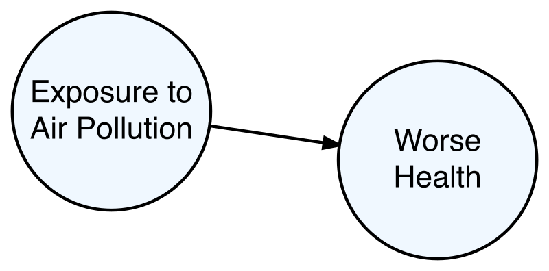
Under the reality depicted by the DAG in Figure 11.5, if we collected data on air pollution exposures and health outcomes, we would expect there to be a correlation. So for example, we might see that higher levels of air pollution are correlated with worse health outcomes.
However, someone else might propose an alternative scenario that says that air pollution and health are connected through a third variable called “urban living”. The theory is that living in large urban areas causes one to be exposed to higher levels of air pollution because of traffic and other local sources. At the same time, living in large urban areas increases one’s stress, which then leads to poor health outcomes. This theory is depicted with the DAG in Figure 11.6. Here, the “Stress” circle is dashed because it serves as the mechanism by which urban living causes worse health. Stress itself is not exactly a confounder in this scenario because it does not directly cause increased exposure to air pollution.
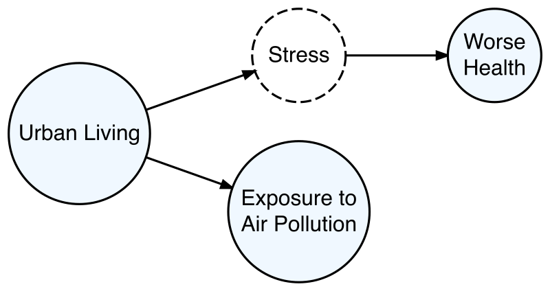
Under this alternate scenario, we could still see a correlation between air pollution and health, even though there is no direct causal relationship between the two factors. In order to distinguish between the two DAGs and determine which one better reflects the underlying reality, we would need to conduct an analysis that controlled for the concept of “urban living” or stress. For example, we might restrict our study to people who live in small towns. If we still saw a correlation between air pollution and health after controlling for urban living, we might consider the first DAG more likely than the second as a depiction of reality. That said, there is always the possibility of yet another explanation being proposed by someone else that is an even better reflection of reality.
11.2 Accounting for Potential Confounding Variables
If we want to make causal inferences, then the assumption of ignorability (i.e. no hidden confounders) is a requirement. In practice, we generally cannot verify that this assumption holds with certainty except in some limited cases, like randomized controlled trials. However, we can use the data we have to provide evidence that the ignorability assumption is likely to be true.
We will describe the general process for dealing with potential confounding variables in a causal analysis in three phases:
Consider what are the relevant variables that may be confounding variables with respect to the causal relationship of interest;
Build a model for the assignment mechanism, or the process that determines who receives the treatment vs. the control;
Construct a dataset via propensity score matching that is balanced on the relevant confounders.
We will describe each of these phases in detail below.
11.2.1 Identifying Relevant Confounder Variables
The first step in accounting for potential confounding factors is to figure out what those factors could be. Generally, this is not a technical task, but rather a scientific one that requires considering how the data-generating process works. Of course, our knowledge of the data-generating process is likely to be incomplete, so we have to do the best we can with what we know.
The definition of a confounding factor is as follows: If we are trying to determine if predictor X causes changes in outcome Y, then Z is a confounding factor if Z causes changes in X and Z causes changes in Y. Based on this definition, we have to attempt to identify factors that we believe satisfy this definition.
If we know that Z causes X, then we would generally expect that the data on Z and X would be correlated with each other. Similarly, if we know that Z causes Y, then we would also generally expect the data on Z and Y to be correlated. In both cases it’s important to remember that the reverse is not true, so correlation does not imply causation, but causation can imply correlation.
Identifying relevent potential confounders does not have to involve data. In fact, it may be an activity that occurs before the data have even been collected, given that if we identify an important confounder we are going to want to make sure we collect data on that confounder. Often, it is useful to have discussions with subject matter experts who have some understanding of how the underlying mechanisms may work. Drawing DAGs to show the relationships between different variables in play can also be a useful tactic.
11.2.2 Treatment Assignment Mechanism
The key underlying process that we want to understand when making causal inferences is the assignment mechanism. This is the process by which individual units or people are assigned to receive either the treatment or the control. In controlled experiments, the investigator determines who receives the treatment and the control, and so the assignment mechanism is known. But in other types of studies, such as observational studies, the assignment mechanism is unknown and we have learn about it from the data as best we can.
We will focus here on what is known as a regular assignment mechanism. A regular assignment mechanism has three key properties:
Individualistic: The assignment to a study group is dependent only on an individual’s characteristics;
Positive: there is a non-zero probability of being assigned either study group
Ignorable: assignment to treatment only depends on measured baseline covariates or characteristics.
This last property refers to baseline covariates or characteristics, which are variables that are observed before the study group is assigned to an individual. The main condition here is that these covariates or characteristics are not affected by the treatment that is being studied. For example, in a clinical study, when we enroll participants we often take some basic measurements like height, weight, and age. These measurements are all taken before they are assigned to a study group, in part so that we can determine if they are eligible to be in the study.
In other types of studies where we do not control the assignment mechanism, we may have to make some assumptions about the baseline covariates. For example, suppose we are studying a job training program and we are interested in the training program’s effect on people’s starting salaries, but we do not control who enrolls in the training program. In this case, the treatment group consists of people who enroll in the training program and the control group consists of people who do not. It could be that age is a factor in determining whether someone enrolls in the program. Given that age is not something that is affected by the treatment, it is reasonable to assume that age is a baseline covariate here. Another baseline factor could be the neighborhood where they live, because if they live closer to the training site, they might be more likely to enroll. Factors that are not baseline covariates are anything that might be measured after the intervention or treatment has occurred and could have been affected by the treatment itself. So a person’s salary at their job after completing the training program is not a baseline covariate because the training program might have helped them to get a job with a higher salary.
Example: PREACH Randomized Intervention Study
The Particulate Reduction Education in City Homes (PREACH) study was a randomized intervention of children designed to study the effect of installing air cleaners on indoor particulate matter air pollution levels. In this study, one group was randomized to receive a filter-based air cleaner along with an educational module about indoor air pollution. The control group was randomized to receive only the educational module.
One question we could ask is how similar were the two groups of children? Given that this was a randomized intervention, we would expect that they would be roughly equivalent on all baseline characteristics. For example, we would not expect one group to be much older than the other group. Although that could happen just by chance, it would be very unlikely. We can look at the data from the study and compare the average baseline age of the children in each of the study groups (Table 11.2).
| group | age (in years) |
|---|---|
| Air Cleaner | 9.0 |
| Control | 9.2 |
From Table 11.2 we can see that the group that received the air cleaners was slightly younger, on average, than the control group, but the difference is not major. We can also make a boxplot of the ages of the two groups to get a sense of their overall distributions (Figure 11.7).
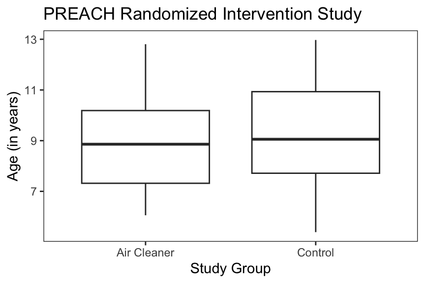
Again, we can see from Figure 11.7 that the air cleaner group is slightly younger than the control group but the distributions of the ages look mostly similar.
Source: Butz et al. (2011)
11.3 Propensity Score Matching
The propensity score is a function that gives the probability of an individual being assigned to the treatment or intervention group, given a set of baseline predictors for that individual. We can denote this function as \(\lambda(x_1,\dots,x_p)\) where \(x_1,\dots,x_p\) is a set of \(p\) predictors for an individual (e.g. age, height, weight) and \(\lambda(x_1,\dots,x_p)\) is a value between 0 and 1 representing the probability of being in the treatment group. For the randomized intervention setting, we have that \(\lambda(x_1,\dots,x_p)=\frac{1}{2}\). In this scenario the propensity score is known, does not depend on any predictors, and is constant.
In general, the propensity score will be unknown and so we will have to model it in some way. This propensity score model will be used to estimate or approximate the true unknown propensity score. Often, a logistic regression can be used to model the propensity score and that is what we will do here. The response for the logistic regression model is the indicator of whether an individual is in the treatment or control group and the predictors of the model are any predictors that we consider to be potential confounders.
Once we have a model for the propensity score, we can fit the model to the data. The fitted propensity score model will be denoted as \(\hat{\lambda}(x_1,\dots,x_p)\). For a given individual, we can plug that individual’s predictor values into the model to obtain their probability of being assigned to the treatment group. In the next section, we will discuss how the fitted propensity score model can be used to create a balanced dataset.
11.3.1 Matching With a Propensity Score Model
Once we have an estimate of the propensity score model, we can use it to create a matched dataset that is balanced across any potential confounding predictors that were included in the model. Suppose we have \(N\) individuals in a study and we index each individual withe \(i=1,\dots,N\). We use \(z_i = 1\) to indicate that the \(i\)th individual is in the treatment group and \(z_i=0\) to indicate that the \(i\)th individual is in the control group. We also have \(x_{i1}, x_{i2},\dots,x_{ip}\) indicating the \(p\) different predictor values for the \(i\)th individual.
In a 1-to-1 matching scheme, suppose that the \(i\)th individual in the study is in the treatment group. We can compute their propensity score value by plugging their predictor values \(x_{i1}, x_{i2},\dots,x_{ip}\) into \(\hat{\lambda}(x_{i1}, x_{i2},\dots,x_{ip})\). Then, the aim is to find someone in the control group who has a similar propensity score value. These two people then form a matched pair. We can continue through all of the people in the treatment group and match them with people in the control group who have similar propensity score values. Once we have matched everyone treatment group, we have our completed dataset.
Similar to the exact matching case, we are pairing people in the treatment group with people in the control group. However, instead of matching them on predictor values, we are “matching” on their propensity score values (in reality we are simply finding the closest propensity score value). This way, no matter how many predictors we consider to be potential confounders, we only need to match on a single value, the propensity score. The theory of propensity scores says that building a matched dataset in this manner will result in a dataset where the individuals in the treatment group and the individuals in the control group are similar, on average, across all the predictors.
One advantage of building a balanced dataset with propensity score matching is that it is a fairly intuitive process to describe and furthermore we can directly examine the resulting dataset to see how the different study groups compare with respect to different confounder variables. That said, propensity score matching is only one of a large array of approaches to conducting data analyses with the goal of making causal inferences. Another category of approaches involves weighting the data in specific ways to create balance between treatment and control groups without necessarily discarding any data. Unfortunately, providing a comprehensive survey of causal inference techniques is beyond the scope of this book.
11.4 Example: Pest Eradication and Asthma
The Mouse Allergen and Asthma Intervention Trial tested whether an integrated pest management improved asthma morbidity in children living in that household (Matsui et al. 2017)1. Participants were randomized to receive a professional integrated pest management program (the treatment) or to receive an education module (the control). One of the primary outcomes measured was the pre-bronchodilator forced expiratory volume in 1 second (FEV1). This was a measure of the participant’s lung capacity. The primary target of the pest management program was mice inside the house. All of the participants in the trial were allergic to mouse allergen.
During the trial it was noted that some participants saw complete eradication of mice while some still had some evidence of mouse infestation. A question then arose regarding whether complete eradication of mice is the key to improving asthma morbidity. The challenge was that although complete eradication of mice was observed during the trial in some households, it was not something that was controlled by the investigators directly. Therefore, it could not be argued that participants were randomized to have complete eradication of mice or not. In this situation, the groups we want to compare are the participants who achieved complete eradication (the “treatment” group) and the participants who did not achieve complete eradication and still observed some evidence of mice infestation (the “control” group).
Some of the confounders that were thought to be relevant were participant age, the asthma control test score (ACT), the use of inhaled corticosteroids to control asthma, evidence of exposed food, holes in house’s walls, evidence of roaches, and the baseline mouse allergen level. In real-world studies it is often difficult to say with certainty that a given variable is or is not a confounder. In practice, we often collect information on a wide array of variables that are considered likely to be confounders and then incorporate them into a propensity score model. The hope is that we can capture the overall confounding effects of various factors (and therefore satisfy the ignorability assumption).
The approach to analysis proceeds in the following steps
We first use the data to fit a propensity score model using a logistic regression. The for the model specification, we have an indicator of complete eradication as the model outcome and all of the potential confounders listed above as model predictors.
From the fitted logistic regression model, we can create a matched dataset using 1-to-1 matching. Every member of the treatment group (i.e. those participants who saw complete eradication of mice) is matched with a member of the control group who has a similar propensity score.
We check the balance of the potential confounders across the two study groups to see if they are similar.
We then fit a final model with pre-bronchodilator FEV1 as the model outcome and the indicator of complete eradication as the sole model predictor. From this model, we can obtain our estimate of the effect of complete eradication on FEV1.
Propensity Score Matching
Below is a sample of the data that we will use for this example. Each row in Table 11.3 represents a single participant in the study and each column provides a characterstic of that participant.
| age | act | ics | food | holes | roach | dmousef | erad | preFEV |
|---|---|---|---|---|---|---|---|---|
| 11.36 | 13 | 1 | 1 | 1 | 0 | 1.78 | 0 | 1.43 |
| 11.42 | 19 | 1 | 0 | 1 | 0 | 1.17 | 0 | 1.75 |
| 6.74 | 13 | 1 | 0 | 0 | 0 | -0.52 | 0 | 0.94 |
| 11.06 | 17 | 1 | 1 | 1 | 0 | 2.91 | 1 | 1.90 |
| 10.29 | 21 | 0 | 0 | 0 | 0 | 1.50 | 0 | 1.51 |
| 11.05 | 22 | 1 | 0 | 1 | 1 | -0.22 | 0 | 2.44 |
| 7.69 | 18 | 1 | 0 | 0 | 0 | 2.39 | 0 | 2.01 |
| 9.98 | 19 | 1 | 1 | 1 | 0 | 4.05 | 0 | 1.66 |
| 7.84 | 18 | 1 | 0 | 1 | 0 | 2.12 | 1 | 1.15 |
| 7.76 | 15 | 1 | 0 | 1 | 0 | 1.93 | 1 | 1.16 |
Overall, there are 137 participants in the dataset. The key variables here are
erad: an indicator of complete eradication (1) or not (0). We will refer to the participants who observed complete eradication as the “treatment group” and the participants who did not observe complete eradication as the “control group”.preFEV: the pre-bronchodilator forced expiratory volume in 1 second (FEV1), measured in liters.
The remaining variables represent the potential confounders that we want to balance between the treatment and control groups.
Upon fitting the propensity score model using a logistic regression, we can compute the predicted propensity score for each participant in the dataset. Recall that the predicted propensity score is the estimated probability that an individual would receive the treatment. In this case, we can think of this probability as the probability that we observe complete eradication in an individual’s home, given all of the covariates that we have included in the model.
We show a sample of individuals from both study groups and their predicted propensity scores in the right-most column below in Table 11.4.
| age | act | ics | food | holes | roach | dmousef | erad | preFEV | pscore |
|---|---|---|---|---|---|---|---|---|---|
| 16.60 | 24 | 0 | 0 | 0 | 0 | -0.52 | 1 | 2.66 | 0.56 |
| 14.00 | 19 | 1 | 1 | 1 | 0 | -0.99 | 1 | 2.49 | 0.55 |
| 10.44 | 20 | 1 | 0 | 0 | 0 | -2.22 | 1 | 2.51 | 0.55 |
| 11.14 | 21 | 1 | 0 | 1 | 0 | -0.68 | 1 | 1.98 | 0.54 |
| 12.08 | 22 | 0 | 0 | 0 | 0 | -0.92 | 1 | 2.10 | 0.54 |
| 8.78 | 25 | 1 | 0 | 1 | 0 | -0.12 | 0 | 1.65 | 0.56 |
| 10.69 | 20 | 0 | 0 | 1 | 0 | -0.83 | 0 | 2.17 | 0.55 |
| 11.05 | 22 | 1 | 0 | 1 | 1 | -0.22 | 0 | 2.44 | 0.51 |
| 15.92 | 23 | 1 | 0 | 0 | 0 | 0.27 | 0 | 2.30 | 0.50 |
| 15.36 | 22 | 0 | 0 | 1 | 0 | 1.50 | 0 | 3.13 | 0.50 |
We can see in the first row of the table above that this individual is in the treatment group (erad = 1) and that their estimated propensity score is 0.56. In the sixth row of the table, we see an individual who is in the control group (erad = 0) and has an estimated propensity score that is also 0.56. When matching people in the treatment group to people in the control group, we are looking for pairs of people whose propensity scores are similar to each other, as we have seen here in this example.
The key idea here is that even though both people had a probability of receiving the treatment (i.e. observing complete eradication of mice) of 0.56, one of them actually observed complete eradication and one of them did not. When you extend this idea to the entire matched dataset, the hope is that both groups are very similar to each other except for the fact that one group got the treatment and other did not.
After constructing the matched dataset, we can take a look at some of the summary statistics from that dataset. In Table 11.5 below, we show the means of each of the potential confounder variables by study group. The goal of the matching process is to make the means of each group similar to each other.
| erad | age | act | ics | food | holes | roach | dmousef |
|---|---|---|---|---|---|---|---|
| 1 | 9.75 | 18.86 | 0.84 | 0.12 | 0.36 | 0.04 | 2.05 |
| 0 | 9.78 | 18.70 | 0.82 | 0.14 | 0.40 | 0.02 | 2.18 |
We can see in the table above that the means are relatively close between the two groups. For example, the average age of participants in the treatment group is 9.75 years while the average age in the control group is 9.78 years.
One question we might ask is how does the matched dataset compare to the original dataset with respect to the balance of the confounder variables between the treatment and control groups? If we compare the means of the confounder variables by study group in the original (non-matched) dataset, we get Table 11.6 below.
| erad | age | act | ics | food | holes | roach | dmousef |
|---|---|---|---|---|---|---|---|
| 1 | 9.75 | 18.86 | 0.84 | 0.12 | 0.36 | 0.04 | 2.05 |
| 0 | 9.47 | 18.21 | 0.87 | 0.13 | 0.36 | 0.05 | 2.88 |
Here we see that the means of the treatment and control groups are further apart on some variables, but not all of them. For example, the average age in the treatment group is 9.75 years vs. 9.47 years in the control group. That represents a bigger difference than in the matched dataset (9.75 vs. 9.78 years). However, the proportion of houses with holes in the walls is 0.36 for both treatment and control groups in the original dataset, while for the matched dataset, these proportions were different. Hence, the matching process does not always improve the closeness of the means for every variable.
One note about the matching process conducted here is that conceptually, we took each person in the treatment group and matched them with a person in the control group. Furthermore, every person in the control group is matched at most once. Therefore, with a 1-to-1 matching, the total number of people in the matched dataset will be twice the number of people in the treatment group. In the original dataset we had 50 people in the treatment group, so the matched dataset has a total of 100 people. You may recall that the original dataset had 137 people, which means that 37 people were dropped from the matched dataset. The explanation is that these 37 people, who were all from the control group, simply did not match well with anyone in the treatment group and so were not included. This is a feature of the matching process, because we generally do not want to include people in the control group who are very different from people in the treatment group in some way. However, this matching process, along with the dropping of some people from the control group, changes the nature of what we are estimating. We will discuss this further in Section 11.4.1 below.
Estimation of Causal Effect
Now that we have our matched dataset constructed, we can go ahead with the next step, which is to estimate the change in FEV1 associated with complete eradication of mice. Here, we use a linear regression model with the preFEV variable as the outcome and erad as the sole predictor. Instead of using the original dataset for the model, we run the model using the matched dataset. The results from the model are shown below.
| Model Term | Estimate | Std. Error | 95% CI (low) | 95% CI (high) |
|---|---|---|---|---|
| (Intercept) | 1.800 | 0.10 | 1.60 | 2.00 |
| erad | 0.068 | 0.15 | -0.22 | 0.36 |
From the output in Table 11.7, we can see that complete eradication of mice is associated with a 0.068 liter increase in FEV1 (or a 68 mL increase), which is an improvement in FEV1. That change, though, is associated with substantial uncertainty, as we can see the 95% confidence interval ranges from -0.22 to 0.36 liters. Therefore, we might conclude from this analysis that there is very little evidence that complete eradication of mice has an effect on FEV1.
11.4.1 A Note About Causal Estimands
Up to this point we have talked about estimating the average treatment effect on a group of people (or more generally, a group of units). But it is worth having a brief discussion on the different kinds of effects we can estimate and how they are interpreted. In particular, in the last example, where we used propensity score matching to create a balanced dataset for estimating the causal effect of complete eradication of mice, actually estimated a different kind of “average treatmet effect” than we have been discussing.
The average treatment effect can be thought of the effect of applying a treatment to a target population compared to applying the control (which could be nothing) to the same target population. This effect definition is useful in situations where one might be considering a policy or a rule that would apply to all units or people in a group. For example, a city might be considering a traffic restriction policy in order to reduce local levels of air pollution and city leaders want to know what would be the effect of such a restriction. In this case, the policy would apply to everyone living in the city, and leaders want to compare the air pollution levels with the restriction and without the restriction. The average treatment effect in this situation would be the difference in air pollution levels.
The ATE is usually relevant when one has control over how the treatment will be given to the target population. In the example above, city leaders will be applying the traffic restriction to everyone, so there is no mystery about how the people living in the city will receive the treatment. In other situations, where we may be developing some sort of treatment but we do not control who will receive it, the ATE may not be the right effect to estimate. For example, if we are developing a training program and people are able to sign up for the program at will, but we have no plans to force everyone to enroll in the training program, then the ATE may not be a good estimate of what the impact of the training program will be.
The average treatment effect on the treated is commonly used when there is no direct control over who receives the treatment or control. With the ATT we are estimating the effect of the treatment on those who received the treatment. Essentially, we are taking those who received the treatment and comparing them to units or people who are just like them, but got the control. This is effectively what we have done in the mouse eradication example—we want to know what is the effect of complete eradication on those households actually did experience eradication. With the ATT, we can get a sense of the inherent effectiveness of the treatment in situations where we may not have any control over who receives the treatment.
11.6 Summary
Estimating causal effects with data comes down to comparing groups of comparable units, people, or observations who either receive a treatment or not. In order to ensure that our groups are comparable, we can match them on characteristics that we believe may confound the relationship between our observed treatment and our outcome of interest. While directly matching on specific variables can provide strong control of confounding, it is usually not practical once we have multiple factors to control for because of the curse of dimensionality.
The propensity score is a function that gives the probability of being assigned the treatment given a set of baseline predictor variables. If we knew the propensity score function, we could use it to match people who receive the treatment to people who receive the control but have a similar propensity to receive the treatment. In practice, we do not know the propensity score function and so we estimate it with a model like logistic regression. Once we have an estimate of the propensity score function we can construct a matched dataset by matching people in the treatment group to people in the control group who have similar predicted values of the propensity score model. This matched group will, on average, be similar between treatment and control group on the covariates included in the propensity score model. We can check the balance of the covariates between the treatment and control groups both visually and numerically.
Upon creating a propensity score matched dataset, we can compare the outcome between the treatment and control group to estimate either the average treatment effect or the average treatment effect on the treated. The hope is that after matching on the propensity score, the threat from confounder variables is less than before matching. Of course, there always remains the possibility that unobserved confounders exist that we are not aware of. Therefore, one must rely on knowledge of the context and the underlying science to determine the validity of the inferences we make from a causal analysis.
11.7 Exercises
In a study of high fiber diets and heart disease, scientists found that adults who eat foods that are high in fiber have lower rates of heart disease than adults who eat foods that are lower in fiber. The scientists conclude that eating high fiber foods causes a decrease in your risk of heart disease. Draw the directed acyclic graph (DAG) that corresponds to the scientists’ conclusion. What would be an alternative explanation for why we observe that people who eat high fiber foods have lower rates of heart disease? Draw the corresponding DAG for this alternative explanation.
In a clinical study of a new drug therapy, half of the patients are randomized to receive the new drug and half are randomized to receive a placebo. During the trial the investigators observe that many people who received the new drug experience difficult side effects and drop out of the study. Meanwhile in the placebo group none of the patients drops out of the study. After the study is concluded, the investigators decide to ignore the patients who dropped out of the study and analyze the data from the patients who remained. They compare the outcomes of the patients in the new drug group (the ones who did not drop out) to the outcomes of the patients in the placebo group. Explain why this comparison is problematic from the perspective of estimating the causal effect of the new drug relative to the placebo.
During World War II, statistician Abraham Wald was working for the military analyzing data from airplanes that were operating in combat zones. He noticed that many of the planes that returned to base had damage in their wings but no damage in the fuselage or main body of the aircraft. Some thought that this implied that the planes needed reinforcement of their wings (the area that had received the most damage). But Wald instead suggested that the planes needed reinforcement in the fuselage area. Why did Wald make this suggestion?
The full study is described at https://pmc.ncbi.nlm.nih.gov/articles/PMC5632564/↩︎