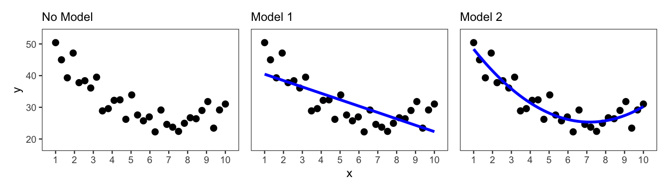
x and y, with no model and two different models.
Most data analyses involve more than one variable. For example, an analysis motivated by a predictive question explores how to use one or more variables to predict another variable. Or an analysis motivated by a causal question seeks to quantify the effect of one variable on another variable. Analyses such as these are concerned with the relationship between variables.
In this chapter we introduce the process of learning about the relationships between variables prior to fitting and evaluating a formal model, subsequent steps of data analysis discussed in the next several chapters. While you may have some expectations or hypotheses about how the variables in your dataset are related, taking time to explore these relationships with certain numerical and visual summaries—before formal modeling—can assist with important tasks, such as model selection, specification, and interpretation.
For example, suppose an analyst has two variables x and y, and they want to fit a prediction model to predict y based on x. They expect that x and y are negatively related, meaning that y decreases as x increases. However, upon visualizing the relationship between these two variables using a scatter plot—an important visual summary discussed in more depth later—they notice that this appears to be true for most of the data but not all of the data. Namely, looking at the leftmost plot in Figure 5.1, they observe that x and y appear negatively related until around where x is equal to 8, after which point the two variables now appear positively related (y increases as x increases).
Prior to exploring the relationship between x and y, the analyst assumed that for the prediction model they would simply fit a decreasing straight line to the data (see Model 1 in Figure 5.1). However, after creating the scatter plot, they realize that it may be better to fit a curved line to the data to capture the shift occurring around where x is equal to 8 (see Model 2 in Figure 5.1). In other words, the scatter plot helped to inform the model specification.
x and y, with no model and two different models.
In the remainder of this chapter, we introduce a series of numerical and visual summaries for exploring the relationships between variables. We begin by focusing on the exploration of two variables at a time, i.e., bivariate relationships. Given that the choice of summary tool depends largely on the variable types, we divide this discussion into three main parts: 1) tools for two numerical variables, 2) tools for one numerical variable and one categorical variable, and 3) tools for two categorical variables. We then introduce the use of colors and facets in visualization to explore more than two variables at a time.
We begin with tools for exploring the relationship between two numerical variables.
One common tool for visualizing the relationship between two numerical variables is the scatter plot. The scatter plot uses a Cartesian coordinate system to visualize the location of observations relative to each other, based on the values from two numerical variables. One of the variables is mapped to the x-axis, and the other variable is mapped to the y-axis. Note that outcome variables are generally mapped to the y-axis.
In a scatter plot, each observation has a set of coordinates—(x, y)—that determines its location. The x coordinate is the observation’s value for the variable mapped to the x-axis. The y coordinate is the observation’s value for the variable mapped to the y-axis. In the plot, the location of each observation is represented by a point, or dot. Then, from the plotted points, we can check if differences in one variable correspond (broadly) with differences in the other variable. If they do, we say the variables appear to be related.
Let’s consider the scatter plot in Figure 5.2, plotting variables called x and y. Two of the 30 observations are labeled. We can see that observation 8 has an x value of 3.17 and a y value of 68.95. Meanwhile, observation 14 has a higher x value of 5.03 and a higher y value of 74.04. Therefore, the point for observation 14 sits to the right of and above the point for observation 8.
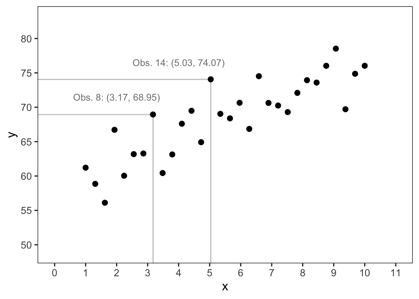
x and y, with two labeled observations.
Once the plot is made, it is important to spend time considering what the plot is telling you about the relationship (or lack thereof) between the two plotted variables. Often this can involve asking yourself a series of questions about what you are seeing in the plot. Thus, let’s work through one common line of questioning that you might use to interpret Figure 5.2.
First and foremost, we can simply ask: Do x and y appear related? If they were not related, we would expect to see the points distributed across the scatter plot with no observable trend or pattern connecting x and y. However, it does appear that there is some sort of relationship between x and y because changes in x correspond with changes in y. Specifically, the points trend upwards together across the plot.
A common next question could be the following: Does the relationship appear to be linear? In other words, we want to check if the points trend upwards in a straight line, i.e., at a constant rate of change. In this case, there appears to be linearity. If we drew a line from left to right—through the data points—to capture the trend, the line would be relatively straight. It would not have any notable curves or sharp changes in direction.
Given that the relationship appears to be linear, the next plausible question is the following: Is the linear relationship negative or positive? From Figure 5.2, we can see that as x increases, so does y. This means the linear relationship is positive. If it were negative, y would decrease as x increased.
Lastly, it is common to assess the strength of the relationship: Is it weak or strong? To assess this visually, we need to check if, for a value of x (or a small range of x), the values of y have a large span relative to the total span of y. For example, in Figure 5.2 let’s consider the range of 1–2 for x. The values of y in that range span approximately 55–60, which is relatively contained, given that y spans approximately 55–80 across the entirety of x. Furthermore, this degree of dispersion in y appears to be fairly consistent across the span of x. Thus, it is reasonable to say the relationship appears to be strong. Later in this section, we introduce a method for quantifying the strength of a linear relationship.
The line of questioning that we just worked through to characterize the relationship between x and y is visualized in a tree diagram in Figure 5.3. Starting at the bottom of the tree diagram and working our way back up, we can summarize our findings as follows: there appears to be a strong positive linear relationship between variables x and y. As we will see in upcoming chapters, this summary provides us with a strong start for fitting and evaluating a model.
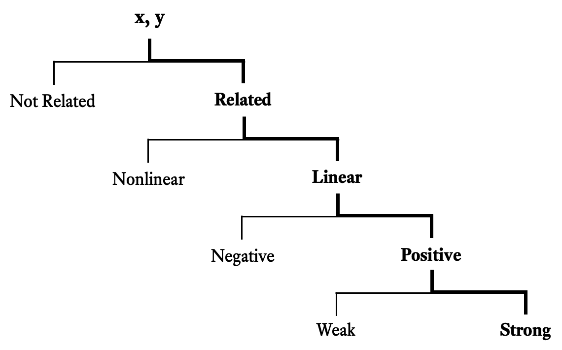
x and y in Figure 5.2. The bold path represents the selections and progression discussed in the text.
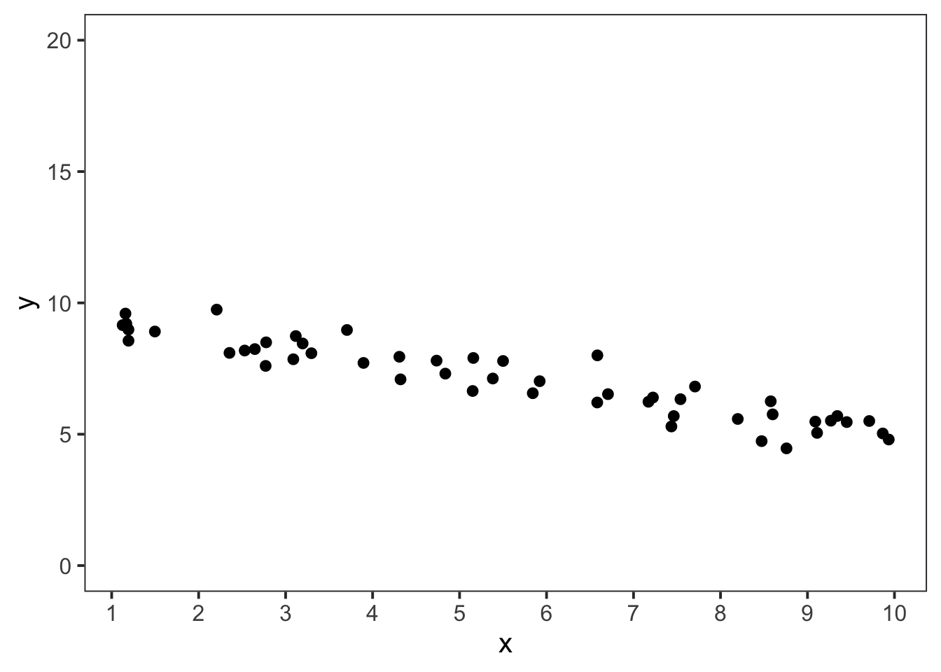
Let’s now consider another scatter plot shown in Figure 5.4. We can begin with the same two questions as before. Do x and y appear related? And if so, does the relationship appear to be linear? It does appear that x and y are related as they trend downward together across the plot. However, they do not move together at a constant rate of change. The change in y is greater for lower values of x. It appears that this relationship is nonlinear.
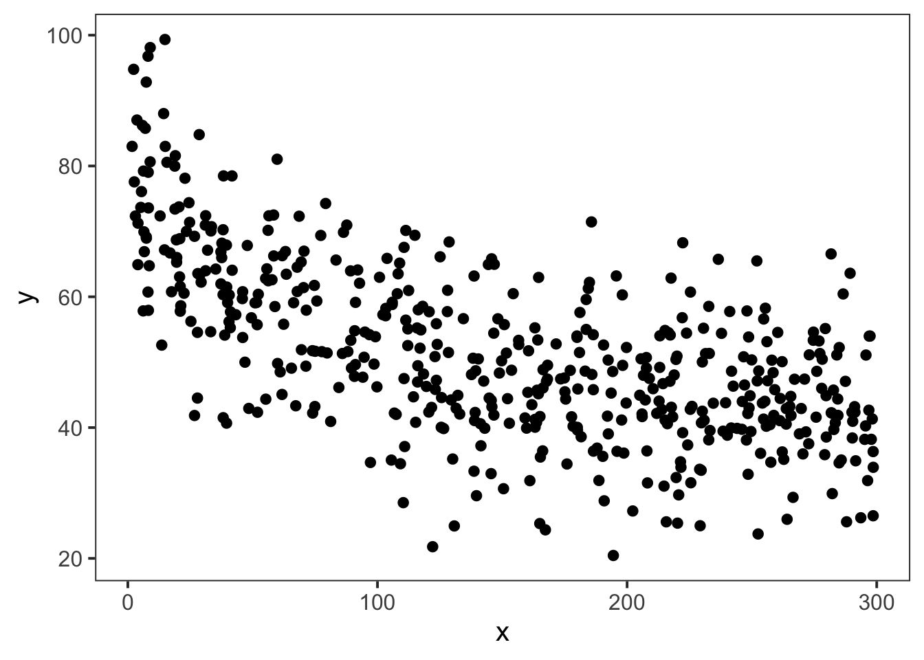
To further describe the nonlinearity, a common follow-up question might be: Does the shape of the points resemble a mathematical function? This could be a quadratic function, cubic function, exponential function, logistic function, etc. In the example, we see a rapid decrease in y that levels off as x increases, a shape that is similar to a negative logarithmic function.
From here, we can visually assess the strength of this relationship. We can see that for most values of x the values of y span about half the full range of y. As such, we might characterize this strength as more moderate than the previous example.
To conclude, we can summarize our assessment for Figure 5.4 as follows: there appears to be a moderate negative (log-like) nonlinear relationship between x and y.
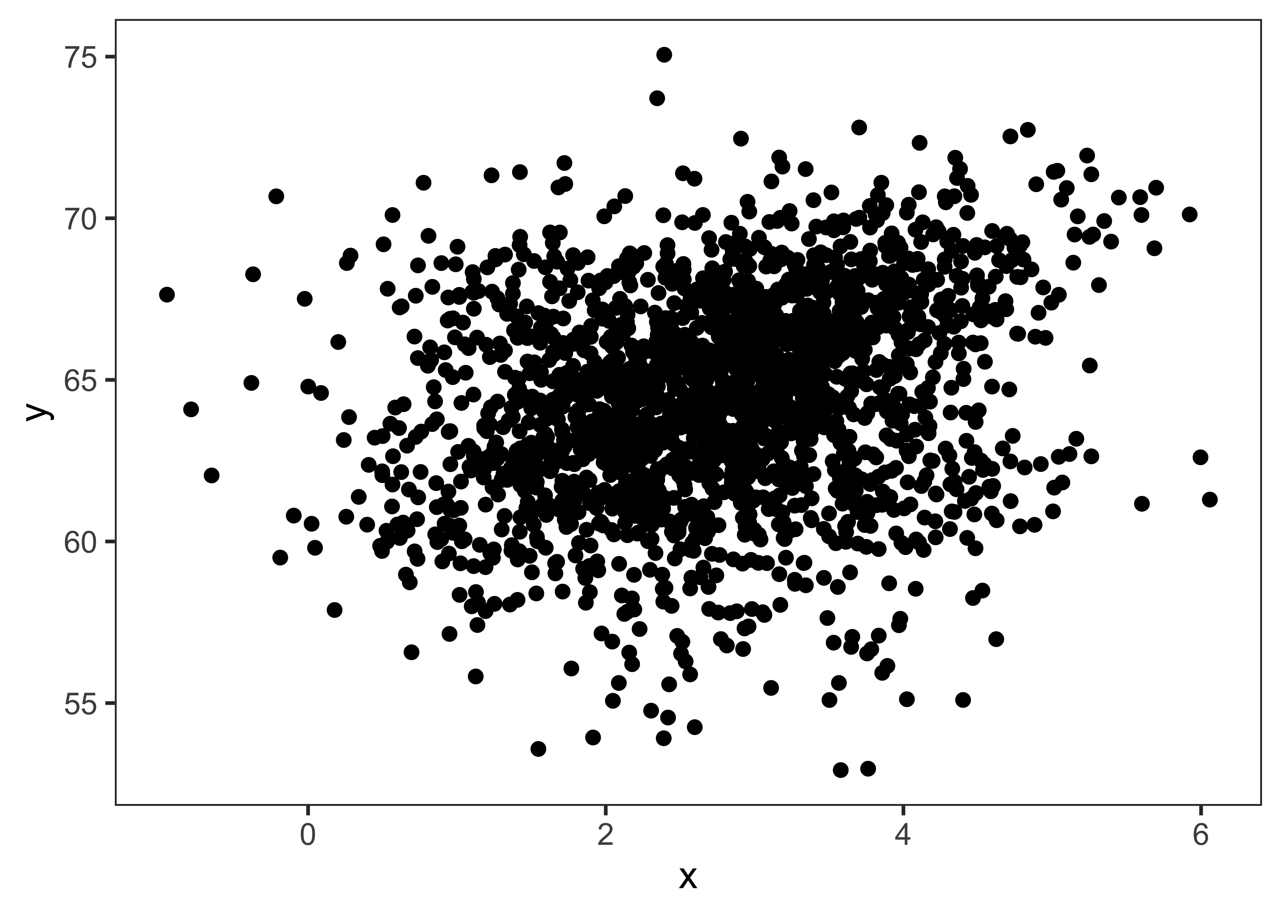
When working with real-world datasets, you may have hundreds, thousands, or millions of data points. Sometimes plotting all of these points at once—as opaque dots—can result it a scatter plot that looks like a blob of ink. Consider the scatter plot in Figure 5.5. There is significant overlap among the 2,000 points that are plotted. And because of this, it is difficult to see whether x and y might be related.
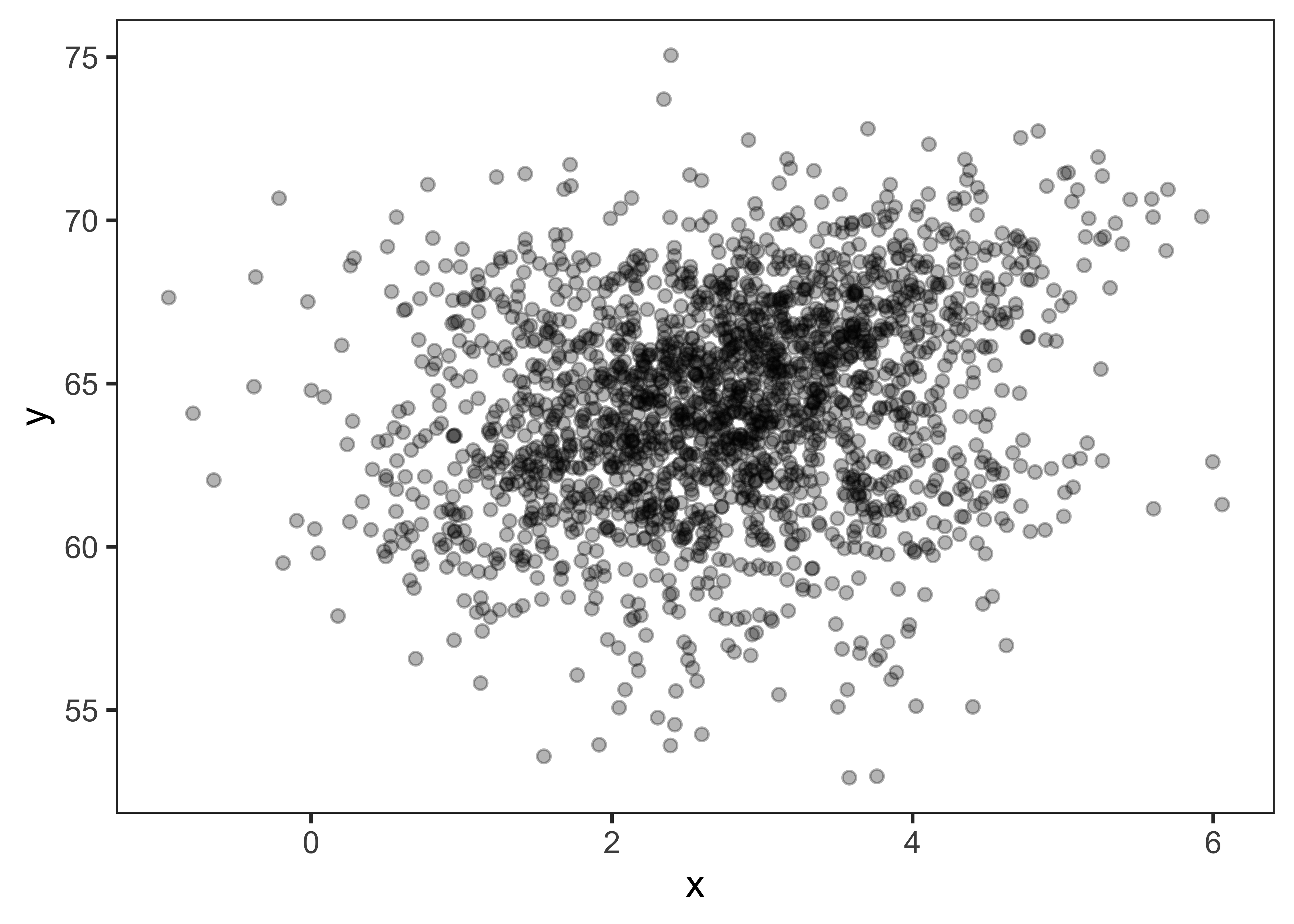
Nevertheless, when working with a large dataset, there may still be some interest in plotting two variables simultaneously, to better understand if and how they might relate to each other. Therefore, one common adjustment to make when dealing with overlapping points is to increase the transparency of each point. Then areas with a higher density of points appear darker, while areas with a lower density of points appear lighter. This can make it easier to see potential trends in the data. See Figure 5.6 for an example of this. Looking at the plot, we can now see that there might be a weak positive linear relationship between x and y.
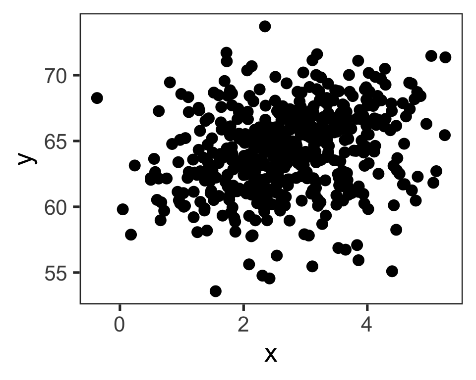
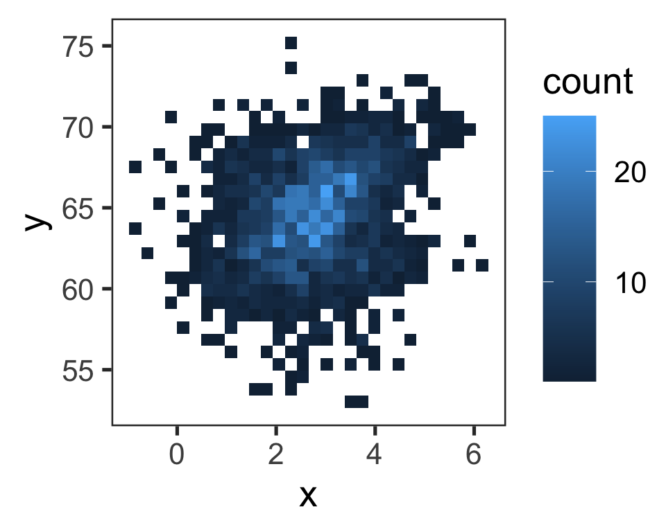
For very large datasets, increasing the point transparency may not work well either. In this case, an analyst may turn to other alternatives, such as sampling or binning. In particular, an analyst may choose to plot a random subsample of the data. Or they may choose to use a binned scatter plot, which divides the plot into bins and then fills each bin with a color that represents the number of data points in it. Examples of using a random subsample or a binned scatter plot are shown in Figure 5.7.
These different adjustments and approaches to the scatter plot can be helpful to keep in mind as you do exploratory work.
So far we have assessed the strength and direction of a relationship between two variables visually with a scatter plot. However, it is also important to assess relationships quantitatively. One way to do this is to measure relationships with correlation coefficients. Before proceeding, we should reiterate that the “strength” of a relationship does not refer to how steep a trend line is but rather the amount of spread or dispersion around the trend line. A stronger relationship has less dispersion, and a weaker relationship has more.
There are two different correlation coefficients that are commonly used to measure relationships: the Pearson correlation coefficient and the Spearman’s rank correlation coefficient. Both coefficients range from -1 to +1 and simultaneously tell you about the strength and direction of the relationship. Specifically, the number refers to the strength, and the sign refers to the direction. A coefficient close to -1 indicates a strong negative relationship. A coefficient close to +1 indicates a strong positive relationship. A coefficient close to 0 would indicate no relationship or a very weak relationship.
The key difference between these correlation coefficients is that the Pearson method assumes linearity, while the Spearman’s rank method does not. Note, however, that the Spearman’s rank method is not suitable for all nonlinear relationships, as it is designed to measure monotonic relationships. Monotonic relationships are those that move in one direction, either negative or positive. For example, the Spearman’s rank method would not be suitable for assessing a quadratic-like (i.e., “U-shaped”) relationship where both negative and positive relationships are present.
The Pearson correlation coefficient for two variables \(x\) and \(y\) in a sample with \(n\) observations is defined as
\[ r_{xy} = \frac{\sum_{i=1}^{n}(x_i - \bar{x})(y_i - \bar{y})}{\sqrt{\sum_{i=1}^{n}(x_i - \bar{x})^2}\sqrt{\sum_{i=1}^{n}(y_i - \bar{y})^2}} \] where \(\bar{x}\) and \(\bar{y}\) refer to the mean of variables \(x\) and \(y\), respectively.
The Spearman’s rank correlation coefficient for variables \(x\) and \(y\) in sample \(s\) with \(n\) observations can be computed with the following formula, where \(D\) is the difference in ranks between the values for \(x\) and \(y\), when all values are ordered from largest (rank 1) to smallest (rank \(n\)).1
\[ r_s = 1 - \frac{6\sum_{i=1}^{n}D^2}{n(n^2 - 1)} \] To get a sense for how these coefficients work, let’s calculate them for variables explored in the previous scatter plots. For variables \(x\) and \(y\) in Figure 5.2, recall that \(x\) and \(y\) appeared to have a strong positive linear relationship. If we compute the Pearson correlation coefficient, we get 0.85, which aligns with the result from our visual assessment. Alternatively, for variables \(x\) and \(y\) in Figure 5.4, we can use the Spearman’s rank correlation coefficient because the relationship appears nonlinear and monotonic. The coefficient is -0.63 indicating a moderate (to strong) negative relationship.
To conclude this section on tools for two numerical variables, let’s revisit the U.S. Department of Education College Scorecard data previously discussed in Chapter 3 and Chapter 4. Let’s say that we are doing an analysis focused on undergraduate enrollment and the cost of in-state tuition and fees at 4-year public institutions. And suppose that at this point in our analysis we want to explore if the two variables are related.
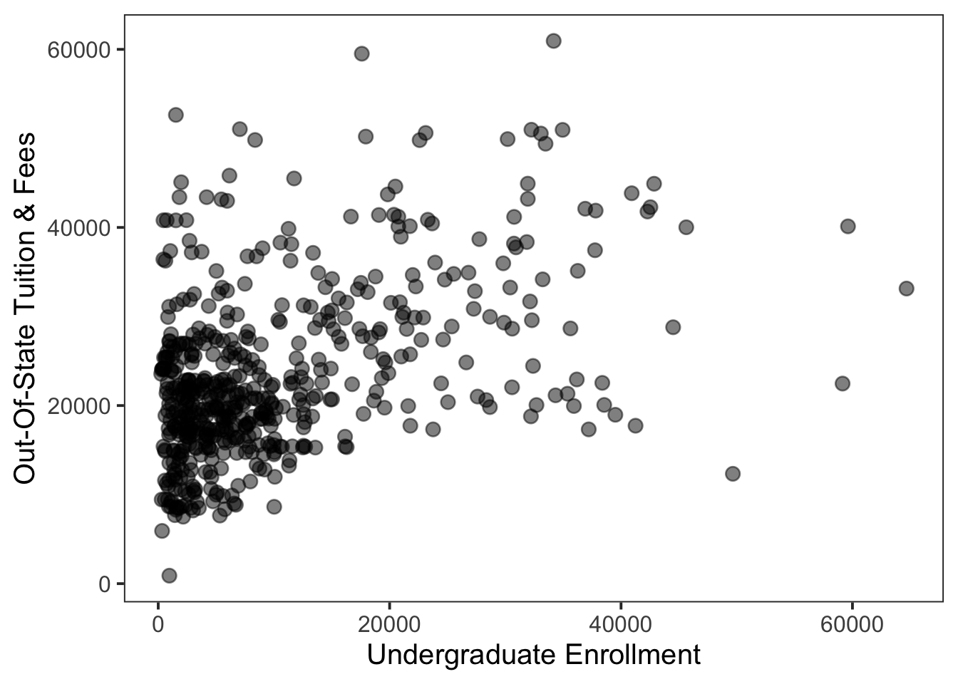
To begin our exploration, we can create a scatter plot with undergraduate enrollment on the x-axis and in-state tuition and fees on the y-axis, as shown in Figure 5.8. Note that we have made the points partially transparent because there is significant overlap among points on the left side of the plot. Recall that in Chapter 4 we created a histogram for the undergraduate enrollment variable that revealed a highly right-skewed distribution, with the majority of schools having enrollments below 10,000 students. In other words, this high density of points on the left side of the plot would not necessarily be surprising to us as analysts, if we were creating this scatter plot after the “learning about variables” step.
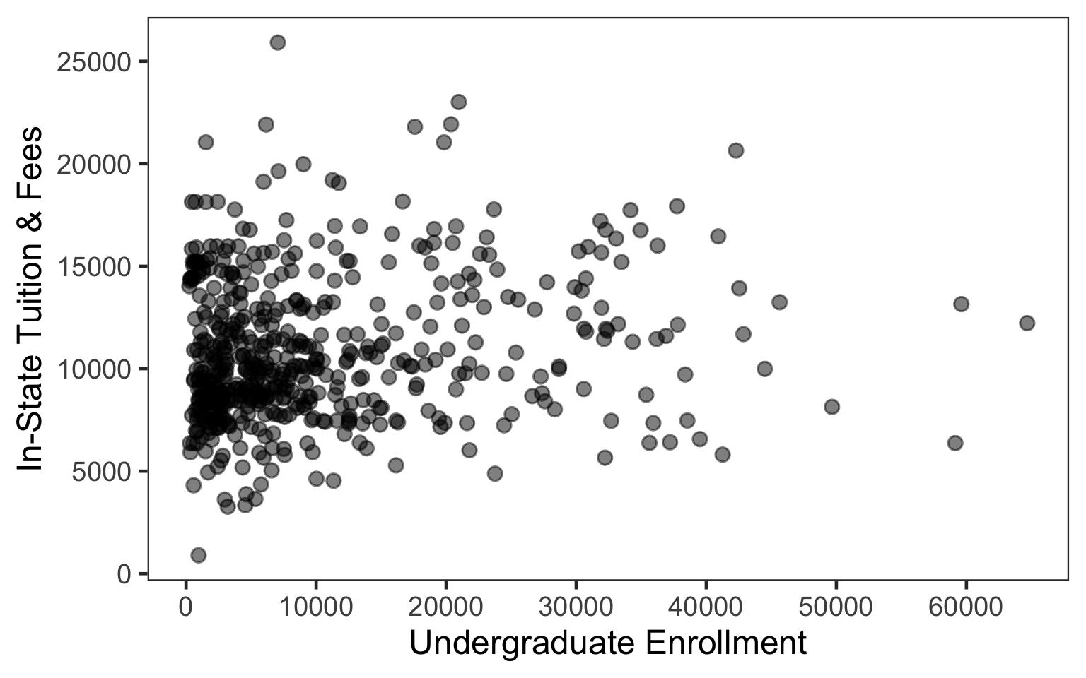
With the scatter plot made, we can turn our attention to interpretation. From the plot, we can see that differences in undergraduate enrollment do not seem to correspond with any observable increases or decreases in tuition and fees. Rather, tuition and fees vary between approximately $5,000–$20,000 for small, medium, and large undergraduate enrollments. In other words, it appears that these two variables are not related. Importantly, calculating the correlation coefficients can help us to check this visual assessment. The Pearson correlation coefficient is 0.16, and the Spearman’s rank correlation coefficient is 0.14. Both of these coefficients indicate no (or a very weak) relationship.
Next, we consider tools for exploring the relationship between one numerical variable and one categorical variable.
Let’s begin by thinking back to Chapter 4, where we discussed numerical summaries for learning about a numerical variable. We focused on calculating the mean and median. Now the idea will be to generate these same numerical summaries for the numerical variable but for each group in the categorical variable. We can then compare the summaries across groups, to look for differences that might indicate a relationship between the variables.
Let’s consider a hypothetical scenario. Suppose we are curious whether there is any relationship between the brand of batteries you put in a headlamp and how many hours the light in the headlamp lasts. And suppose we have some data on the topic. Specifically, we have a dataset with two variables: brand and hours. The variable brand is categorical with brand A and brand B of batteries. The variable hour is numerical and refers to the number of hours the light on the headlamp lasted on one set of batteries from either brand A or brand B.
To begin exploring the relationship between these two variables, we could compute the mean and median of hours for each group in brand. If the averages exhibit meaningful differences between groups, this might indicate to us that there is some relationship between the two variables. Note that at this point in the analysis you would have already spent time learning about the variables individually, putting you in a better position to assess what is potentially a meaningful difference, given the data. For example, given what you know about the distribution of hours, maybe a difference of one hour between the averages for A and B seems meaningful, or maybe it does not.
In addition to generating numerical summaries by group, we can also generate visual summaries by group. Recall the box plot introduced in Chapter 4. Now we can use that visual summary to explore the relationship between one numerical variable and one categorical variable. Specifically, we can create an individual box plot for each group and plot them side-by-side. In turn, we can compare the distributions for the numerical variable by group. This type of plot is called a side-by-side box plot.
Figure 5.9 is an example side-by-side box plot for the variables brand and hours, from our previous headlamp example. Once the plot is made, we can shift our attention to interpretation. In the plot we can see that the overall distribution for brand B sits higher on the y-axis than brand A. In other words, it appears that, on average, headlamps with brand B batteries tend to last longer than headlamps with brand A batteries, indicating a possible relationship between brand and hours.
Now, alternatively, suppose the box plot for brand and hours had actually looked like the plot in Figure 5.10, where the distributions for A and B look identical. This plot might indicate that brand and hours are not related. However, what if you learned that the tests for brand B were done in much colder temperatures than brand A? And suppose the assumption is that temperature affects battery life; specifically, regardless of brand, batteries do not last as long in the cold. Now our interpretation of the plot might change to the following: despite being tested in colder temperatures, on average, brand B batteries lasted just as long as brand A batteries. In other words, there may still be a meaningful relationship between brand and hours, even though it is not immediately apparent from the plot.
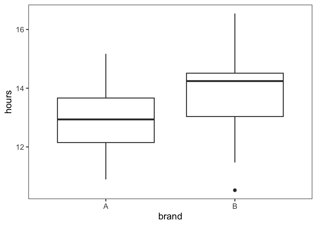
brand and hours.
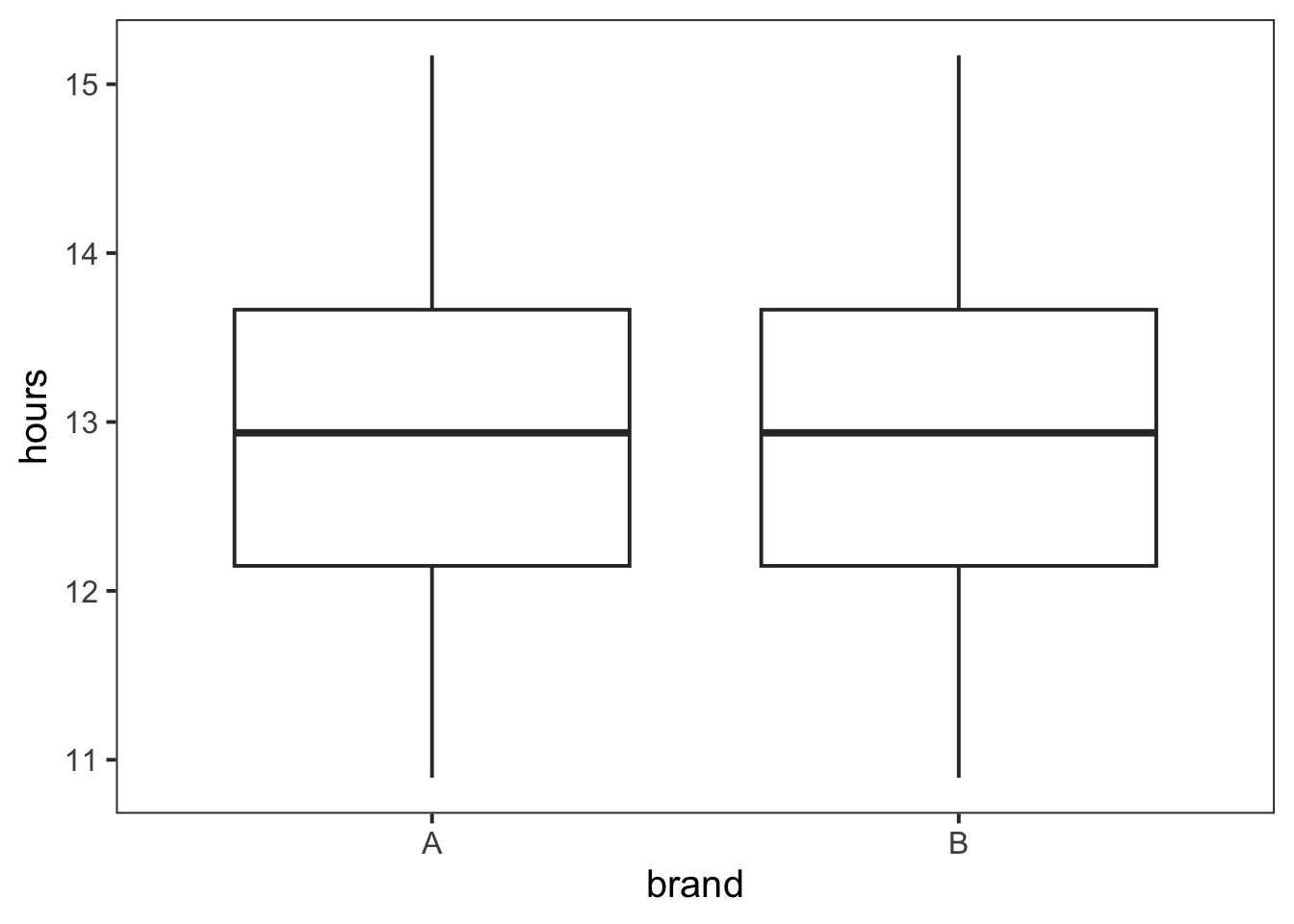
brand and hours, representing a different scenario from Figure 5.9.
Later in this chapter we will learn two visualization techniques to “control” or “adjust” for a third variable in a plot. But ultimately, it is important to remember that these are exploratory plots and the interpretation for each plot will depend on the analysis at hand and what you know or assume about the data-generating process and the data collection process.
The faceted histogram is another useful visualization for exploring the relationship between a numerical variable and a categorical variable.
In visualization, faceting refers to creating the plot type of interest, separately, for each group of a categorical variable. The plot for each specific group is called a panel. The full set of panels can then be arranged horizontally, vertically, or in grid. Importantly, the choice of arrangement depends on the comparisons you would like to make. Panels in a horizontal line best support comparisons related to the y-axis, while panels in a vertical line best support comparisons related to the x-axis.
Thus, in a faceted histogram, we are making a separate histogram for each group and arranging them such that we can compare the distributions across groups. For our previous headlamp example involving variables brand and hours, we can make a faceted histogram to see if the distribution for hour differs by brand. The plot can be found in Figure 5.11. We have arranged the panels vertically, so that we can compare the locations of the distributions. Interpreting the plot, it appears that the distribution for brand A is shifted slightly to the left of the distribution for brand B. This matches what we observed in the box plot in Figure 5.9.
Ultimately, faceting is an important visualization technique that we will revisit later in this chapter.
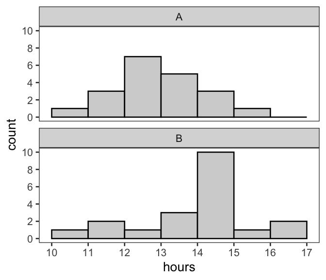
brand and hours.
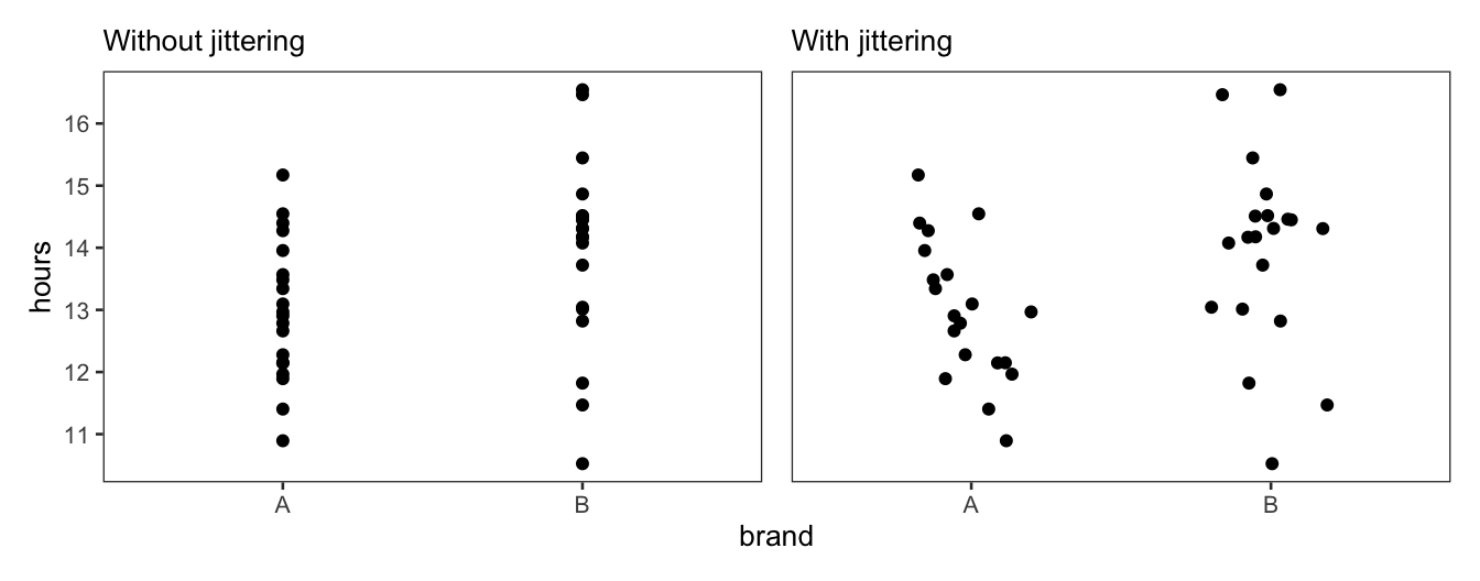
The last plot we discuss in this section is the scatter plot with jittering. This plot is useful if you want to see all of the specific data points that make up the distribution (for the numerical variable) for each group in the categorical variable.
Figure 5.12 shows a standard scatter plot on the left and a scatter plot with jittering on the right. In the standard scatter plot, the points are perfectly aligned above each group in brand. Often, when plotted this way, the overlap among points will make it difficult or even impossible to learn about the distribution. Therefore, as shown in Figure 5.12(b), we can jitter the points—or add random noise to the points—to make them more visible. Because the categorical variable is mapped to the x-axis, horizontal noise is added. No vertical noise is added, as we do not want to alter the values for hours. Alternatively, if brand were on the y-axis and hours were on the x-axis, the points would be randomly shifted up and down, rather than left and right.
Note that one could also pair jittering with increased point transparency (a plot adjustment discussed in the previous section), to further address the issue of overlap among points.
The final pairing to consider is two categorical variables.
In Chapter 4, we introduced the process of learning about a single categorical variable by calculating counts and plotting those counts in a bar plot. The process for two categorical variables is similar. However, now the counts are calculated for combinations of groups. Specifically, each combination consists of one group from each categorical variable. It is also often necessary to convert the counts into proportions or percentages. We will explore why this is the case later in this section.
Once the counts, proportions, or percentages are calculated, a grouped or stacked bar plot is used to visualize and compare them. In a grouped bar plot, bars for different groups are placed next to each other. In a stacked bar plot, bars for different groups are stacked on top of each other. In the remainder of this section, we work through a real-world example illustrating how these plots work in practice.
In this example, we use data from the U.S. Bureau of Transportation Statistics on 2023 domestic flights—operated by American Airlines (AA), Delta Air Lines (DL), and United Airlines (UA)—out of Dallas Fort Worth International Airport (DFW). There are 178,837 observations in the dataset. Each observation refers to a flight that was not cancelled. An example row from the dataset is printed in Table 5.1. It tells us that the flight departed in January (1) on Sunday (7) between 11:00-11:59 AM (1100-1159). The flight was operated by American Airlines (AA) and did not have a departure delay of 15 minutes or more (0).
All five variables are categorical. And note that DepDel15 is binary, where a 1 in that column indicates a delay of 15 minutes or more. Now let’s suppose that we want to explore the relationship between this variable, DepDel15, and each of the other four variables.
Month | DayOfWeek | DepTimeBlk | Reporting_Airline | DepDel15 |
|---|---|---|---|---|
1 | 7 | 1100-1159 | AA | 0 |
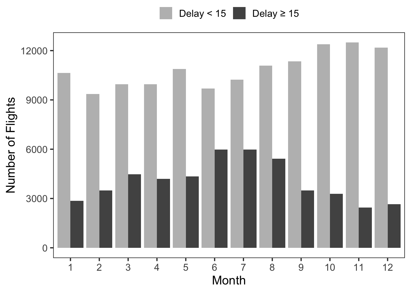
Beginning with DepDel15 and Month, our primary question of interest is: Does the difference between the two departure delay categories differ by month? The first step is to compute the count for each departure delay category in each month. This results in 24 counts: two delay categories multiplied by twelve months. We can then visualize these counts in a grouped bar plot, as shown in Figure 5.13. It plots two bars—one for each delay category—for each month. Specifically, the two bars for the different delay categories are grouped together above each month category. From the plot, we can see that there does appear to be a relationship between DepDel15 and Month. The number of departure delays \(\ge 15\) minutes, relative to the number of departure delays \(< 15\) minutes, is higher over the summer months.
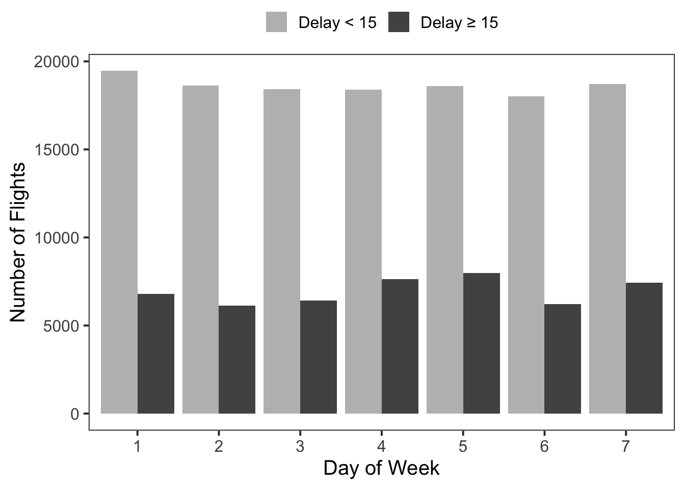
A grouped bar plot for DepDel15 and DayOfWeek is shown in Figure 5.14. For these two categorical variables, it is not as clear if there is a relationship. While there is some variation in the number of delays \(\ge 15\) minutes (relative to the number of delays \(< 15\) minutes), it does not appear to be substantial. In general, the counts for both departure delay categories are relatively consistent across the seven days of the week.
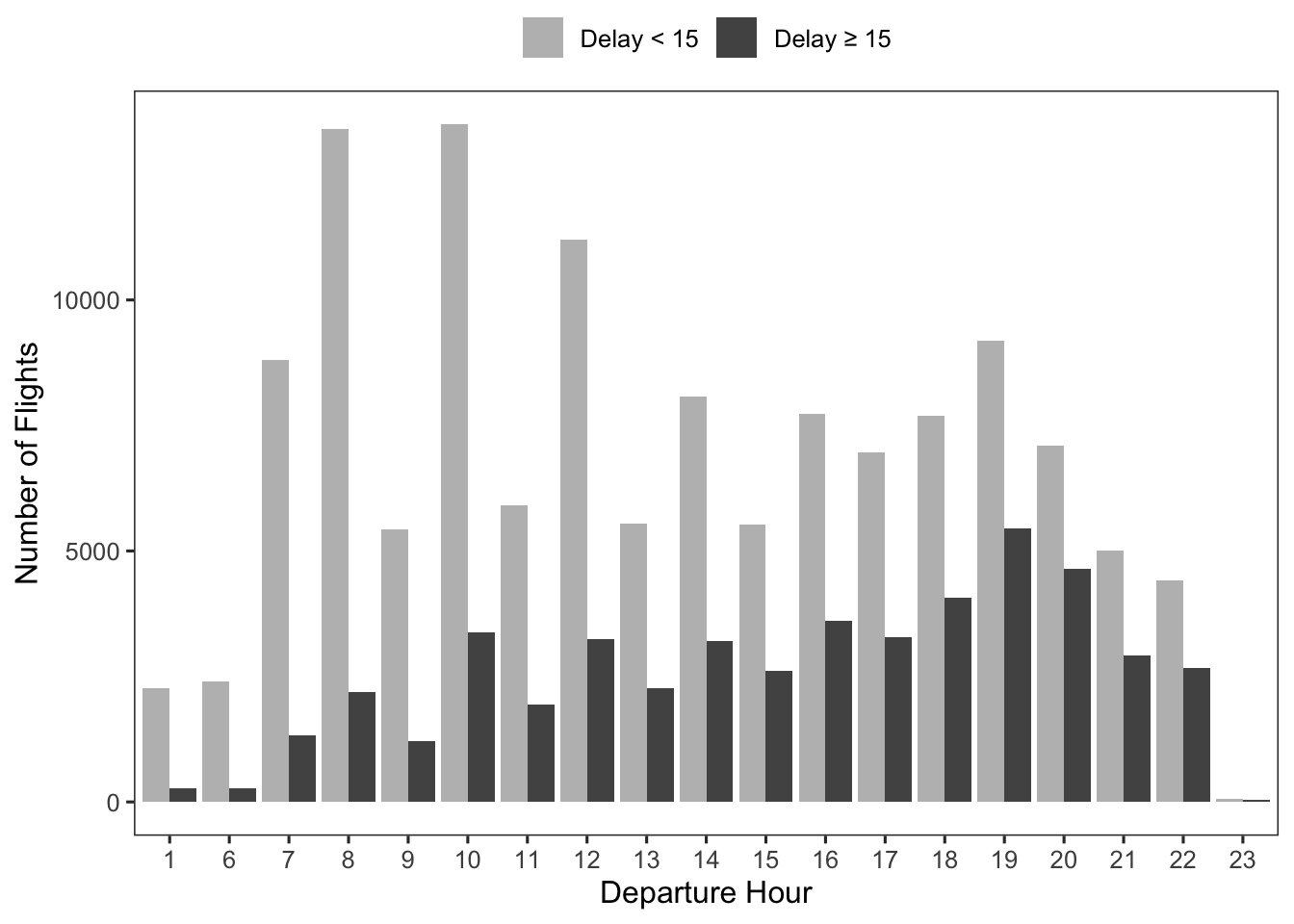
Meanwhile, the grouped bar plot for DepDel15 and DepTimeBlk in Figure 5.15 shows a much clearer relationship between the two variables. Namely, as the day progresses the number of delays \(\ge 15\) minutes—relative to the number of delays \(< 15\) minutes—increases.
So far we have been able to look at counts because the total number of flights for each category of either Month, DayOfWeek, and DepTimeBlk has been fairly consistent. For example, in 2023 each day of the week had somewhere between 24,230–26,566 flights. However, it is not uncommon to not have this consistency across categories.
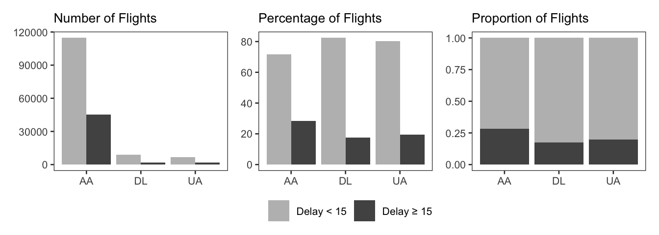
Let’s consider the leftmost plot in Figure 5.16, which explores the relationship between DepDel15 and Reporting_Airline. Because American Airlines has significantly more flights than either Delta Air Lines or United Airlines, it is difficult to tell whether there is a meaningful difference between the departure delay groups, across the different airlines. Therefore, we need to convert the counts to percentages or proportions, so that we can more easily compare relative differences. The percentages are shown in the middle plot, and we can see that American Airlines has a slightly higher percentage of delays \(\ge 15\) minutes, compared to the other two airlines, suggesting a possible relationship between the two variables. In the rightmost plot, the proportions are plotted using a stacked bar plot, which is a helpful format for visualizing the composition of each delay distribution for each airline.
For multivariate analyses involving three or more variables, it may also be of interest to explore the relationship between three variables at a time. In this section we present several examples to introduce the topic. The examples involve the use of color and faceting in visualization. It is important to note that these examples only scratch the surface, and in practice, there are many ways to explore relationships between three or more variables.
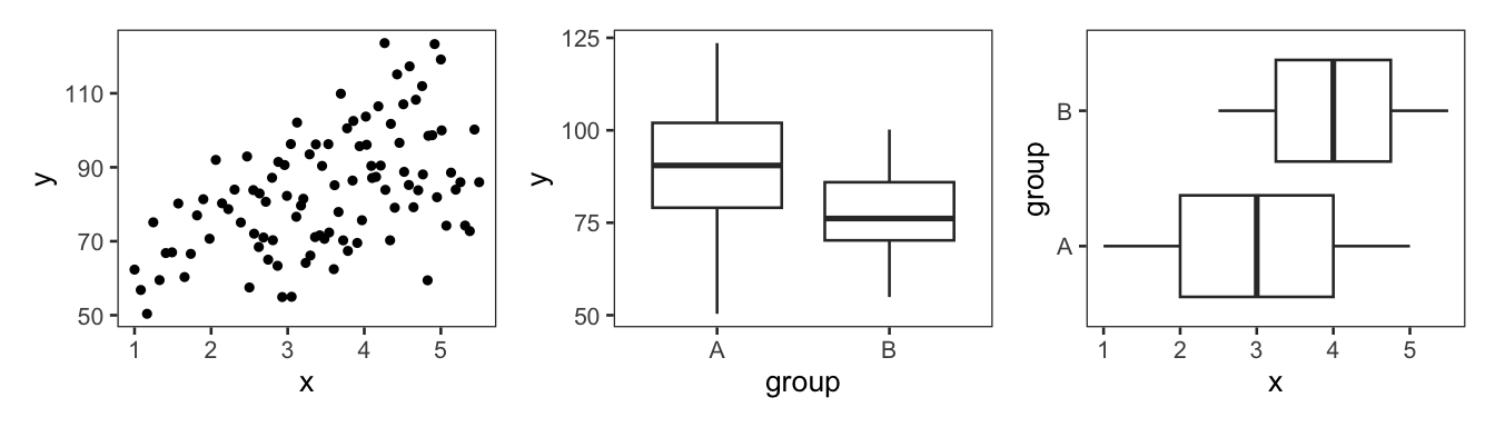
In this first example, suppose that we have two numerical variables x and y and one categorical variable group. In our analysis we are interested in predicting y based on x and group. Let’s assume that we know about our dataset, have explored the variables individually, and are now ready to explore the relationships between them. We can start by making a scatter plot for x and y and a side-by-side box plot for group and y as well as x and group, as shown in Figure 5.17. Looking at the plots, we can conclude that x and y appear to have a weak-to-moderate positive linear relationship. While the box plots suggest that group (which has categories A and B) is related to both y and x.
From here a plausible next step might be to visualize all three variables at once. This can enable us to explore questions such as the following: Does the relationship between x and y differ by group? To do this, we can map the group variable to the color of the points. Then, the color of each point represents which group the observation belongs to: A or B. The result is in Figure 5.18, and it provides a lot of information relevant to our analysis. Some of this information was already provided in Figure 5.17. However, in the bullet points below we consider all of the different pieces of information that Figure 5.18 provides about the relationships between x, y and group. The first three points correspond to information we already know from the previous plots. The last two are specific to Figure 5.18.
x and y.x and group (i.e., the x-axis and point color), it appears that the distribution of group A (red) has a greater spread and is shifted to the left of group B (blue), indicating a relationship between x and group.y and group (i.e., the y-axis and point color), it appears that the distribution of group A (red) has a greater spread and a higher central value than group B (blue), indicating a relationship between y and group.x and y may differ slightly by group. The change in y given a change in x appears to be slightly more for group A than group B.x and y differs by group. The relationship appears stronger for group A than group B.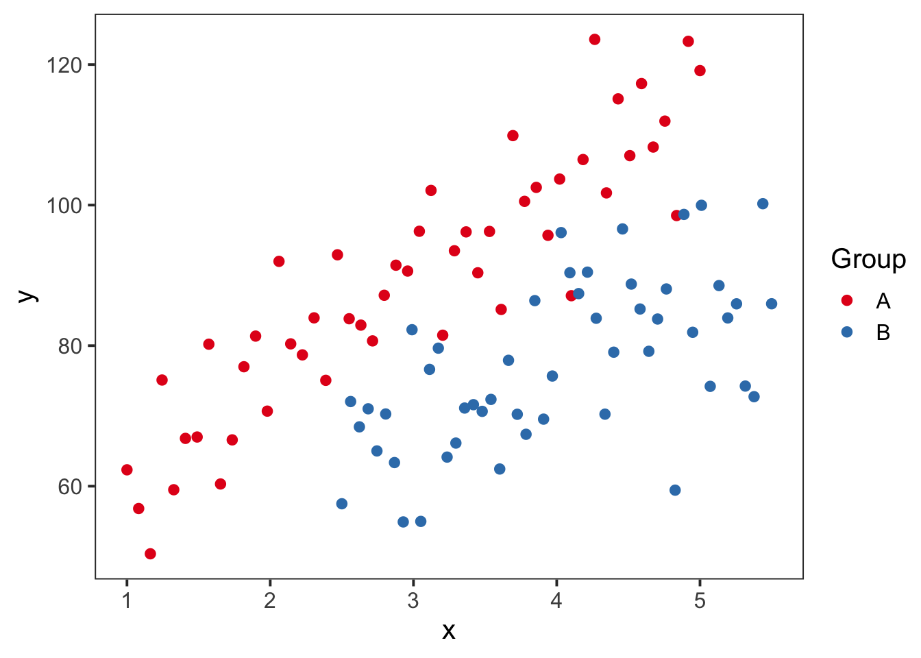
x and y with group mapped to point color.
Ultimately, each of these bullet points will be important information to consider in the subsequent modeling step.
Another technique that can be used to incorporate a third variable into a plot is faceting. Recall from earlier in the chapter that faceting involves creating the plot type of interest, separately, for each group in a categorical variable.
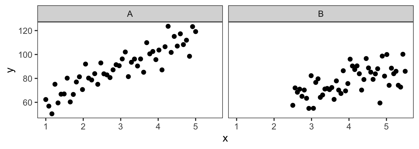
So in the previous example with variables x, y, and group, an alternative to mapping group to point color is faceting by group. In this approach, a scatter plot is created for each individual category in group, as shown in Figure 5.19. The observations belonging to group A are in the left panel, and the observations belonging to group B are in the right panel. In each panel, we can see that there is a positive relationship between x and y. Furthermore, we can see that observations in group B are located in the lower right quadrant of the plot, while observations in group A form a diagonal across the full width and height of the plot.
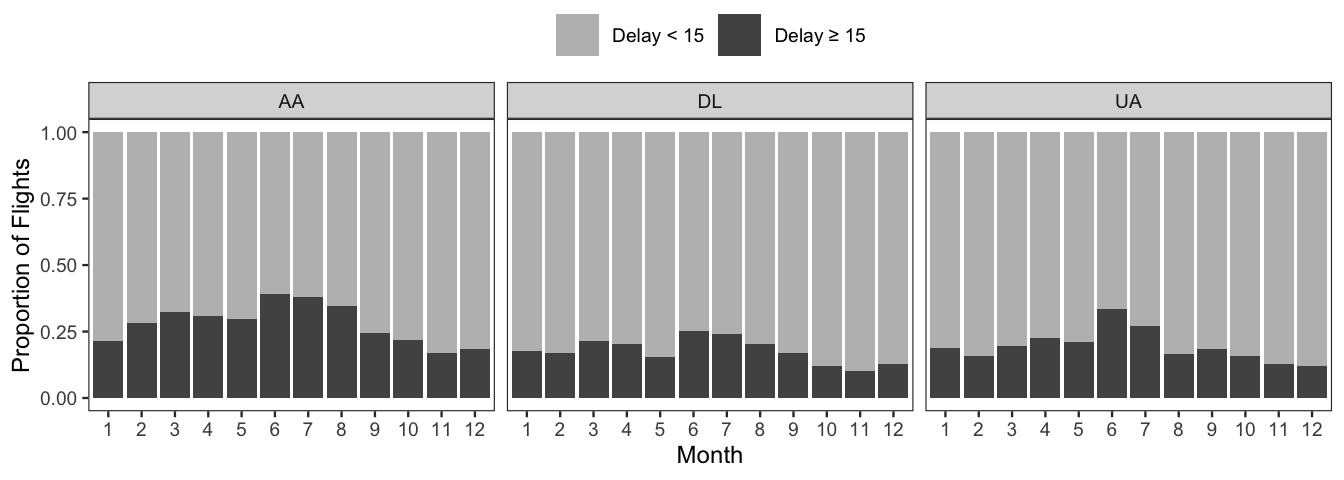
Faceting is particularly helpful when trying to visualize the relationship between multiple categorical variables. For example, let’s consider the flight data from before, and in particular, Figure 5.13, which visualized the relationship between the two departure delay categories (\(< 15\) minutes and \(\ge 15\) minutes) and month. The main takeaway from that plot was that delays \(\ge 15\) minutes were highest over the summer months. To see if this trend is consistent across the airlines in the dataset (American Airlines, Delta Air Lines, and United Airlines), we can facet by the variable Reporting_Airline. The result is shown in Figure 5.20. Note that counts have been converted to proportions, to account for differences in total flight numbers between airlines. Additionally, bars have been stacked instead of grouped.
The faceting reveals that in general American Airlines tends to have a slightly higher proportion of delays \(\ge 15\) minutes. However, all three airlines display a similar trend in delays throughout the year, with June and July consistently having the highest proportion of delays \(\ge 15\) minutes.
Most data analyses involve two or more variables. For analyses that do, taking the time to explore the relationships between those variables—before a formal model is fit—is an important and worthwhile step. The insight gained from this exploratory step can be used to decide, refine, or confirm the approach to modeling implemented in the next step.
During this step, different numerical and visual summaries come into play. Which summaries are used will depend on the types of variables at hand. To explore the relationship between two numerical variables, scatter plots and correlation coefficients are used. For one numerical and one categorical variable, grouped means/medians, side-by-side box plots, faceted histograms, and scatter plots with jittering are useful. And for two categorical variables, grouped or stacked bar plots of counts, percentages, or proportions are common choices.
After an analyst detects the presence of a relationship between two variables, they will want to characterize that relationship in as much detail as possible. For instance, for two numerical variables, an analyst will want to consider the following. Is the relationship linear or nonlinear? It is positive or negative? Is it strong or weak? Once the relationships of interest are characterized in detail, an analyst is typically well on their way to answering the question of interest in their analysis.
x, y, and group. One of the conclusions from the plot was the following: Considering all three variables at once, it appears that the relationship between x and y may differ slightly by group. The change in y given a change in x appears to be slightly more for group A than group B. In the figure below, a trend line has been added for each group. Do these trend lines provide evidence for or against the conclusion above? Explain your answer.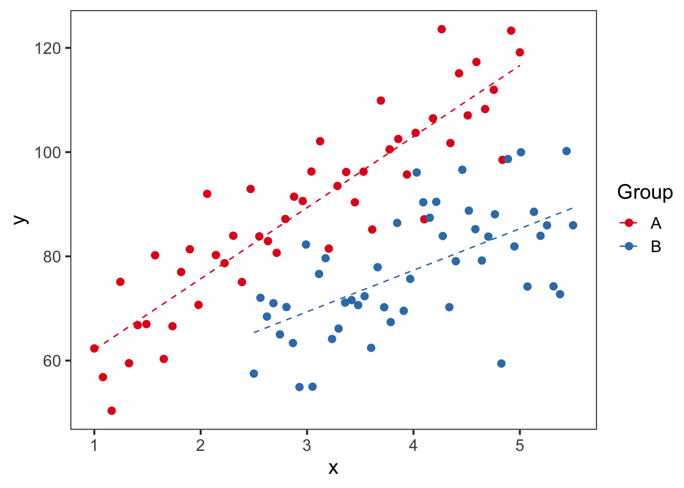
Note that this formula only works when there are no ties in rank.↩︎