
x and y, with a simple linear regression model in blue.
Linear models consist of a large category of models that have proven to be enormously useful and flexible across a wide variety of applications. We can specify a linear model using an equation style of notation. The model will have an outcome variable on the left-hand side of the equation and one or more predictor variables on the right-hand side of the equation. The notation appears as follows:
outcome ~ predictor1 + predictor2 + predictor3 + …
While there are various types of linear models, in this chapter we focus on two of the most common: the linear regression model and the logistic regression model. We will start with the linear regression model.
Linear regression is a common choice when you have a continuous outcome variable and one or more predictor variables. Although the outcome variable is always continuous, a predictor variable may be numerical (either continuous or discrete) or categorical in type. When you have only one predictor variable, it is called simple linear regression. When you have more than one predictor variable, it is called multiple linear regression. We will focus on simple linear regression first because it is more straightforward to visualize and interpret.
To begin, let’s look at a simple linear regression model, fit to some data that we first saw in Chapter 5. Our first encounter with the data was a scatter plot visualizing outcome variable y plotted against predictor variable x. In Figure 6.1, we remake this scatter plot but now also include the fitted simple linear regression model—the blue line—that “regresses” y onto x. We can see that the model is a straight line that goes through the data. This is sometimes referred to as the “line of best fit.”
x and y, with a simple linear regression model in blue.
Moving forward, the model in Figure 6.1 will be our example model, as we consider four key questions about simple linear regression. The questions are:
In simple linear regression, we are fitting a straight line to the data. So before introducing the model formulation, let’s review the basic equation for a straight line: \(y=mx+b\). In the equation, the \(m\) refers to the slope, which determines the steepness and direction of the line. The \(b\) term is the y-intercept, which determines the vertical positioning of the line. In the context of simple linear regression, we refer to the intercept and slope as the parameters of the model, and we estimate these parameters when we fit a model to our data.
Let’s see how these parameters are represented in the simple linear regression model, which has the following form.
\[ y = \beta_0 + \beta_1 x + \varepsilon \]
In the equation, \(y\) represents the continuous outcome variable, and \(x\) represents the predictor variable. Our unknown parameters of the model—the intercept and slope—are represented by \(\beta_0\) and \(\beta_1\), respectively. We pronounce \(\beta_0\) as “beta zero” and \(\beta_1\) as “beta one.”
Lastly, in the equation there is \(\varepsilon\), which represents the random error, or the deviation between the observed outcome and the predicted outcome from the model. A key assumption that we make of the linear regression model is that the difference between the observed outcome and the predicted outcome from the model is additive and symmetric. The additive error assumption means that the difference between the observed data points and predicted model values are about the same magnitude no matter where we are in the range of the \(x\) variable. The symmetric error assumption means that there should be about the same number of points above and below the line at different values for the \(x\) variable.
We can consider these assumptions for our example model, shown in Figure 6.2. In the plot, there are two shaded regions. Across the two shaded regions, the deviations between the points and the regression line are around the same magnitude. Put differently, one of the shaded regions does not have dramatically larger deviations than the other. This appears to hold across the full range of x, so it appears that the errors are indeed additive. Furthermore, in each of the shaded regions, we can see that there are roughly the same number of points above the line as below the line. This appears to hold across the full range of x, so the errors appear symmetric, too.

x and y, with a simple linear regression model in blue and two red shaded regions for assessing error assumptions of the model.
Another important assumption that we often make of the linear regression model is that the error component \(\varepsilon\) has a mean of zero. As such, another way that we can write the simple linear regression model is as follows.
\[ \mathbb{E}[y] = \beta_0 + \beta_1 x \]
This version looks similar to the previous version, but notice that we use \(\mathbb{E}[y]\) instead of \(y\) and there is no \(\varepsilon\) term. The \(\mathbb{E}\) operator is the expectation operator, and it returns the expected value, or mean value, of its argument. Here we are saying that the expected value of \(y\) is equal to a linear combination of the intercept coefficient and the predictor value multiplied by the slope coefficient. Because the error term \(\varepsilon\) has an expected value of zero, it disappears from this formulation of the model.
These assumptions will be particularly important to keep in mind as we start to interpret and evaluate linear regression models.
Given the model formulation, a basic question is then: What should the values of \(\beta_0\) and \(\beta_1\) be so that the model best predicts the outcome \(y\)? Suppose we arbitrarily selected the values of 90 and -1.5 for the \(\beta_0\) and \(\beta_1\) regression coefficients, respectively. The model with those coefficients is plotted in blue in Figure 6.3, and we can see that it does not fit the data well at all. Therefore, how do we find these values, so that the model fits the data better? The method that is most commonly used is known as least squares.

y onto x, that does not fit the data well.
To understand the least squares method, we must first introduce the concept of a residual. A residual, \(r\), is the difference between the observed outcome, \(y\), and the predicted outcome from the model, represented as \(\hat{y}\) (pronounced “y hat”).
\[ r = y - \hat{y} \]
A positive residual means that the model underestimates the observed outcome, while a negative residual means that the model overestimates the observed outcome. For example, in Figure 6.4, the residual for one of our example data points is visualized with a dashed red line. This large negative residual of -20.41 tells us that the model from Figure 6.3 overestimates the value of y (by a lot) for that particular data point.

Ultimately, with the least squares method, we want to select the model that minimizes a measure called the residual sum of squares (RSS), which squares and then sums the residuals, as shown in the following equation. Note that the difference taken within the parentheses equals the residual for data point \(i\).
\[ RSS = \sum_{i=1}^{n}(y_i - \hat{y}_i)^2 \]
In Figure 6.5, we can see how the RSS compares across three different models. The first two models are arbitrary lines, while the third is the simple linear regression model fit using the least squares method. This last model—the “line of best fit”—can be estimated using a closed-form solution and written as follows: \(\mathbb{E}[y] = 58.60 + 1.79 x\).

Once the model is fit, we can turn our attention to interpreting the fitted model. The primary focus will be interpreting the estimated regression coefficients for \(\beta_1\) and \(\beta_0\). We call these estimates \(\hat{\beta}_1\) (“beta one hat”) and \(\hat{\beta}_0\) (“beta zero hat”). The “hat” indicates that this is an estimate of the parameter. We will discuss the interpretation for numerical predictors and then categorical predictors. For each type of predictor, we will focus on \(\beta_1\) first as it is typically the most important of the two to interpret.
For numerical predictors, the interpretation of \(\beta_1\) is often stated as the expected change in the outcome variable associated with a 1-unit change in the predictor variable. In our example simple linear regression model, the estimated \(\beta_1\) coefficient, \(\hat{\beta}_1\), is 1.79. This means that, on average, each one-unit increase in x is associated with a 1.79-unit increase in y. Here we say increase because the coefficient 1.79 is positive. If the coefficient were instead negative, we would say decrease.
The \(\beta_0\) regression coefficient can be interpreted as the expected value of the outcome variable when the predictor variable is equal to zero. In our example model, because an x value of zero is beyond the range of our data (see Figure 6.1), interpreting the \(\beta_0\) estimate of 58.60 would be considered extrapolation.
It is important to note that it may not always make sense to interpret the estimate for \(\beta_0\). Whether or not it does will depend on the meaning of your predictor variable. For example, suppose your predictor variable referred to temperature in degrees Fahrenheit in New York City during the winter. Here it will likely make sense to interpret the expected outcome when the predictor is equal to zero degrees Fahrenheit because this temperature is a real, plausible value. However, suppose your predictor variable referred to the height in inches of people in a study. Then interpreting the expected outcome when the predictor equals zero might make less sense because the predictor at zero represents an implausible value.
For categorical predictor variables, we can start with interpretation of the coefficients for the simplest case, a binary categorical predictor. Recall from Chapter 4 that categorical variables can be encoded, or represented by numbers. For binary variables, this typically means that one group is represented by a 0 and the other group is represented by a 1. This type of encoding is implemented in simple linear regression. Then \(\beta_1\) can be interpreted as the difference in the mean outcome for each group, and \(\beta_0\) is the mean outcome for the group encoded as 0.
For categorical predictor variables with more than two groups, one common approach is to treat one group as the reference group and create a binary variable for each of the remaining groups. For example, suppose you have a categorical predictor variable about computer operating systems called system with three values—macOS, Windows, and Linux—that you are using to predict outcome variable y. One model formulation could be:
\[ y = \beta_0 + \beta_1Windows + \beta_2Linux + \varepsilon \]
where macOS is treated as the reference group. We would then interpret \(\beta_0\) as the mean y for macOS, \(\beta_1\) as the difference in mean y for macOS and Windows, and \(\beta_2\) as the difference in mean y for macOS and Linux.
Now that we have covered the formulation, fitting, and interpretation of the simple linear regression model, let’s focus on the fourth question posed at the beginning of this section on simple linear regression: What can we do with this model?
The simple linear regression model can be used to answer different types of data analysis questions, such as inferential questions or prediction questions (which were first introduced in Chapter 3). In the next chapter of this book, when it comes to linear models, the primary focus will be on prediction. However, at this point, we will pause to consider how the simple linear regression model can be used in different applications. In particular, we will compare some important differences in how we think about and use a simple linear regression model to answer inferential versus prediction questions.
Recall from Chapter 3 that an inferential question uses a sample of data to make inferences about the population from which we believe we are sampling the data. We want to know: What can the data and the estimates we obtain from the data tell us about the true state of the world? Thus, with simple linear regression, we might want to fit a simple linear regression model to a sample of data, to make inferences about the relationship—or association—between the predictor and outcome, in the population.
For this question, we want to know the true value of the model parameter \(\beta_1\). However, because we only have a sample of data, we can only estimate it instead. In this book, we do not go into detail about the estimation process for inference with simple linear regression; as noted previously, our focus will be on prediction. However, the important thing to note is that it typically involves estimating more than just \(\hat{\beta}_1\). Often the main estimator of interest is a confidence interval, which provides a range of values that can be said to—with a certain probability (usually 95%)—cover the true value of \(\beta_1\), assuming certain assumptions hold. For example, one of the assumptions that an analyst must make is that the linear model is the true model, i.e., the data that we observed came from the linear regression model.
For prediction problems, the goal is different. In a prediction problem, we want to accurately predict the outcome \(y\) given \(x\), particularly when \(y\) is unknown. If \(x\) and \(y\) exhibit a strong linear relationship, then we may be able to fit a simple linear regression model that can be used to predict \(y\) (with high accuracy) for an observation, when we know what \(x\) is for that observation.
Returning to our example model from before, suppose we have a new observation (that was not in our original dataset) with an x value of 6.50, and we want to predict y for this new observation. We can plug the x value of 6.50 into our model, to get a prediction for y. This process of “plugging in” a value for x is demonstrated in the following equation. The prediction is also visualized in Figure 6.6.
\[ \mathbb{E}[y] = 58.60 + 1.79 \times 6.50 = 70.24 \]

x equal to 6.50, from the model in blue.
It is important to note that when constructing a prediction model an analyst must ensure that it will actually be possible to “plug in” a predictor value at the time of prediction. For example, suppose we want to fit a prediction model that can predict how much time people will spend at a particular outdoor event. And suppose we have data on two variables: time, which measures how many minutes attendees spent at past outdoor events, and rain, which measures how much rain fell during each of these past events. We could fit the simple linear regression model minutes ~ rain, but if we wanted to use it to make a prediction for a future event, we will not have an input for rain because the event has not happened, yet. Instead, it would likely be more useful to fit a model like minutes ~ forecast, where forecast is a variable that measures the forecasted amount of rain during the event. Because we could have access to a rain forecast before the event occurs, we could use our model to make a prediction about a future event.
At this point, we have introduced the basics of linear regression in the context of simple linear regression, where we have only one predictor variable. It is common, however, to include more than one predictor variable in a linear regression model. This is referred to as multiple linear regression. We can write the formulation for a multiple linear regression model as follows.
\[ y = \beta_0 + \beta_1x_1 + \beta_2 x_2 + \cdots + \beta_px_p + \varepsilon \]
As you can see, the formulation is the same as simple linear regression but with more terms, as now we have p predictor variables instead of one predictor variable.
For prediction problems, we may often want to include more than one predictor variable in our model to get a better prediction. For instance, in the previous example about predicting time spent at outdoor events, maybe the outcome variable minutes is also dependent on what hour of the day the event is scheduled to start at, in addition to the forecasted weather for that day. Therefore, if we have a variable called hour that can take on any integer value from 1–23, then we can include this variable in our model as well.
\[ minutes = \beta_0 + \beta_1forecast + \beta_2hour + \varepsilon \]
As such, when fitting a multiple linear regression model, there will be more regression coefficients to estimate. We can still use the least squares method to fit the model, but our interpretation of the output changes slightly. In particular, when interpreting the slope coefficient for one variable, we must account for the other variables in our interpretation. If we were interpreting \(\beta_1\) for the forecast variable in our example model, we would say that \(\beta_1\) represents the change in the expected value of minutes associated with a one-unit increase in the forecast variable, holding the hour variable constant.
In Chapter 7, we will revisit linear regression, focusing specifically on model evaluation in prediction contexts.
We began this chapter on linear models with the linear regression model, which can be used when you have a continuous outcome variable. In this section, we introduce the logistic regression model, which can be used when you have a binary (categorical) outcome variable. Namely, this is a linear model commonly used in binary classification problems, and this type of prediction problem will be the primary application of interest in this section on logistic regression.
One may wonder: Why do we use a model with the word “regression” in its name, for a classification problem? In short, the output of a logistic regression model is probabilities, and then from these probabilities, we produce classifications. Let’s explore how this works in more depth.
Suppose we have two variables: x and y. The predictor variable x is continuous, and the outcome variable y is binary and contains 0s and 1s, which represent two groups: failing and passing, respectively.
We can visualize these variables in a scatter plot in Figure 6.7. Notably, because y is a binary variable, the scatter plot consists of two horizontal lines of points at a y value of 0 and 1. Interpreting this plot, we can see that when x is lower, y tends to be 0 (failing), and when x is higher, y tends to be 1 (passing). In other words, it seems that x and y are indeed related, and it seems reasonable to believe that we can fit some type of model in which we use x to predict y. In this case, we will fit a logistic regression model. To introduce how this new model can be used for classification, we break it down into three main steps: 1) reframing the y-axis, 2) fitting an S-curve, and 3) producing classifications.

x and y.
First, we reframe the y-axis as probabilities. Specifically, we reframe the y-axis to be the probability of the outcome group encoded as 1. In this case, that is the probability of passing. As such, we rename the y-axis in Figure 6.8 to be “probability of passing” and interpret the scatter plot as follows. For observations that we know have a y value of failing, the probability of passing is zero. For observations that we know have a y value of passing, the probability of passing is one.

x and y, with a fitted logistic regression model in blue and a prediction in green.
After reframing the y-axis as probabilities, we can fit an “S-curve” or logistic regression model to the data, that predicts the probability of passing given our predictor variable x. For now we will focus on visualizing the model, and later we will focus on writing out the exact model formulation. The fitted logistic regression model is visualized in blue in Figure 6.8. Tracking the model from left to right, we can see that at lower values of x, the probability of passing is low, while at higher values of x, the probability of passing is high. For the middle range of x, the probability of passing is around 0.5. For example, the prediction for an x value of 20 is 0.46 (see Figure 6.8). This probability of 0.46 reflects the fact that at around x equal to 20 there are both failing and passing observations in our dataset, so there is a reasonable chance it could be either outcome, given the observed data.
At this point in the process we have probabilities, but we do not yet have classifications for the binary outcome variable. Thus, we need to select a threshold (or cutoff) that can be used to dichotomize the predicted probabilities into the two original outcome groups. One common choice for this threshold is 0.5. Probabilities greater than or equal to 0.5 are classified as one outcome group, and probabilities less than 0.5 are classified as the other outcome group. Classification using this threshold for our example model is visualized in Figure 6.9. The plot shows that observations will be classified as failing until around an x value of 20.2, after which point they will be classified as passing.

Note that with a classification threshold of 0.5 the logistic regression model would make some errors in its classification. These errors are highlighted in red in Figure 6.9. Some observations with a known outcome of failing would be classified as passing. These errors are referred to as false positives. Alternatively, some observations with a known outcome of passing would be classified as failing. These errors are referred to as false negatives. In Chapter 7, we will discuss different types of errors in more depth and how we can use them to evaluate a logistic regression model.
There are two formulations for the logistic regression model. The first is the logit form, and it outputs a log-odds. The second is the probability form, and it outputs a probability. This is the form in Figure 6.8. We will now formally introduce both forms and how they are related.
Let’s begin by revisiting the model formulation for linear regression, discussed earlier in this chapter. The formulation of the model can be written as modeling the expected value of the response variable \(y\).
\[ \mathbb{E}[y] = \beta_0 + \beta_1x_1 + \beta_2x_2 + \cdots + \beta_px_p \]
In linear regression, we are working with continuous outcomes. However, in logistic regression, the outcome is binary. For a binary variable \(y\) that takes values 0 and 1, it turns out that the expected value of \(y\) is equal to the probability that \(y\) takes on the value 1. Thus, we can write the expected value of \(y\) as
\[ \mathbb{E}[y] = \mathbb{P}(y=1). \]
The approach taken with logistic regression is that we will model a transformed version of the probability that the outcome variable \(y\) is equal to 1. The transformation that we take is the logit transform. For a variable \(p\) that takes values between 0 and 1, the logit transform is
\[ \text{logit}(p) = \log\left(\frac{p}{1-p}\right). \]
This transform takes values between 0 and 1 and transforms them into a variable that takes values between \(-\infty\) and \(+\infty\). Specifically, the input is a probability, and the output is a log-odds, or the log of the odds. Note that the odds is the part inside of the parentheses on the right side of the equation. It is the ratio of the probability of something happening to the probability of that something not happening.
Because \(\mathbb{E}[y]\) is a probability for a binary variable \(y\), it makes sense to take the logit transform of \(\mathbb{E}[y]\). Thus, we can write the logit formulation of the model as
\[ \text{logit}(\mathbb{E}[y]) = \beta_0 + \beta_1x_1 + \beta_2x_2 + \cdots + \beta_px_p. \]
This formulation looks a lot like the linear regression model formulation except for the logit transform.
The last key transform that we need to know is the inverse logit transform. For a variable \(z\) that takes values between \(-\infty\) and \(+\infty\), the inverse logit transform is
\[ \text{logit}^{-1}(z)=\frac{e^z}{1+e^z}. \]
The inverse logit transform takes a variable that takes values between \(-\infty\) and \(+\infty\) and maps it to a variable that takes values between 0 and 1. In other words, we can use this transform to get predicted probabilities from the log-odds. We can write the probability formulation of the model as
\[ \mathbb{E}[y]=\frac{e^{(\beta_0+\beta_1x_1+\beta_2x_2+\cdots+\beta_px_p)}}{1+e^{(\beta_0+\beta_1x_1+\beta_2x_2+\cdots+\beta_px_p)}}. \]
This example centers on a dataset about breast cancer biopsy samples. The dataset comes from researchers at the University of Wisconsin and contains characteristics (measurements) of 569 cancer biopsies as well as a diagnosis of “benign” or “malignant.” A small sample of rows and columns from the dataset is shown in Table 7.8.
| id | diagnosis | radius_mean | texture_mean | perimeter_mean |
|---|---|---|---|---|
| 84610002 | M | 15.78 | 17.89 | 103.60 |
| 863270 | B | 12.36 | 18.54 | 79.01 |
| 871001502 | B | 8.22 | 20.70 | 53.27 |
| 883270 | B | 14.22 | 27.85 | 92.55 |
| 92751 | B | 7.76 | 24.54 | 47.92 |
In the dataset, the diagnosis column is the outcome variable, and the goal is to predict whether a sample is benign (B) or malignant (M) based on the characteristics in the dataset. The idea here is that a prediction algorithm might assist with the diagnosis for a biopsy. In this example, we will only focus on one characteristic, radius_mean, as a predictor variable. However, in Chapter 7 we revisit this dataset and evaluate a model that incorporates more characteristics as predictor variables.
Before we fit a logistic regression model that can be used to predict a diagnosis of benign or malignant based on a radius_mean measurement, let’s take one step back to the previous step of a data analysis—exploring relationships between variables—and explore if and how diagnosis and radius_mean are related. We want to first ask: Could radius_mean be a good predictor of diagnosis? Recall from Chapter 5 that, because we are working with one categorical variable and one numerical variable, a side-by-side box plot and faceted histogram are good options for this exploratory task. These two plots are shown in Figure 6.10.

radius_mean for each group in diagnosis.
Interpreting the plots in Figure 6.10, we can see that there does appear to be a relationship between diagnosis and radius_mean. The distributions for radius_mean differ by diagnosis, and the average for radius_mean is less for benign biopsies than malignant biopsies. While the distributions differ, it is also worth noting that the plots do show an overlap in the distributions between radius_mean values of approximately 10 to 18. In this overlapping space, the faceted histogram shows that there are noticeably more benign biopsies than malignant biopsies from 10–15. Then from 15–18, there are more malignant than benign biopsies.
Now that we have a better understanding of the relationship between our outcome variable and predictor variable, we can move on to the modeling step. The first task in this step is to encode the diagnosis variable. We map “benign” (B) to 0 and “malignant” (M) to 1. Because of this encoding, the logistic regression model will predict the probability of malignancy.
The fitted model is visualized in Figure 6.11, over the data it was fit to. The plot shows that, for radius_mean values less than 10, the predicted probability of malignancy is approximately 0. For radius_mean values greater than 18, the predicted probability of malignancy is approximately 1. Between 10 and 18, there is more uncertainty. Note that the predicted probability crosses 0.5 around where we saw—in the faceted histogram—the shift from higher counts of benign biopsies (relative to malignant biopsies) to higher counts of malignant biopsies (relative to benign biopsies).

radius_mean value, fitted to the Wisconsin breast cancer dataset. Gray vertical line marks the decision boundary between a benign and malignant diagnosis, associated with a classification threshold of 0.5.
This model is kept simple—with only one predictor—for illustrative purposes. However, at this point, you may be wondering: How do we know if the model is good at prediction? This is an important question. Thoroughly evaluating a model and the types of errors it makes is a critical next step, especially when a model is being deployed in a high-stakes setting, such as assisting with medical diagnoses. For instance, consider what a false positive or false negative means in this context. A biopsy is classified as malignant when it is in fact benign, or a biopsy is classified as benign when it is in fact malignant.
We discuss model evaluation in the next chapter.
Linear models are one of the most important types of models used in data science. All linear models have a few key characteristics:
This chapter focused specifically on two widely-used linear models: the linear regression model for continuous outcomes and the logistic regression model for binary outcomes. With both models, prediction comes in the form of predicting the conditional mean of the outcome variable \(y\), conditional on all of the predictors \(x_1,\dots,x_p\). With logistic regression, the conditional mean is interpreted as the probability of one of the outcome groups, given the predictors. Therefore, in order to produce hard classifications, we need to specify a classification threshold to dichotomize the predicted probabilities into two classes.
The simple linear regression model can be written as \(y=\beta_0+\beta_1x+\varepsilon\), where \(\varepsilon\) represents the error between the observed value and the true model. When we fit a simple linear regression model to the data, the fitted model is written as \(\hat{y}=\hat{\beta}_0+\hat{\beta}_1x\) and we can compute the residuals of the model as \(r=y-\hat{y}\). What is the difference between the errors represented by \(\varepsilon\) and the residuals represented by \(r\)?
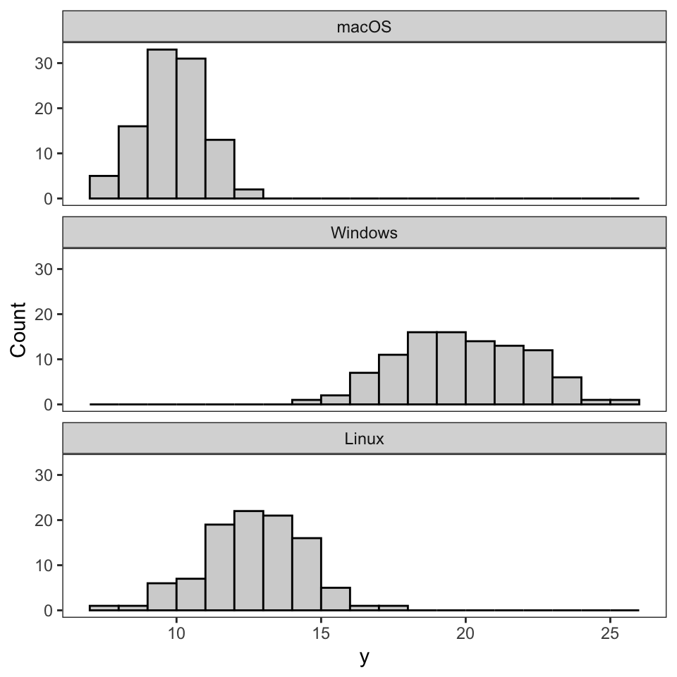
Recall from this chapter the linear regression model with outcome variable y and categorical predictor variable system (with the three groups macOS, Windows, and Linux), written as follows. \[
y = \beta_0 + \beta_1Windows + \beta_2Linux + \varepsilon
\] Based on the faceted histogram below, which shows the distribution of y for each type of operating system, which regression coefficient, \(\beta_1\) or \(\beta_2\), do you expect to be larger in the fitted model? Explain your answer.
In this chapter, we introduced the linear regression model and the logistic regression model. For each of the following outcome variables, determine if one or neither of these two linear models is a potentially suitable choice for modeling it.
gpa, which refers to student grade point averages.grade, which contains the letter grades: A, B, C, D, and F.win, which refers to whether or not a college football team won their game.students, which refers to the number of students who attended their college’s football game.