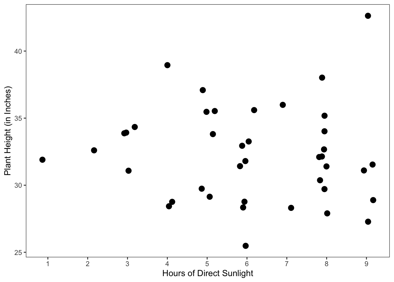
Sunlight and Height, with a small jitter of 0.2 applied to the x-axis, so that all points are at least partially visible. The real data value for Sunlight can be identified as the closest whole number.
As an analyst, setting expectations and developing alternative explanations will be an integral part of every data analysis that you do. Importantly, these practices help you to identify and navigate the problems and anomalies that inevitably arise in data analysis. In this chapter, we walk through eight case studies on setting expectations and developing alternative explanations. These case studies span different steps of a data analysis, from learning about variables to evaluating models. Each section is a different case study, and each case study is self-contained.
Before proceeding, it is important to emphasize three things. Firstly, the types of problems and anomalies discussed in these case studies are by no means comprehensive of the types of problems and anomalies you might encounter as an analyst. Secondly, in the case studies, how a problem is resolved might represent one possible solution to the problem but not the only possible solution. Thirdly, a solution used in a case study may not be appropriate in a different data analysis, where the same type of problem arises; the “appropriateness” of a solution can be highly context-specific.
In this first case study, we consider a hypothetical scenario involving an analyst, some (real-world) aviation data, and a prediction task.
Suppose an analyst works for a travel agency that books domestic travel itineraries. The analyst’s supervisor has asked them to build a prediction model that can help the agency book reliable flights for its customers. In particular, the goal is to be able to predict whether a flight will arrive 15 minutes or more after the scheduled arrival—the U.S. Department of Transportation’s definition of “late.” Then, when possible, the agency can avoid booking flights likely to arrive late, creating a better travel experience for its customers.
To build this model, the analyst decides to use a publicly available flight dataset from the U.S. Bureau of Transportation Statistics. The dataset contains domestic flight-level data. This includes a flight’s operating airline, aircraft, origin, destination, departure performance, and arrival performance. In total, there are over 100 variables in the dataset.
Importantly, the dataset contains the outcome variable that the analyst needs: an indicator of a late flight. In the dataset, this variable is called ArrDel15. The dataset documentation describes it as a binary indicator variable, where 0 indicates an arrival delay under 15 minutes and 1 indicates an arrival delay of 15 minutes or more.
As part of the analysis, the analyst needs to spend time learning about this variable. What does the distribution of on-time versus late arrivals look like? As such, they first generate some expectations for what they will see, based on their knowledge from working in the travel industry. Namely, they expect to see an imbalanced distribution, with over 80% of flights arriving on time. They then start their exploration of ArrDel15 by computing counts for the categories 0 and 1. It is at this point that they encounter an unexpected result.
The distribution of on-time and late arrivals is largely as-expected, with there being notably more on-time arrivals than late arrivals. However, the analyst notices that the counts for the two categories do not sum to the total number of rows in the dataset, which is unexpected to them, given ArrDel15 is a binary variable. This prompts an investigation into the data, which uncovers missing values in the variable.
As is commonly the case in data analysis, one investigation prompts another. At this point, the analyst is now asking: Why are some flights missing an ArrDel15 value? This is an important question, as the answer to it will help the analyst determine what to do about the observations with missing ArrDel15 values.
Looking into the data, they notice an interesting pattern between three indicator variables in the dataset: ArrDel15, Cancelled, and Diverted. In nearly every case, a missing ArrDel15 value corresponds with a cancelled or diverted flight. In other words, cancelled or diverted flights do not have an ArrDel15 value. The analyst realizes that—given the overall goal of the project—this is an important discovery to act on carefully. The analyst outlines three possible routes forward.
Exclude observations with missing ArrDel15 and update the question associated with the prediction model to be: Assuming the flight is not cancelled or diverted, will it arrive late?
Update the outcome variable to have four possible categories: 1) on-time, 2) late, 3) cancelled, or 4) diverted.
Classify cancelled or diverted flights as late arrivals, i.e., assign cancelled or diverted flights an ArrDel15 value of 1.
Note the importance of the follow-up investigation into why the values were missing. Had the analyst stopped after the first investigation and simply excluded observations with missing ArrDel15 values from the analysis, they would have effectively excluded the most extreme cases of a late arrival from the analysis. This action may have resulted in a misleading prediction model for the travel agency.
Ultimately, unexpected results can appear in all sorts of places and ways in a data analysis. In this case study, the focus was on an intermediate result: the category counts for a binary outcome variable. One part of the result was as-expected: the number of on-time arrivals relative to late arrivals. Another part was unexpected: the sum of the counts relative to the size of the dataset. Investigating this unexpected result led to an important discovery about missing values in the outcome variable, necessitating changes to the question, dataset, and/or model.
In this second case study, we consider some simulated data about the fuel economy of plug-in electric vehicles (PEVs).
To get started, let’s first discuss two common metrics for measuring the fuel economy of PEVs. The first metric is kilowatt-hours per 100 miles. It corresponds with the question: How many kilowatt-hours (kWh) of electricity are required to drive 100 miles? The second metric is MPGe, or “miles per gallon of gas equivalent.” It corresponds with the question: How many miles can be driven on 33.7 kWh of electricity, the energy equivalent to one gallon of gas (according to the U.S. Environmental Protection Agency)? For example, a PEV might use 30 kWh per 100 miles. That means with 33.7 kWh it could drive 112 miles (\(\frac{100}{30} \times 33.7\)). Thus, it gets 112 MPGe.
Now suppose an analyst is interested in studying the relationship between vehicle weight and fuel economy, for PEVs on the market. The analyst finds a publicly available dataset that seems suitable for the task. The dataset contains 65 observations, each of which refers to a different PEV model on the market. Moreover, it has the two numerical variables MPGe and Weight, which according to the dataset documentation refer to MPGe on the highway and vehicle weight in pounds, respectively.
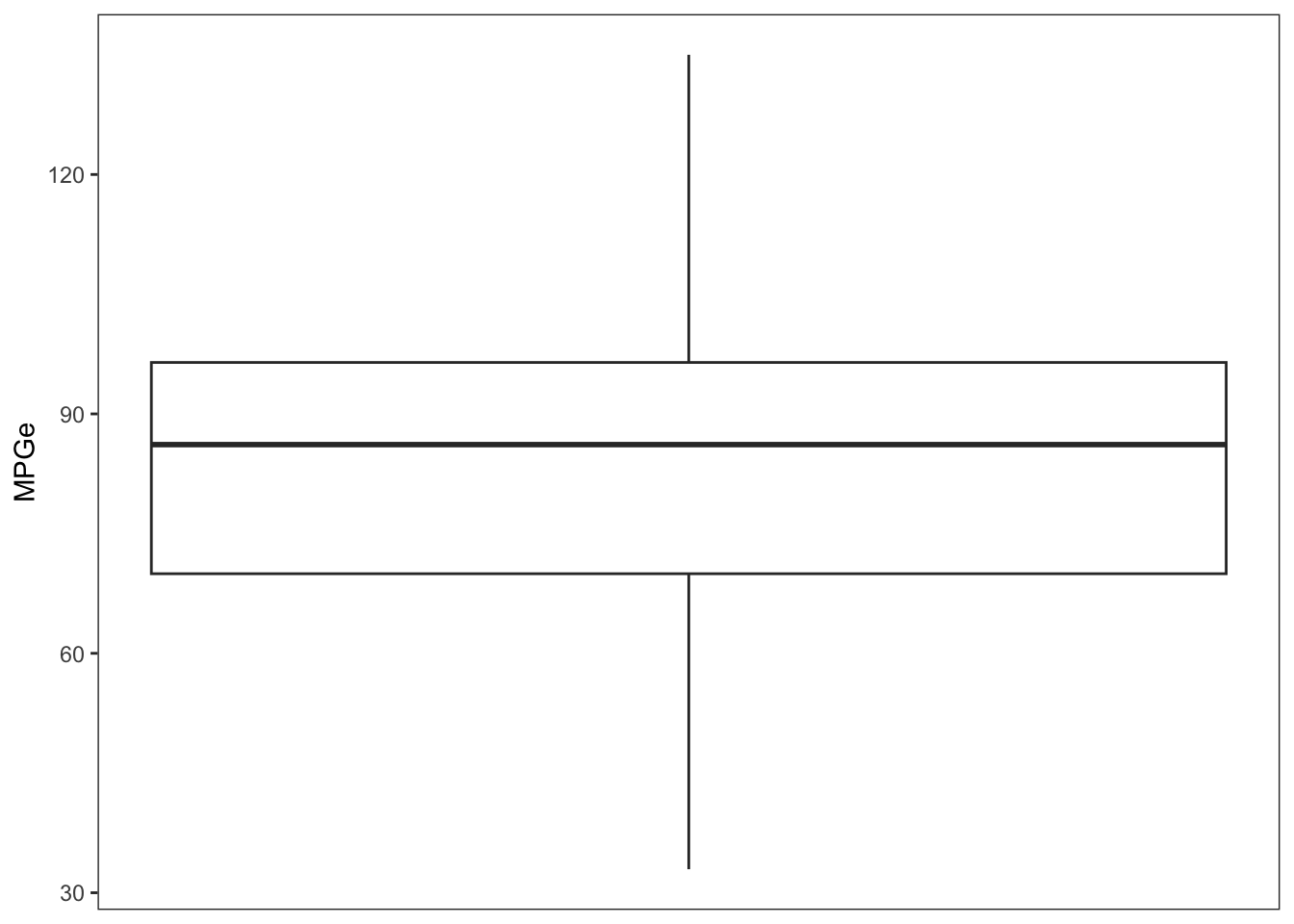
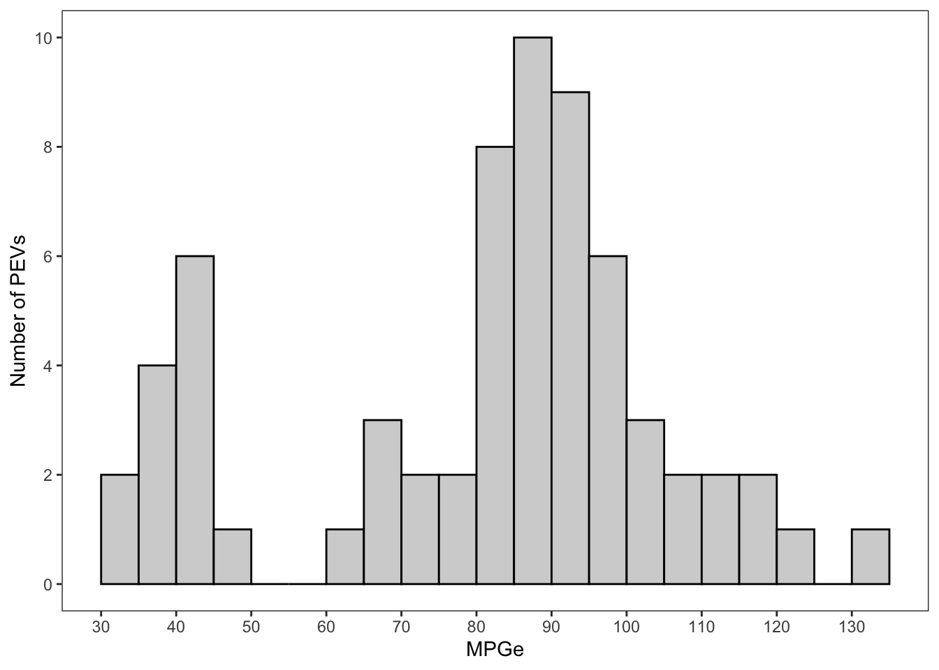
At this point, the analyst knows their question and dataset and is ready to start learning about the variables. They begin with MPGe and calculate its mean and median: 81.3 and 86.2, respectively. The analyst finds the mean, in particular, to be a little lower than expected. The difference between the mean and median is also somewhat surprising to the analyst, as this might indicate a left-skewed distribution, which the analyst was not expecting. Nonetheless, the analyst concludes both values are well within the range of reasonable values for MPGe and does not suspect any issues. However, the analyst is now especially curious to see the box plot and histogram for MPGe.
The analyst proceeds to create each plot, shown in Figure 13.1. In the plots, the analyst observes MPGe values much lower than they would expect. The histogram even shows a bimodal distribution, with a small peak around 30–40 MPGe. The analyst now suspects a data issue, as they are not aware of any models on the market with an MPGe estimate below 50.
MPGe
To investigate, the analyst starts by looking at which models in the dataset have an MPGe value below 50. Doing so confirms their suspicion of a data issue. The analyst is familiar with these specific models and knows that the recorded MPGe values in the dataset are lower than the true MPGe estimates. Moreover, the analyst notices that these values look more like the estimates for the other commonly reported fuel economy metric: kilowatt-hours per 100 miles. They suspect a mix-up of metrics in MPGe.
There is often no easy or obvious solution to a problem like this. However, there are next steps one can take.
Let’s pretend for a moment that we are the analyst in the case study. Assuming we are still interested in using the dataset despite the data issue, one next step we can take is to gather as much information as we can about the data issue. In the context of the case study, this might involve the following actions.
We can look for other data sources or reference materials with PEV fuel economy information. This information might provide further evidence that a data issue does in fact exist. It might also provide evidence about the nature of the data issue.
We can reread the dataset documentation for more information about where the data come from. Information about how the data were collected or prepared might shed light on where the issue originated.
We can spend more time examining the dataset and learning about the data issue. How many observations, or PEV models, are affected? What are the names of those models? Are there any patterns in the data that can be used to identify the affected models? For example, are they all from the same manufacturer or different manufacturers?
We can contact the data provider, to ask about the observations.
Gathering this information prepares us to talk about the data issue (in meaningful detail) with team members, supervisors, collaborators, etc. and decide on next steps together, based on all of the available information.
In this third case study, we consider a simulated dataset about plant growth and growing conditions.
Suppose 40 gardeners—all living in the same city—planted the same species of plant at the beginning of the summer. Some gardeners chose to put the plant in a pot, while others planted it in the ground. Then at the end of the summer, each gardener measured how tall the plant was and estimated on average how many hours of direct sunlight the plant received each day. These data were compiled into a dataset with 40 observations (one for each gardener’s plant) and three variables: Location (pot or ground), Sunlight (hours of direct sunlight), and Height (plant height in inches).
One of the gardeners is interested in analyzing the dataset. Their plant was in a pot and received about five hours of direct sunlight per day, and it did not grow as tall as they would have hoped. As such, they want to know if it may be beneficial to put the plant somewhere with more direct sunlight next summer; they suspect a strong positive association between sunlight and growth. They are less concerned about the difference between planting in a pot versus the ground; the other types of plants they grow do well in pots.
Let’s assume the analyst has already learned about each variable individually and is now ready to start exploring relationships between variables. For the analyst, the relationship of interest is between Sunlight and Height. Both are numerical variables, so the analyst makes a scatter plot, shown in Figure 13.2. What they observe in the scatter plot is unexpected to them. Namely, there appears to be no notable relationship between Sunlight and Height.
Sunlight and Height, with a small jitter of 0.2 applied to the x-axis, so that all points are at least partially visible. The real data value for Sunlight can be identified as the closest whole number.
As such, the analyst brainstorms three possible explanations for the unexpected result. One: their initial expectation about the relationship between Sunlight and Height was wrong. Two: there is a data quality issue, e.g., some gardeners underestimated or overestimated the amount of direct sunlight their plants received. Three: there is another variable at play that has not been accounted for.
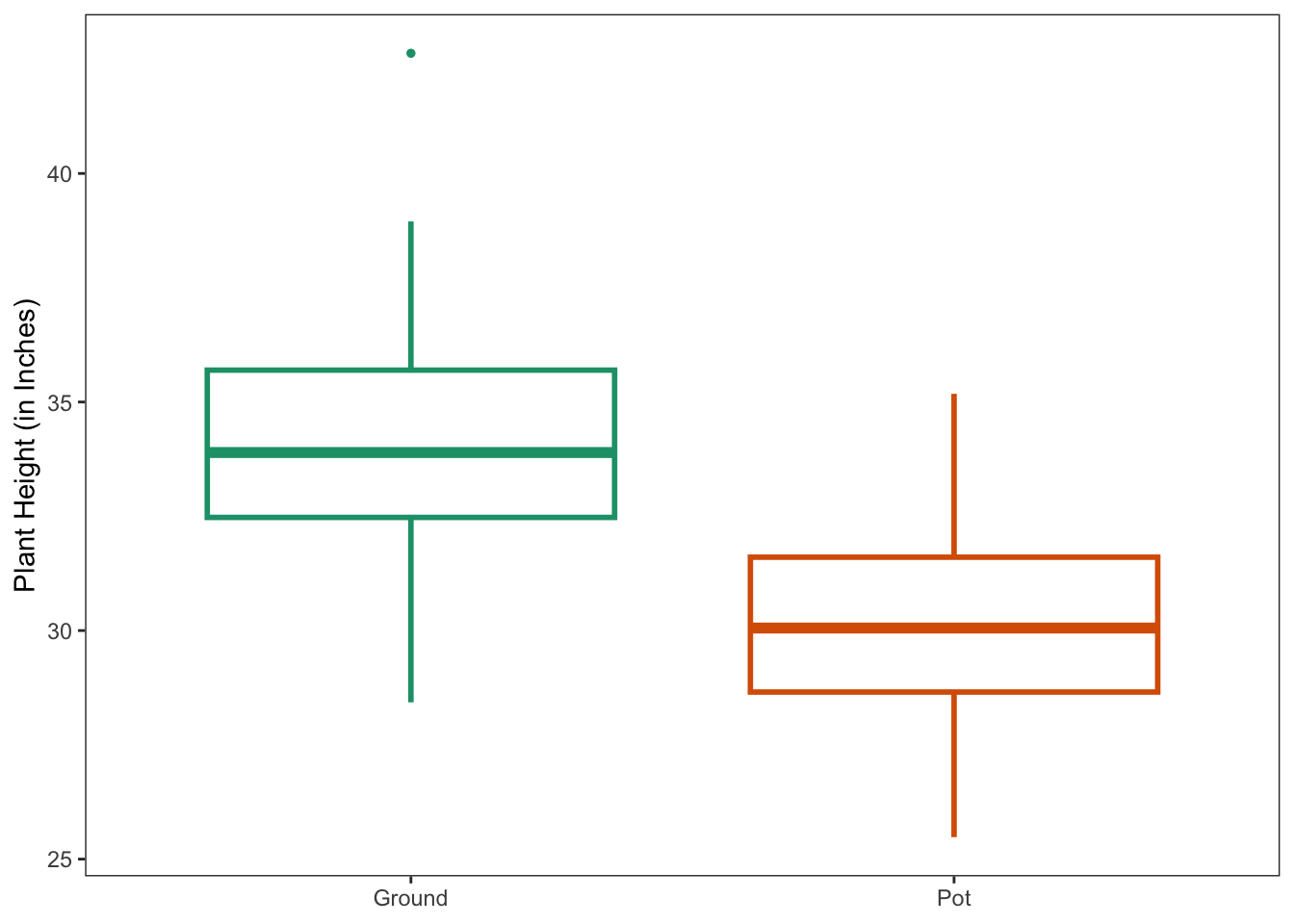
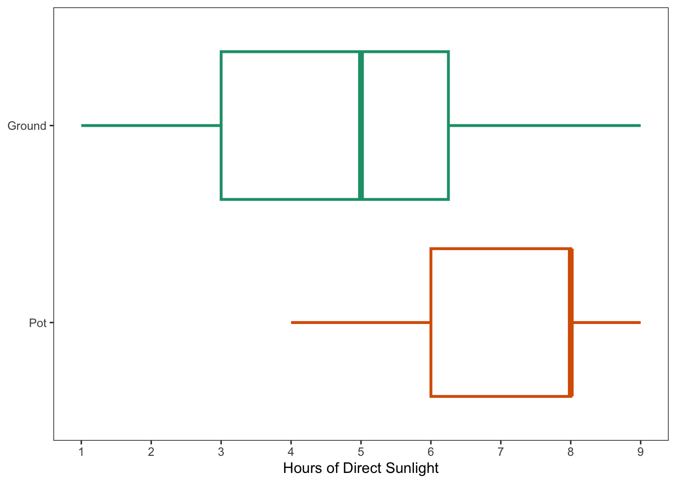
When considering this third reason, the analyst wonders if they have overlooked Location. In turn, they make two grouped box plots, shown in Figure 13.3. From these plots, the analyst can see that Location appears to be related to both Height and Sunlight. On average, the plants in the ground grew higher than the plants in a pot. And on average, the plants in the ground received less direct sunlight than the plants in a pot. The analyst also notes that for Sunlight the spread is greater for ground than pot.
Looking at the orange box plots, the analyst expects that plants in a pot would be located primarily in the lower right quadrant of that first scatter plot in Figure 13.2. Meanwhile, looking at the green box plots relative to the orange box plots, the analyst expects that plants in the ground would be located slightly above and to the left of plants in a pot, in that same scatter plot.
With this new information, the analyst returns to the scatter plot of Sunlight and Height but now controls for Location with point color. The updated scatter plot is shown in Figure 13.4. The within-group trends align with the analyst’s initial expectation about a positive relationship between Sunlight and Height. However, the analyst would not describe these positive relationships as strong, as there is substantial spread around the trend lines. The analyst suspects that this variation might be related to other gardening factors, such as watering practices, soil quality, or the amount of room the plant had to grow (i.e., pot size or ground space).
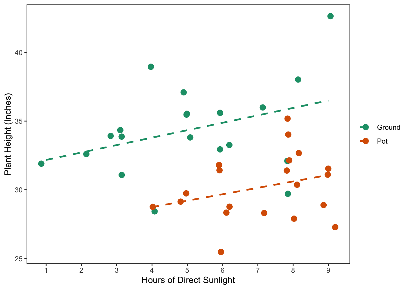
Sunlight and Height, controlling for Location. Trend lines are fit using simple linear regression. A small jitter of 0.2 is applied to the x-axis, so that all points are at least partially visible; the real data value for Sunlight can be identified as the closest whole number.
When using linear regression models to explore a relationship between an outcome and a predictor, it is common to focus on interpreting the estimated regression coefficients and their uncertainty. Indeed, these coefficients are the quantities that quantify the relationship and allow us to potentially make predictions about the outcome at certain levels of the predictor. However, in order for a linear regression model to make accurate predictions, we typically assume that the errors in the model are statistically independent, so that they are not correlated with anything. That is, the deviations between what the model predicts (what we call \(\hat{y}\)) and what we actually observe (\(y\)) is purely random.
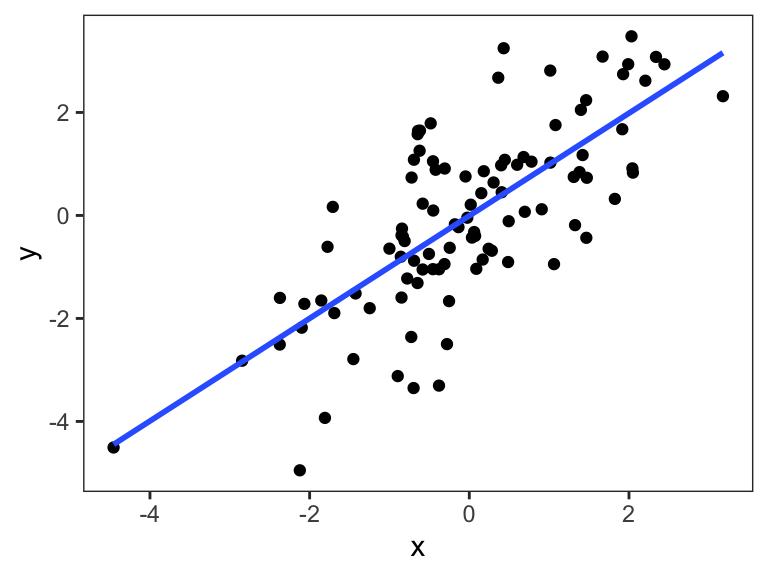
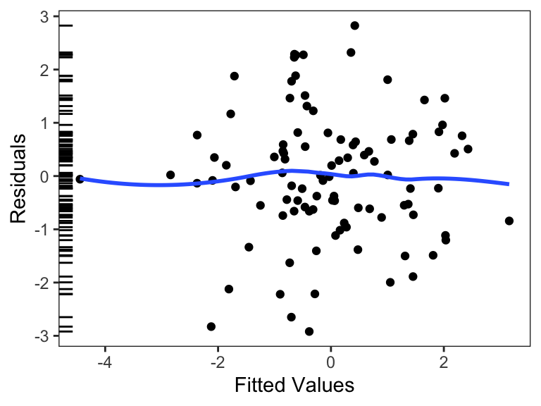
One check that we can make for any linear regression model is to look at the residuals of the model. The residuals are simply the deviations between the observed outcome \(y\) and the fitted value that the model assigns to a given value (\(\hat{y}\)). For a simple linear regression model with one predictor \(x\), after fitting a model and obtaining the estimates \(\hat{\beta}_0\) and \(\hat{\beta}_1\), we can compute for the \(i\)th observation, \[\begin{eqnarray*} r_i & = & y_i - \hat{y}_i\\ & = & y_i - \hat{\beta}_0 - \hat{\beta}_1 x_i \end{eqnarray*}\] Then we can examine the residuals \(r_i\) to see if they appear random or not. One useful plot is a plot of the residuals vs. fitted values, which is a scatter plot that places \(\hat{y}_i\) on the x-axis and \(r_i\) on the y-axis. If the assumption about the errors in a linear regression model hold, then this plot should like like purely random noise. Figure 13.5 gives an example of what we would ideally see in a residuals vs. fitted values plot for a small dataset. We can see in Figure 13.5 that there is no apparent pattern in the scatter plot, which is what we would expect.
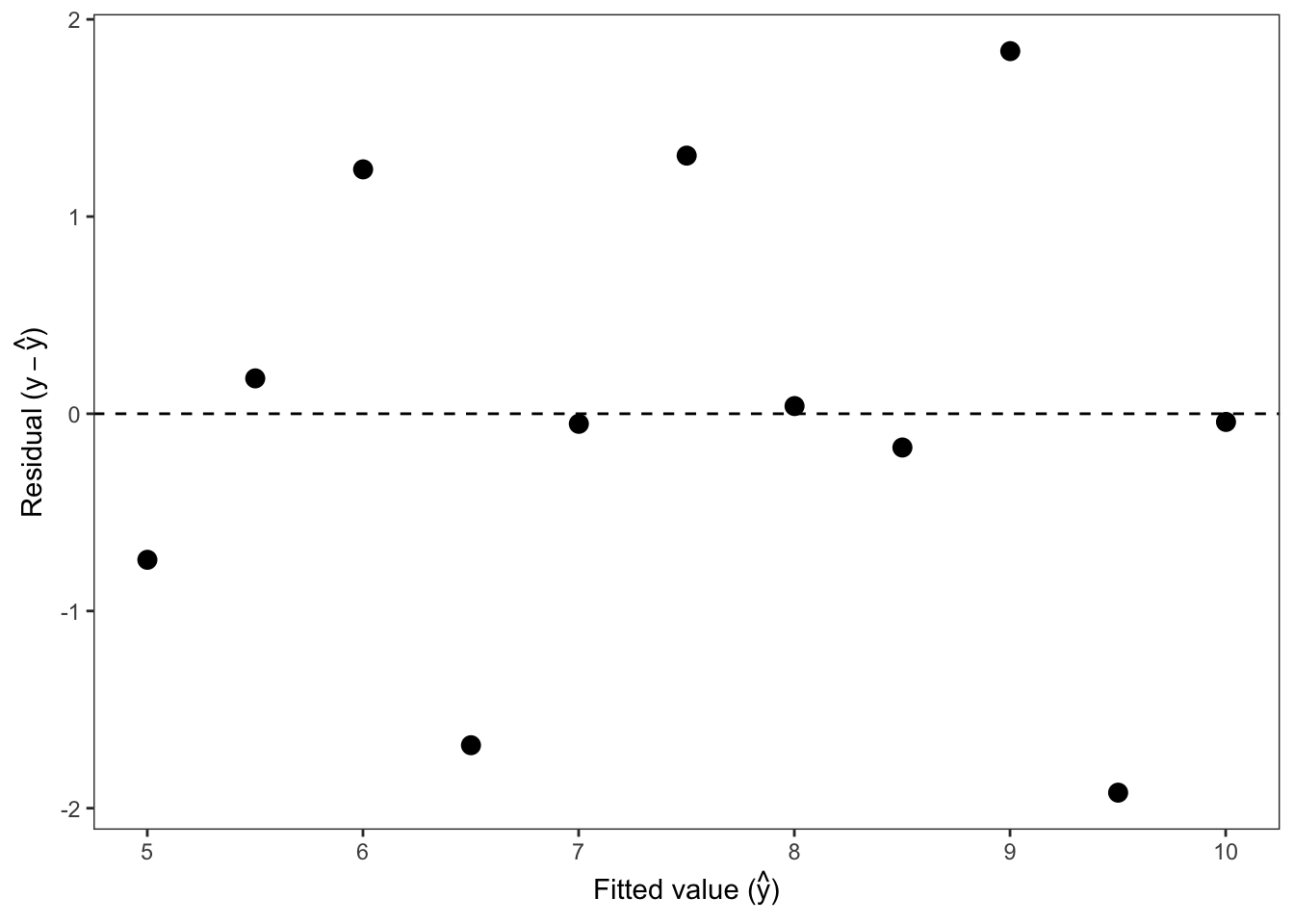
Table 13.1 shows a simple dataset with predictor \(x\) and outcome \(y\), along with fitted values and residuals obtained after fitting a simple linear regression model.
| x | y | Fitted value | Residual |
|---|---|---|---|
| 10 | 9.14 | 8.0 | 1.14 |
| 8 | 8.14 | 7.0 | 1.14 |
| 13 | 8.74 | 9.5 | -0.76 |
| 9 | 8.77 | 7.5 | 1.27 |
| 11 | 9.26 | 8.5 | 0.76 |
| 14 | 8.10 | 10.0 | -1.90 |
| 6 | 6.13 | 6.0 | 0.13 |
| 4 | 3.10 | 5.0 | -1.90 |
| 12 | 9.13 | 9.0 | 0.13 |
| 7 | 7.26 | 6.5 | 0.76 |
| 5 | 4.74 | 5.5 | -0.76 |
From the numeric values shown in Table 13.1, it does not appear that anything unusual is going on with the data. Table 13.2 shows the linear regression model output for this dataset, including the estimated intercept and slope and their 95% confidence intervals. Again, there is nothing in Table 13.2 that suggests a problem with the data or the assumptions that we make about the linear model. At this point, everything looks fine or as-expected.
| Model Term | Estimate | 95% CI (low) | 95% CI (high) |
|---|---|---|---|
| (Intercept) | 3.0 | 0.46 | 5.55 |
| x | 0.5 | 0.23 | 0.77 |
In Figure 13.6 we show the residuals vs. fitted value plot for the simple linear regression model corresponding to the data in Table 13.1. Here, we see that there is a clear nonlinear pattern in the residuals, something far from a pure random noise pattern. Given the clear pattern in the residuals, it would seem that the assumption we made for the errors in the linear model is incorrect and therefore out predictions may not turn out as we might expect them to. In particular, in certain ranges of the data we will systematically under-estimate the truth while in other ranges we will systematically over-estimate the truth.
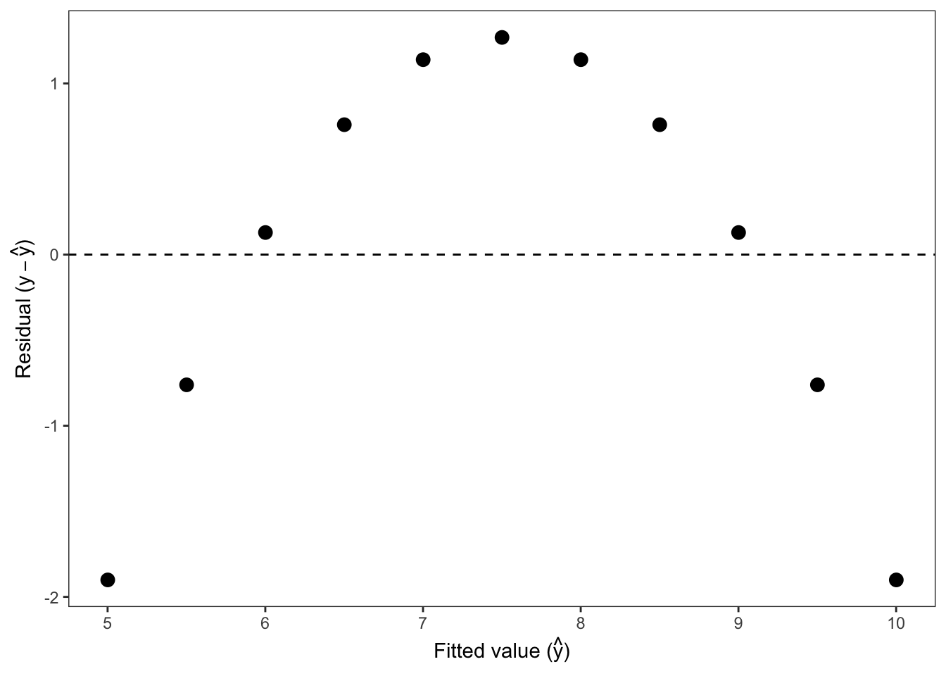
Upon seeing a residual vs. fitted value plot that looks like Figure 13.6, one’s first instinct should be that we need to use a different model. There is some systematic structure in the data that is not captured by the predictor \(x\) and therefore is “passed through” to the residuals. If the predictor \(x\) had been able to capture all of the structural variation in the outcome \(y\), then we would have seen pure noise in the residuals.
Model development, or the process of building and diagnosing models, is a complex process that we will only touch on here in the next two case studies. The purpose of this case study is to show that even though the data and model results may not indicate any serious issues, unexpected patterns can appear in the residuals which may only be apparent when visualized with a scatter plot. Fortunately, the residuals vs. fitted values plot is applicable not just for simple linear regression models like the one shown here, but for all linear regression models regardless of the number of predictors.
In many scientific applications we want to determine whether a key predictor of interest \(X\) is causally related to an outcome \(Y\). For example, we may want to determine if exposure to a certain air pollutant is causing increased hospitalizations for respiratory disease. In this kinds of settings, we are generally aware that there could be a possible confounding factor (\(Z\)) that might make it seem like \(X\) causes \(Y\) when in fact it is not true. The challenge is that in some cases it can be difficult for the data alone to tell us the truth.
We will start with some simulated data of \(X\), \(Y\), and \(Z\). The first few rows of the data are shown in Table 13.6.
| x | y | z |
|---|---|---|
| 0.80 | -0.51 | -0.78 |
| -0.64 | 0.25 | -0.58 |
| 0.35 | 1.32 | 0.66 |
| -0.05 | 0.73 | 0.09 |
| 0.58 | 1.64 | 1.26 |
A scatter plot of these two variables is shown in Figure 13.10.
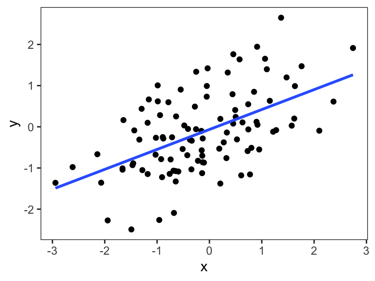
We can see that the two variables are positively correlated, with increases in \(X\) associated with increases in \(Y\). At this point, we might consider that there are two possible causal models that would be consistent with this scatter plot. Expressed as a directed acyclic graph (DAG), the first is the simplest, which is that changes in \(X\) causes changes in \(Y\) (Figure 13.11).
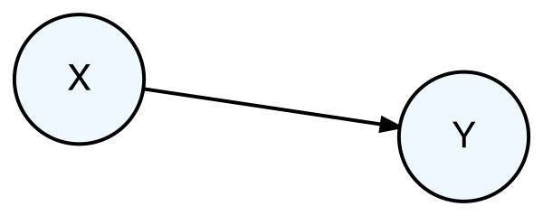
If this caual relationship were true, then we would expect observed measurements on \(X\) to be correlated with observed measurements of \(Y\) as in Figure 13.10.
A second scenario is that \(Z\) is a confounder of the relationship between \(X\) and \(Y\), as shown in Figure 13.12.
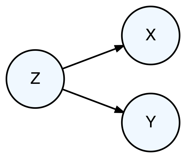
In this case, \(X\) does not cause changes in \(Y\), but data on \(X\) and \(Y\) would appear to be correlated because of their mutual relationship with \(Z\). Under this scenario, we would also expect that data on \(X\) would be correlated with data on \(Y\). In other words, this causal scenario is entirely consistent with the scatter plot in Figure 13.10 even though there is no direct causal relationship between \(X\) and \(Y\).
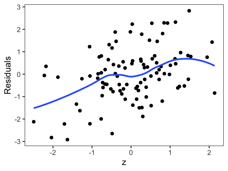
In this case, we can use the data to try to distinguish between the two scenarios. In particular, if the scenario in Figure 13.12 is true, then if we were to somehow control for the \(Z\) variable, there should be no correlation between \(X\) and \(Y\). Because we have data on the \(Z\) variable, we can do this directly by stratifying on the \(Z\) variable. We do this Figure 13.13 by dividing \(Z\) into four strata.
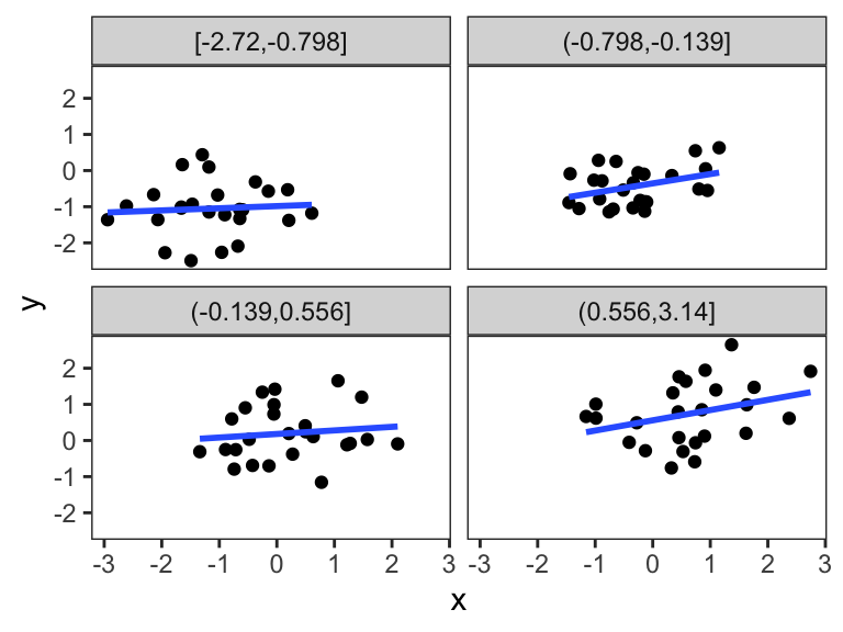
We can see in Figure 13.13 that the relationship between \(X\) and \(Y\) within each of the panels is relatively weak or nonexistent. This suggest that \(Z\) is in fact a confounder variable and that perhaps the second DAG is the correct one and that there is no causal relationship between \(X\) and \(Y\).
However, there is a third possibility for the causal relationships between these variables, and that is that \(Z\) is an intermediate variable between \(X\) and \(Y\). That is, \(X\) causes changes in \(Z\) and then \(Z\) causes changes in \(Y\) (shown in Figure 13.14). In this scenario \(Z\) is known as a mediator variable.
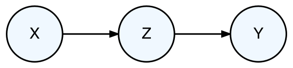
Under this third scenario, we would expect that data on \(X\) and \(Y\) would be correlated and we would expect that the relationship between \(X\) and \(Y\) would be null after controlling for \(Z\). Hence, the combination of Figure 13.10 and Figure 13.13 is consistent with both the “\(Z\) as confounder” scenario in Figure 13.12 and the “\(Z\) as mediator” scenario in Figure 13.14. Given the data we have, there is no way to distinguish between these two scenarios.
If this seems like a frustrating situation, that’s because it is! Identifying causal relationships from data can be very challenging simply because there are often different scenarios that have very different interpretations but are equally consistent with the data we observe. We often need to rely on our existing knowledge of the context and the scientific background to rule out certain scenarios when that data can’t do it for us.
The data for this case study come from the National Morbidity, Mortality, and Air Pollution Study (NMMAPS) of Samet et al. (2000). The original study examined air pollution and daily mortality in 20 cities. We have taken data from one city, New York City, New York. NMMAPS was a time series study whose approach is to correlate daily changes in air pollution (measured in \(\mu\)g/m\(^3\)), in this case particulate matter, with daily changes in mortality. The time series of the data are shown in Figure 13.15 for the years 2000–2002.
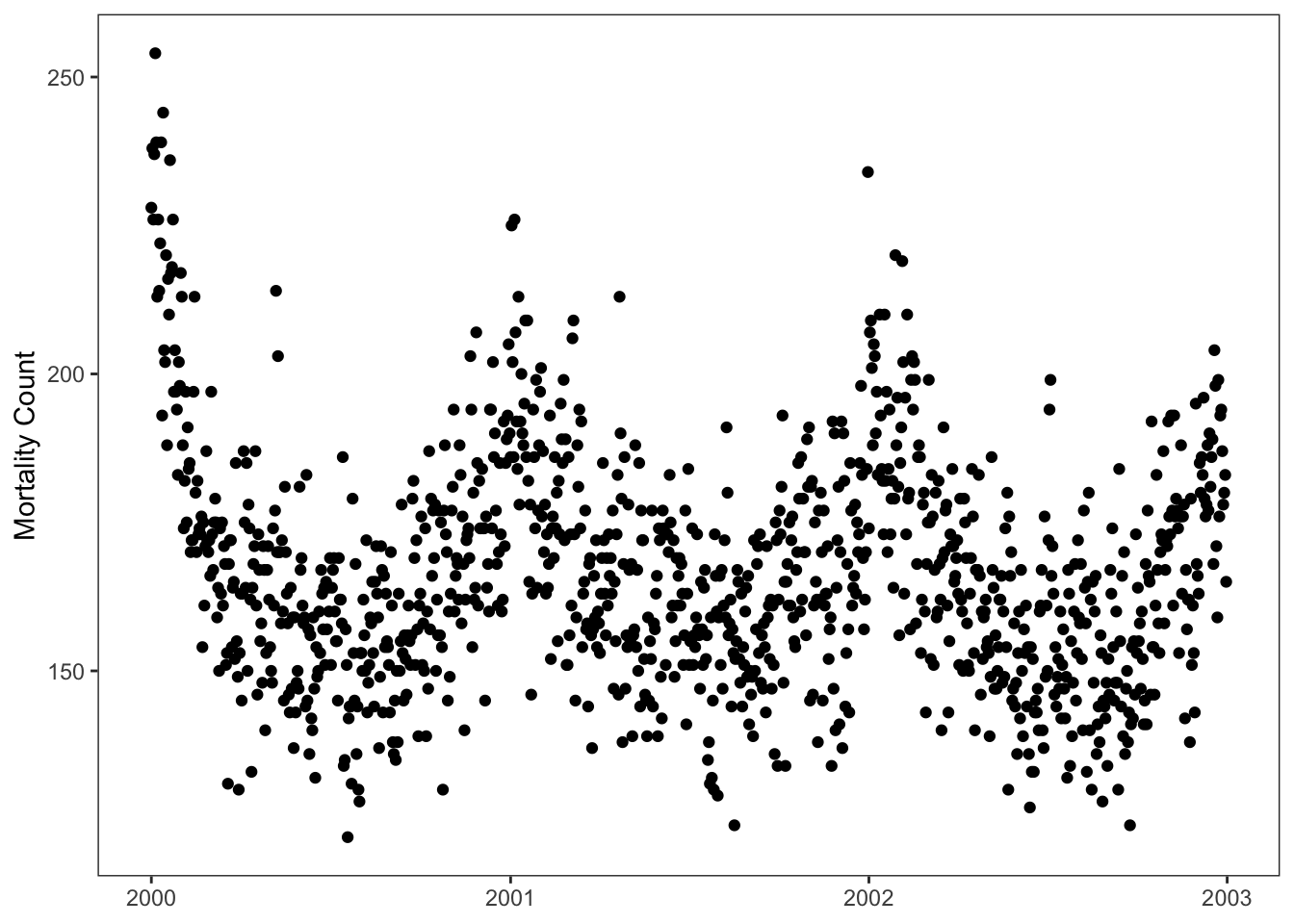
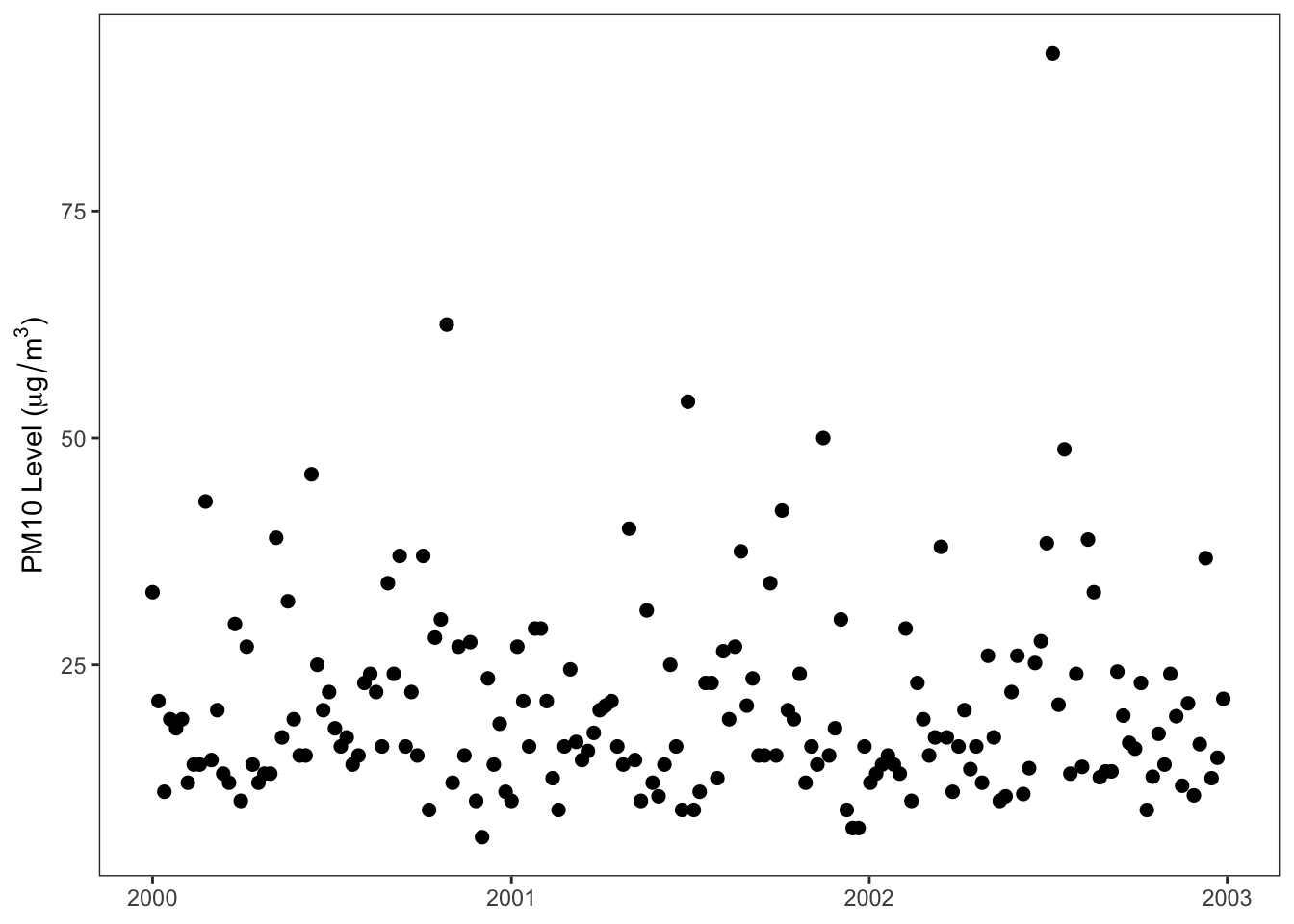
From Figure 13.15 we can see that daily mortality in New York ranges from 125 to about 250 deaths per day and daily PM20 ranges from about 6 \(\mu\)g/m\(^3\) to about 90 \(\mu\)g/m\(^3\).
An initial analysis might look at a scatter plot of mortality and PM10 to see if there is any relationship between the two. That scatter plot is shown in Figure 13.16.
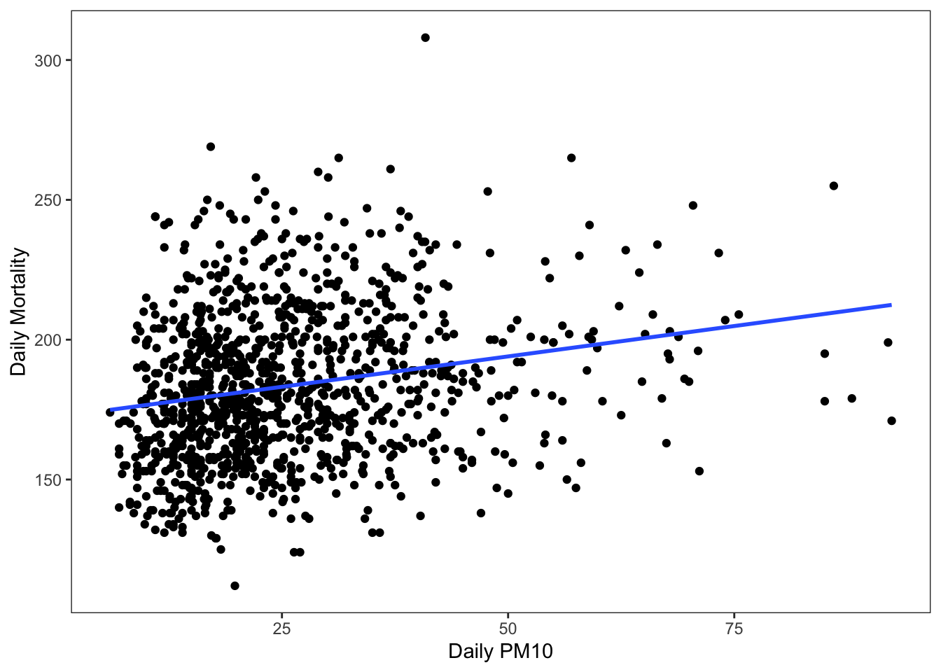
In Figure 13.16 there appears to be a slight positive correlation between PM10 and mortality and the overlaid linear regression line appears to slope upwards and to the right. This suggests that days witgh higher levels of PM10 are associated with higher daily mortality counts. We can further quantify this relationship with a simple linear regression model, whose results are shown in Table 13.7.
| Model Term | Estimate | 95% CI (low) | 95% CI (high) |
|---|---|---|---|
| (Intercept) | 172.30 | 168.93 | 175.66 |
| pm10 | 0.43 | 0.32 | 0.55 |
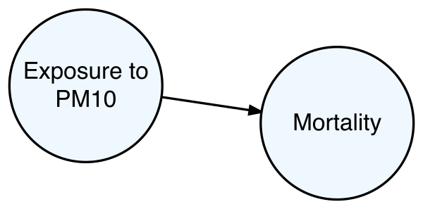
The scatter plot and the linear regression results are both consistent with a causal DAG that looks Figure 13.17.
However, we must question whether we in fact have the correct model. In particular, we must ask whether there may be other hidden factors that either completely or partially explain the observed relationship between PM10 and mortality in Figure 13.16.
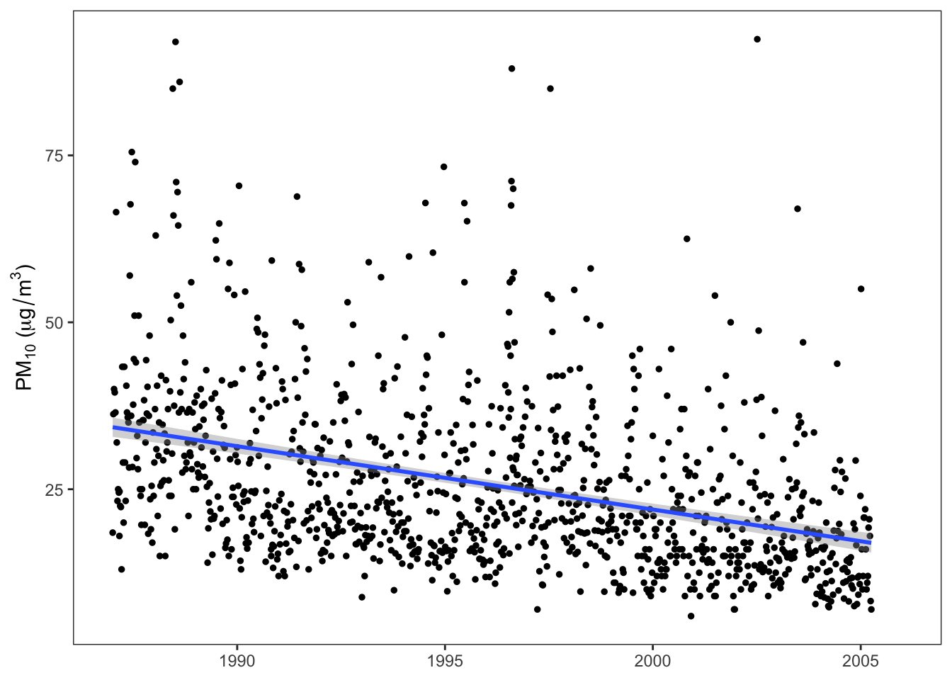
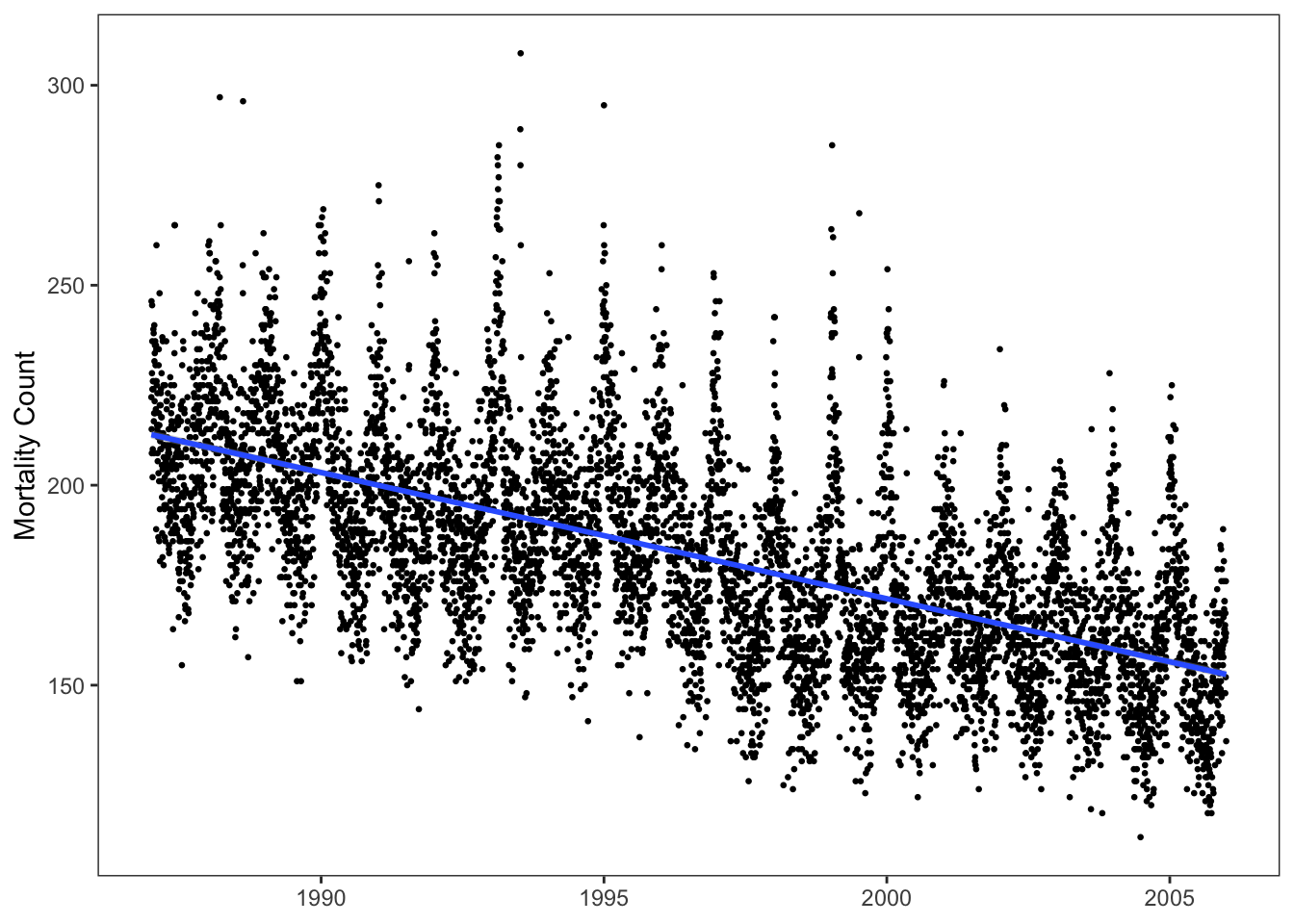
One thing that was not immediately obvious when looking at 3 years of data in Figure 13.15 was whether there were any long-term trends in the data. Figure 13.18 shows the complete dataset for both mortality and PM10 and it is clear that there is a downward trend in both PM10 and mortality.
y is a continuous numerical variable
y is a binary categorical variable
a and b and outcome variable y.
This downward trend could be caused by a number of different factors, including improved and cleaner industries, a decline in population, or an overall decline in the economy. Whatever the reason, those reasons could cause a correlation between PM10 and mortality to appear even if they were not causally related. In a scenario where “economic decline” is causing a long-term trend in both PM10 and mortality, we might have the causal DAG shown in Figure 13.19.
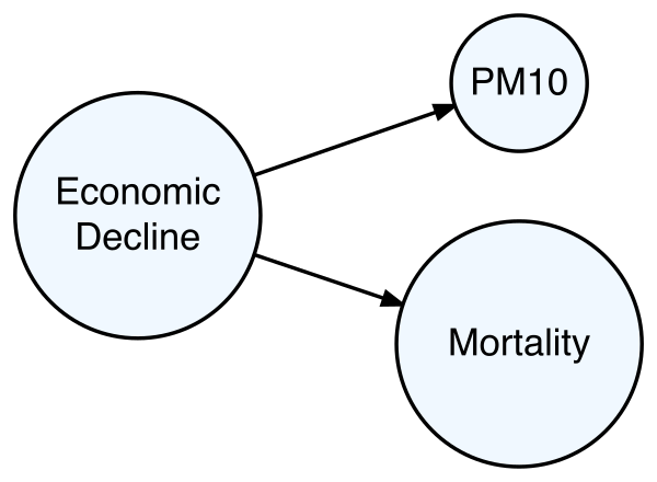
The idea here is that a decline in the economy could cause a decline in polluting industries, which would lead to a decline in pollution. Similarly, a decline in the economy could cause a decrease in population (i.e. people moving to other cities), which would lower the mortality counts for the city. Unfortunately, we do not in this dataset have any data on economic activity or other related factors. However, we can attempt to account for a long-term linear trend in the data by including the date variable as a linear term in the regression model. The results of this are shown in Table 13.8.
| Model Term | Estimate | 95% CI (low) | 95% CI (high) |
|---|---|---|---|
| (Intercept) | 264.284 | 255.971 | 272.597 |
| pm10 | -0.026 | -0.130 | 0.078 |
| date | -0.008 | -0.009 | -0.008 |
Table 13.8 shows that when we account for date as a linear term, there is a negative relationship between mortality and the date as shown by the negative coefficient for date. We also see that the pm10 coefficient here is much closer to zero (with a much larger standard error). The results in Table 13.8 are in fact consistent with the DAG in Figure 13.19, suggesting that these long-term trends are confounding the relationship between PM10 and mortality.
As a diagnostic check on this new model, we can look at a plot of the residuals from the model and the predicted values (Figure 13.20). We can see in Figure 13.20(a) that there is some oscillating in the blue smoother curve that suggests pattern in the residuals (which shouldn’t be there). A closer look at the residuals suggests that the pattern is quite regular and might be happening on an annual basis. One thing we can do is plot the residuals versus the season that they happen to fall in. Because “season” is a categorical variable and the residuals are continuous, we can make a series of boxplots of the residuals, one for each season as in Figure 13.20(b).
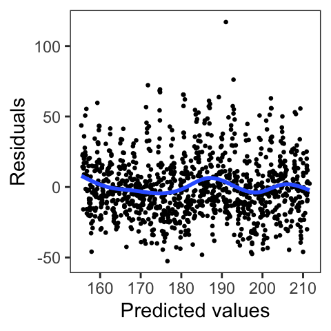
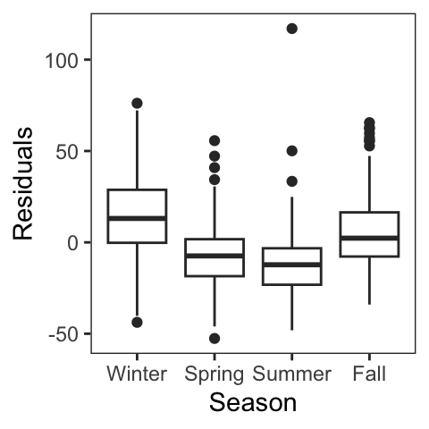
date variables.
Figure 13.20(b) shows a clear seasonal pattern in the residuals, with the winter and fall residuals being generally positive (so the model underestimates mortality there) and the spring and summer residuals being generally negative (the model overestimates mortality there). This clear pattern in the residuals represents an observed problem with the model that we can attempt to address by incorporating additional variables in the model.
One variable we can incorporate is a categorical variable representing the season in which a date falls. Such a variable would need to be constructed from the date variable as it is not included in the original dataset. An alternative would be to include the temperature variable, which also has a highly seasonal pattern that hopefully can capture the seasonal variation that we see in the data. Because we already have the temperature variable in the dataset, we incorporate that into the model here (Table 13.9).
date, and temp.
| Model Term | Estimate | 95% CI (low) | 95% CI (high) |
|---|---|---|---|
| (Intercept) | 282.41 | 275.05 | 289.76 |
| pm10 | 0.40 | 0.30 | 0.50 |
| date | -0.01 | -0.01 | -0.01 |
| temp | -0.74 | -0.81 | -0.67 |
Table 13.9 shows the results of the linear regression model incorporating temperature into the model. We see that on average, higher temperature days are associated with lower mortality days (temp coefficient is negative). We also see that the pm10 coefficient is larger than before, with higher pollution days associated with higher mortality days (pm10 coefficient is positive). A 1 \(\mu\)g/m\(^3\) increase in daily PM10 is associated with an additional 0.4 deaths per day, on average. Moreover, the very small standard error and confidence interval that excludes zero for the pm10 coefficient suggests that this coefficient is actually different from zero.
A check of the residuals versus the predicted values is shown in Figure 13.21. We see from Figure 13.21 that there is no obvious pattern in the residuals (although there is one significant residual outlier that may deserve investigation).
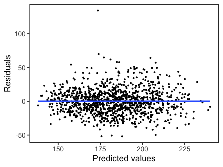
Does this mean that we now have the “correct” model. No, but what this means is that we must once again start thinking about possible unobserved problems and whether we have a good understanding of the data-generating process.
In the United States, the Clean Air Act was a law passed in 1970 in part to address the public health consequences of environmental contaminants such as air and water pollution. Before its passage, there had been a number of severe air pollution events—one in Donora, Pennsylvania and another in London, England (among others)—that had resulted in significant excess mortality and morbidity. While extreme levels of particulate matter (i.e. dust) air pollution were thought to be harmful to human health, at that time there was very little real data on whether normal everyday levels of air pollution were a problem. Opinions ranged from air pollution having no effect on health to air pollution causing severe health consequences. (Bear in mind that at this time, cigarette smoking was still considered by many to be a harmless activity despite the Surgeon General’s warnings.)
The Harvard Six Cities Study was initiated in the 1974 to address this question of whether typical levels of air pollution were harmful to the public’s health. The investigators collected data in six different U.S. cities (hence, the name). In each of those cities they collected data on particulate matter air pollution concentrations and information about the causes of deaths of people living in those cities. In analyzing the data, the study investigators found that when comparing the most polluted city in the study (Steubenville, Ohio) to the least polluted city (Portage, Wisconsin), the people living in Steubenville had a 26% higher risk of mortality compared to the people living in Portage. This was considered a very large risk associated with simply breathing ambient air pollution.
The estimated mortality risk from air pollution was so large that the original investigators barely believed it themselves. Rather than rush to publication, the investigators attempted to replicate the findings in an independent population of people. Luckily for them, there was another dataset available from the American Cancer Society’s Cancer Prevention Study, which was originally a study of the effects of smoking. The Harvard investigators linked the people in the ACS study with available air pollution data for the communities in which they lived and compared their mortality rates. What they found in the ACS population was broadly consistent with what they found in the original Six Cities Study: People who lived in more polluted communities tended to die at higher rates than people who lived in less polluted communities.
The original Six Cities Study was published in 1993 in the New England Journal of Medicine and the ACS study was published two years later in 1995 in the American Journal of Respiratory and Critical Care Medicine. Details about how the authors analyzed the data can be found in those papers. Upon their publication, there was surprise in much of the scientific and policy community given how large the estimated air pollution effects were. In fact, numerous scientists and policy-makers were severely critical of the study and its data analysis. So significant was the controversy, that the Health Effects Institute, an independent non-profit organization, commissioned an independent re-analysis of the Six Cities Study data. The re-analysis largely confirmed the findings of original analysis and also conducted some additional (new) analyses of the data. In the decades following the publication of the Six Cities Study, numerous follow-up studies have been conducted in different populations and settings and have found results that are generally consistent with the original Six Cities Study.
Sources: Pope and Dockery (2025), Dockery et al. (1993), Pope et al. (1995)
How can we think of the story of the Six Cities air pollution study in the context of assumptions, expectations, alternatives, and perspective? At the time the study was initiated, there was very little direct evidence of the health effects of outdoor air pollution on human populations. As a result, assumptions about what those effects are were wide-ranging, sometimes reflecting people’s own biases and personal motivations. Some scientists were skeptical that it was in fact air pollution that caused increased mortality, and instead attributed the observed correlations to other factors (sometimes referred to as confounders). It would be an understatement to say that the results of the Six Cities Study were questioned and challenged. The very large effect of air pollution on mortality that was found in the study was highly unexpected to some people and was surprising even to some of the investigators.
The need to replicate the original study in an independent population was a direct result of the investigators considering alternative explanations for their findings. Furthermore, the investigators anticipated that others would seriously question the validity of such a significant (and surprising) result. In a study like the Six Cities Study, even though a large association was observed between air pollution and mortality, there is always the possibility that air pollution does not cause mortality and that other (hidden) factors are causing the association to appear. When replicating a study in an independent population, the hope is that if there were hidden factors in the original study that cause the investigators to come to the wrong conclusion, then perhaps those factors will not be present (or not be as strong) in the new population of people. The fact that the replication study found a similar association betwen air pollution and mortality lends credence to the hypothesis that air pollution does cause mortality.
In the broader policy debate surrounding air pollution regulation and the implications of the Six Cities Study (and its successor studies), many different opinions were voiced, representing a wide range of perspectives. One could argue that this represented a large-scale version of many people having very different reactions to the exact same data analysis. Those different reactions were due, in part, to each person’s perspective about what the truth really is and what are the underlying processes that generate the data.
In January 2026, Apple reported their earnings for the 3 months that ended on December 31, 2025. In the press release for the earnings report, Apple CEO Tim Cook noted that “Apple is proud to report a remarkable, record-breaking quarter, with revenue of $143.8 billion, up 16 percent from a year ago and well above our expectations.” [emphasis added] The most popular product sold by Apple is the iPhone and that quarter CEO Tim Cook noted that “iPhone had its best-ever quarter driven by unprecedented demand….”
One of the most difficult tasks for a company like Apple that sells hardware products is to estimate the demand for that product. They need to know how many people will buy iPhones in the next 3 months? If the company’s estimates are too low, then the company will not make enough products and customers will either have to wait for products to be in stock or turn to a competitor company. If the company’s estimates are too high, then they will spend too much money on making too many iPhones, which will in turn sit on store shelves.
The public statements that Apple made in January 2026 suggest that Apple underestimated the demand for iPhones, given that sales were “well above our expectations”. Apple does not publish the number of iPhones they sell in a quarter, but some financial analysts estimated the number to be over 85 million phones that quarter.
Although the company does not discuss publicly its internal deliberations about its sales demand estimates, we can speculate about what kinds of assumptions a company like Apple would have to make in order to estimate sales demand for a future quarter. One possible assumption that they made is that sales for the current iPhone model (iPhone 17) would be similar to sales of the previous year’s model (iPhone 16). In that case, we could crudely model sales as \[ \text{iPhone 17 sales} = \text{iPhone 16 sales} + \text{variation} \] where the “variation” in the equation would reflect global phenomena that affect sales but are difficult to measure. Because iPhone 16 sales are already known to the company, the question then is what is the size of this variation? Is it on the order of 2 million or 20 million? Assumptions about the size of this variation would drive estimates of iPhone 17 sales.
Another assumption that could be made is that iPhone 17 sales will reflect a generally increasing trend in iPhone sales over many years. A crude model here might be \[ \text{iPhone 17 sales} = \text{iPhone 16 sales} + \alpha\text{Year} \] Here, the parameter \(\alpha\) represents the increase in sales from one year to the next. In this model, the value that is assumed for \(\alpha\) will influence the estimate of iPhone 17 sales for the coming year.
In this case study, each approach to estimating the iPhone 17 sales were based on an assumption that would determine the future estimate. It can be important to develop an understanding of how sensitive the sales estimates are to these particular assumptions and to perhaps gather some information about what kinds of assumptions should be made (i.e. the size of the “variation” or the value of \(\alpha\)).
Data analysis in the real world is a multistep process that requires the careful consideration of many different components—your assumptions, your data, your tools and methods, your results—and the interplay between them. As such, at each step in the process, it is critical for analysts to be asking the following questions. What result do I expect to get? Is the result I actually got as-expected or unexpected? What are alternative explanations for the result I got? As illustrated in the case studies in this chapter, these questions help analysts to identify and navigate the problems and anomalies that arise in data analysis as well as thoroughly examine the conclusions that they have drawn from a data analysis.