12 Data Analysis In The Real World
One of the realities of doing data analysis is the involvement of human beings, both those who are doing the analysis and those who are consuming or reviewing the analysis. People bring their own perspectives and past experiences to any data analysis and those perspectives will guide the kinds of assumptions they may make about the data-generating process. This variation in perspectives can often lead to vigorous debate about the interpretation and meaning of a given data analysis result. A person’s perspective (or past experience) can also mislead them into thinking a result is true even though there may be an alternative explanation that is more likely. When doing data analysis it is important to recognize people’s differing perspectives and anticipate what questions or objections they may have to the analysis.
In this chapter we will talk about the role of assumptions about the data-generating process and how those assumptions lead to expectations or predictions about what we will observe in the data. We will then discuss the nature of unexpected and as-expected results and conclude with the consideration of alternative explanations of the data. All of these ideas taken together lead us to the iterative process of data analysis, which is how data analyses move forward in the real world.
12.1 The Data-Generating Process (Revisited)
The data-generating process is a concept that we introduced in the beginning at Chapter 1. It is a concept worth revisiting here to consider how our view of the data-generating process can affect how we analyze data. We often make assumptions about the data-generating process and different people will make different assumptions about how the data-generating process works.
Our assumptions about the data-generating process will lead to certain expectations for what the data will ultimately look like. These expectations are effectively predictions about the eventual observed data. These expectations may not be completely specific and we may allow for some uncertainty or a range of plausible expectations.
Although it might seem to be better to have an “open mind” about the data before you see them, it is actually critical to have some sort of expectation about what you will see before you see it. The reason is that errors can occur in any data analysis, either as part of the data collection process or the analysis itself, and having some expectation for the result can help to track down the source of those errors.
12.2 Expectations and Predictions
One of the most important parts of a data analysis occurs before we even see the data. This is the part where we develop some expectations for what the data will look like and what their characteristics will be. This part is important because it involves mentally preparing yourself for what the results of your analysis computations will be based on everything that you know and all of the experience (if any) you have had working on a given problem. Once you have prepared yourself in this manner, you will be able to judge the observations that you make from the data and determine whether there are any problems with the data or if it is possible to move on to the next step.
Let’s revisit the coin flipping example that we introduced back in Chapter 1. Suppose we observe person flipping a coin 10 times in a row, and that this coin has a “heads” side and a “tails” side that are distinguishable. In this example, the data will be an indicator of whether the coin landed “heads” or “tails”. Before the person even flipped a single coin, you might have some expectations for what the data would look like. You might expect that of the 10 flips, about half would land heads and half would land tails. Perhaps something like 4 heads and 6 tails would be expected. If you observed something like 9 heads and 1 tails, that might be unexpected.
It’s important to realize that our expectations do not materialize out of thin air. Rather, they are based on a set of assumptions that we make about the data-generating process. In the coin example, the data-generating process involves the person doing the flipping and the coin itself. What are some assumptions that we make about this process?
The coin has two distinguishable sides, a “heads” and a “tails” (i.e. it is a fair coin);
The person doing the flipping is doing so in an uncontrolled random manner so that the coin will land heads or tails with probability about 0.5.
These assumptions might come from our daily lives dealing with coins and with people. Most coins that we encounter (in the United States) have two different sides and perhaps most people that we encounter do not have any special ability to flip a coin. Therefore, it might be reasonable to believe that the two assumptions stated above are true. Given these assumptions, we expect to observe about half heads and half tails. In other words, we are making a prediction about what the data will show based on our assumptions about the data-generating process.
In general it is also worth considering the data collection process when building expectations about what the data will show. Here, we are simply observing the person flipping the coin and directly seeing the result of the flip. It seems that little could go wrong with this particular data collection process. But recall that in Chapter 1 we also described a data collection process that was filtered through multiple intermediary people. In that scenario, it is perhaps more likely that the data may be corrupted as it travels between its origin point and you.
Before seeing the data, it can be useful to think about how the assumptions that we make about the data-generating process might in fact be false. This can be challenging because first, one might believe strongly that one’s assumptions are true, and second, there might be many different ways that an assumption could be violated. Nevertheless, it can be useful to go through the exercise. Some ways that the assumptions above might be false would be if
The coin actually has two “heads”, so that both sides are indistinguishable;
The person doing the flipping is actually a trickster and can control the flipping process so that the coin always lands on heads.
One reason why it can be useful to consider alternative assumptions is that there may be other people observing the same data as you are and they may make different assumptions about the data-generating process. We will discuss this scenario later in the chapter.
Through this simple coin flipping example, we have briefly demonstrated a few principles that can be applied in any data analysis. These principles relate to assumptions about the data-generating process, expectations and predictions, and alternative explanations.
12.2.1 Why Are Expectations Important?
Every analyst brings their own perspective to a data analysis and it’s important to recognize that when looking at data. For any data analysis, there are often a few perspectives that you need to consider:
Your own perspective as the analyst working with the data and doing the analysis;
The perspective of any potential reviewers or critics of your work, perhaps as part of an internal review board at your organization, a managing superior (i.e. your boss), or a peer reviewer in an academic setting;
The perspective of a potentially broader audience who may encounter your analysis later on and interpret it against the backdrop of their own experience.
A key question an analyst has to ask is to what extent are these perspectives aligned? Because if there are disagreements about assumptions or expectations about how the data are generated and what an analysis will show, an analyst needs to be prepared for this disagreement and perhaps anticipate it by conducting further analysis (if possible).
For the analyst conducting the data analysis, expectations are critical as a kind of mental “sounding board” for considering the results of the analysis. With no expectations (or at least very diffuse expectations), there is no real basis for the analyst to question the results that are observed. With no expectations, every result is acceptable and data analysis becomes a mechanical, rote process where data are inputted and results are outputted. But a fundamental aspect of a data analyst’s job is to question and challenge the results, if only because those results are likely to be questioned and challenged by others with a different perspective.
That said, it is important to be humble about one’s own expectations, and let the data do the talking if the data collection process is verified to be clean. Excessive confidence about one’s own understanding of the data-generating process is not a good strategy and can lead to mistaken or flawed conclusions. Finding the proper balance between letting the data speak for themselves and leaning on one’s own expectations about the data is accomplished over time with extensive experience working with specific kinds of data.
12.3 Unexpected and As-Expected Results
The combination of our assumptions about the data-generating process and the actual data that we observe results in two broad classes of results in a data analysis: unexpected results and as-expected results.
Unexpected results occur when we observe data that are outside of what we would have expected to have seen given our assumptions about the data-generating process. Unexpected results provide direct evidence from the data that challenge our underlying assumptions and typically drive subsequent follow-up actions taken with the data. There may be further investigations that are taken in order to explain why the unexpected result occurred. Unexpected results are sometimes disappointing, but in a way are easier to deal with because we have an immediate indication that something is off.
As-expected results occur when the observed data are within the bounds of what we might expect and therefore are not surprising. As-expected results do not directly challenge our underlying assumptions about the data-generating process and do not generally indicate that anything is wrong with the data. As-expected results seem satisfying at first because they appear to “confirm” our prior assumptions. But results that meet our expectations should be viewed with caution.
What happens after an unexpected or as-expected result is part of the overall iterative process in data analysis. In general, follow up work is needed to rule out possible alternative explanations or assumptions and to learn as much as possible about the data-generating process.
12.3.1 Interpreting Unexpected Results
Suppose in the coin flipping example above that out of 10 coin flips, we observe 9 heads and 1 tails. Without any assumptions about the data-generating process, we might “let the data speak for themselves” and let the result stand as-is. However, under our original assumptions of the coin being a fair coin and the person flipping the coin doing so in a purely random manner, this result is somewhat unexpected (but not impossible).
There are three broad ways in which we can interpret the evidence provided by an unexpected result:
Our assumptions about the data-generating process are incorrect;
Our assumptions about the data-generating process are correct and we have simply observed a highly unlikely (but not impossible) result;
Our assumptions about the data-generating process are correct, but there was a problem in the data collection process or the data analysis that resulted in data that were unexpected.
If we observe data that are not consistent with our assumptions, then we might be inclined to conclude that our assumptions are incorrect (perhaps, out of humility). However, it is important not to immediately reject our original expectations without considering the other two interpretations. The second interpretation is the essentially the realm of traditional statistical inference, which deals with determining how unusual a result can be while still being consistent with our assumptions about the data-generating process. The third interpretation is important because data collection and programming errors of varying degrees are common in the real world. But we cannot detect them if we do not make any assumptions about what the data should look like. If we do not have any expectations about what we will observe in the data, then we have no choice but to accept the data and results as they are.
CautionHighly Deadly Air Pollution?
One of us was involved in an analysis of air pollution and mortality data in a national study in the United States. The analysis effectively involved a linear regression model relating annual mortality rates (the outcome) with annual average concentrations of outdoor fine particulate matter pollution, or PM\(_{2.5}\) (key predictor). Estimates from the regression model seemed to suggest that a 1 unit increase in PM\(_{2.5}\) was associated with a 250% increase in annual mortality. Although this was “what the data say,” decades of research into the effects of PM\(_{2.5}\) and mortality suggested that a 1 unit increase in PM\(_{2.5}\) should be associated with a much smaller increase in mortality, somewhere in the range of 5%–15%. A 250% increase in mortality is far outside what we would have expected to see. In this case, it turned out that a programming error in how the data were processed had lead to this erroneous estimate of risk and the final estimate ended up being around 12%. If we had not had any expectation for what the mortality risk estimate should have been, it’s not clear if we would have caught this error until much later (perhaps when someone else pointed it out to us).
Given that our assumptions about the data-generating process drive our expectations about the data, it can be important to assess how sensitive our expectations are to the assumptions we make. If an expectation or prediction about the data is highly sensitive to an assumption being true, then we may want to double check how sure we are about that assumption, because slight deviations from that assumption may result in large changes to the data. Assessing the sensitivity of expections to assumptions is related to the idea of developing alternatives, which we discuss later in the chapter.
12.3.2 Interpreting As-Expected Results
One of the most challenging situations to encounter in a data analysis is when everything looks fine. In other words, everything—the results, parameter estimates, performance metrics, plots—is as-expected. If something in your data analysis is going to go wrong, seeing a problem or an unexpected result in your dataset is the ideal scenario. This is because the data themselves are telling you that your expectations are incorrect or that you have some misunderstanding of the data-generating process. With this kind of evidence, you can go about investigating the source of this mismatch between data and expectations and try to resolve this divergence in your understanding of the data.
When everything looks fine, there isn’t an explicit cue to get you going on your investigation. It takes a certain level of suspicion and skepticism on the part of the data analyst to question whether everything is in fact fine. This skepticism is not always a natural instinct for many people but it is an important part of any data science activity.
In particular, there are two things that could be true even when results are as-expected:
There might be a problem with the data collection process or data analysis that resulted in the result being as-expected;
Even though the data appear consistent with your assumptions about the data-generating process, there might be an alternative set of assumptions that are equally likely or even more likely to be true given the observed data.
Both unexpected and as-expected results lead us to the same place, which is that we need to consider alternative explanations for what we observe. We will discuss the concept of alternatives in detail in the next section.
12.4 Alternative Explanations
One consequence of the manner in which assumptions are made is that different analysts, with different past experiences, will often make different assumptions about how the data are generated. For simple processes like coin flipping, it is likely that different people will come to the same set of assumptions about the data generation. However, for more complex problems, like outdoor air pollution and health, reasonable people might develop different sets of assumptions about how the data are generated.
Developing good alternative explanations is a skill that comes with knowing the subject matter well and having experience with the kinds of data being analyzed. In general, a good alternative explanation has the following properties:
It is consistent with the data and the observed results;
It is mutually exclusive from the other proposed alternative explanations, so that two alternatives cannot be true at the same time.
The first property is a requirement because if an explanation is not consistent with the data, then it is not really an explanation at all. It does not help explain how the data were generated. The second property is not strictly required, but having mutually exclusive alternatives can simplify proposing future analyses of the data as part of an iterative cycle.
12.4.1 Before Seeing the Results
Even before seeing the data or the results of an analysis, it is useful for an analyst to come up with alternative assumptions about the data-generating process in order to anticipate possible unexpected results. Widening the set of possible explanations doesn’t mean that significant weight has to be given to those explanations, but rather that the possibility of such explanations being true should be acknowledged. Furthermore, it can be useful to develop these alternatives in order to anticipate possible criticisms from other analysts who may make different assumptions or at least disagree with the assumptions you have made.
Suppose, for example, that in the coin flipping example we observe that out of 10 coin flips, all 10 landed heads. If we assume that the coin is fair and the flipping is random, then this is an extraordinary result and we might be very surprised to observe these data. However, if another person assumes that the coin has two “heads” or that the person doing the flipping is a trickster, then they might not be surprised at all. Therefore, given the exact same dataset, two different people can have very different reactions. The difference in those reactions is not a result of the data (because the data are the same for everyone), but rather a result of the assumptions made about the process generating the data.
If you are an analyst and see that others have a very different reaction from you to some data, it can be useful to try to understand what assumptions they are making about the data generating process. Developing possible alternative assumptions before you do a data analysis can help later when you have to present your analysis to people who may think differently from you.
12.4.2 After Seeing the Results
Being skeptical of the conclusion in a data analysis is an appropriate stance, but it is not in and of itself a productive contribution. Saying or thinking “I don’t believe this result is true” does not help to move the analysis forward. The primary goal when “everything looks fine” is to generate alternative explanations that are consistent with the data you observe but tell a different story. Ideally, these alternative explanations are testable with the data that you have so that you can use the data to discriminate between the original conclusion and the alternate one.
We discussed the idea of alternative explanations in the context of developing expectations for what the data will look like. There, we discussed how different people with different (alternate) expectations for the data will have different reactions once the data are observed. Specifically, people who have different hypotheses about the data-generating process have different expectations for the data that will ultimately be generated. Previously, the discussion centered around considerations before we see the data.
Here, we are considering the inverse problem, which is that we have now seen the data and must develop hypotheses about how they were generated. We may have an initial conclusion about the data-generating process, but we must also develop alternate explanations that challenge that initial conclusion. If the data ultimately reject those alternate explanations, then we can be more confident that our initial conclusion is likely to be true. But if we identify alternate explanations that are equally well-supported by the data (or perhaps better-supported), then we cannot so easily reject them as false.
NoteDifferent Reactions to the Same Data: The Utah Valley Study
In the book Particles of Truth, economist and air pollution researcher C. Arden Pope III writes about an analysis of air pollution data in Utah Valley. In 1984 he noticed that a local steel mill in Utah Valley had been closed for a year and then re-opened. When he analyzed data on outdoor air pollution and admissions for respiratory illnesses in a nearby hospital, he noticed that admissions were lower when the mill was closed and increased when the mill re-opened. Pope concluded that the results indicated that air pollution from the steel mill was contributing to respiratory disease. Pope then writes that “when the research became public, the owners, operators, and political supporters of the steel mill unleashed a barrage of criticism…” The steel mill hired a medical consultant to conduct a separate research study, which concluded that the increase in respiratory admissions was due to a virus and not local air pollution. This consultant was proposing an alternative explanation for the observed increase in respiratory admissions.
In addition to developing alternative explanations for the data-generating process, we may also consider developing alternatives for the data themselves and for the programming that led to the initial conclusion. Each of these areas may have problematic components that lead us to the result that we observe. For example, it is possible that a bug in our programming caused a result to appear consistent with our original expectations for the data. It might be that “everything looks fine” but the reality is that our observations were caused by a problem in the programming. Healthy skepticism of the programming and the data collection is usually warranted.
12.4.3 Example: Evaluating a Manufacturing Process
When manufacturing a product, it is common for processes to have a certain rate of defects in which case flawed products are produced that either must be discarded or at least used for a different purpose. In general, it is desirable for a manufacturing process to have a low rate of defects in order to preserve resources and minimize waste.
Suppose two managers are evaluating a new process for manufacturing a product and want to determine what is the defect rate for the process. Based on many years working in the industry, Manager 1 expects the defect rate to be 1 in 10 products, or 10%. Manager 2 is new to the company but has experience in a related industry and expects the defect rate to be closer to 50%. Because the process is expensive to operate, the two managers first agree to do a limited test run and produce 4 products.
Before seeing the data, based on the planned production run of 4 products, we can say the following:
| Explanation | Expected Failure Rate | Expected Number of Defective Products |
|---|---|---|
| Manager 1 | 10% | \(< 1\) |
| Manager 2 | 50% | \(2\) |
Given the expectations in Table 12.1 we can ask what observation might be as-expected? The answer to that question is shown in the table in the right-most column. We might also ask what observation would be unexpected? If we observed 4 defective products, that would be surprising, albeit more so for Manager 1 than for Manager 2. Under Manager 1’s expectation of a 10% defect rate, the probability of observing 4 out of 4 defective products is 0.0001. If we observed 0 defective products, that would be somewhat surprising for Manager 2 and not surprising at all for Manager 1. Under Manager 2’s expectation of a 50% defect rate, the probability of observing 0 defects is 0.06—a low probability but not an impossibility. (We use the binomial probability distribution to calculate these probabilities.) Even before seeing the data, we can predict that for certain observed values, one manager might be more surprised at the result than the other, based on their expectations for how the manufacturing process works.
Suppose that upon completing the production run, the result is 1 defective product out of 4, or an observed defect rate of 25%. This number is in between what either manager expected. Given the small production run and the small amount of resulting data, either manager could argue that their assumption is correct, given the data. The problem here is that the evidence from the data is not quite strong enough to discriminate between the two alternatives.
The managers decide that they need more data and decide to manufacture another 4 products. When they do so, the second batch has 0 defective products out of 4. Combining the two batches, there are a total of 1 defective product out of the 8 that were manufactured, giving an observed defect rate of 12.5%. Under Manager 1’s expectation, the probability of observing 1 defect out of 8 products is about 0.38, so the result is more or less as-expected. Under Manager 2’s expectation the probability of observing 1 defect out of 8 is about 0.03, which might be unexpected. Given the data so far, Manager 1’s assumed defect rate of 10% is \(0.38/0.03=12.7\) times more likely than Manager 2’s assumed defect rate of 50%. The data are leaning in Manager 1’s favor but perhaps not yet convincingly so.
At this point a third manager comes into the factory and sees the results of production run of 8 products. Manager 3 is shocked at the result (1 defective product out of 8) and wonders if Managers 1 and 2 are misinterpreting the data. The reason is that Manager 3 had previously used the same process to build a slightly different product and had seen a defect rate of about 80%. In fact, the defect rate was so high, Manager 3 decided not to use the process at all for this other product. Under Manager 3’s expectation, observing 1 defect in 8 has a probability of about 0.00008, so the result of 1 defect in 8 is highly unexpected from Manager 3’s perspective.
Upon seeing the data from the the first two batches of 4 products, Manager 3 is effectively considering the following alternative explanations:
The data are valid and the defect rate is closer to 10% (i.e. Manager 1’s expectation), which is currently the most likely of the three different expectations (i.e. 10% vs. 50% vs. 80%);
The data have been misinterpreted and the observed defect rate is artificially low; the true defect rate is actually much higher.
Both explanations here are consistent with the observed result of 1 defect out of 8 but they cannot both be true at the same time (they are mutually exclusive). In other words, the true defect rate cannot be “closer to 10%” and “much higher” at the same time. The question now is what can Manager 3 do to discriminate between these two explanations given that they are both equally consistent with the current data?
One option is to simply run the process further and produce 4 more products to see how many are defective. However, this options would likely just produce data that were similar to the first two batches. If Manager 3 is worried about problems with the data, it’s possible that this third batch would also be misinterpreted. Adding more data in this manner would not allow for discriminating between Manager 3’s two alternatives.
Another option would be to have a fourth person, someone other than Managers 1 and 2, that Manager 3 trusts, to run the manufacturing process and independently interpret the data on another batch of products. If this third batch is consistent with the first two, then it’s likely that the data from the first two batches were not misinterpreted and the observed defect rate is valid. However, if the defect rate in the third batch is much higher, then that might be evidence that the data from the first two batches were misinterpreted. Either way, this second option is likely to produce evidence that can discriminate between Manager 3’s two alternatives.
12.5 Analytic Iteration
Analytic iteration is the step-wise process of getting closer to the truth about the data-generating process by using data and data analysis reasoning to rule out (or not) plausible alternative explanations of the data-generating process. Things that need to be considered in analytic iteration are assumptions about the data-generating process, assumptions about the data collection process, and details about the implementation of the data analysis. Broadly speaking, the data-generating process, the data collection process, and the implementation of the data analysis make up a system that ultimately produces the result of the data analysis. Having a strong understanding of this system is one of the primary tasks of the data scientist.
The aim of analytic iteration is to repeatedly generate alternative explanations of the system that produces the results we observe and use the data to discriminate between them, possibly ruling these explanations out as unlikely to be true. These alternative explanations can pertain to any part of the system and will be used to learn the underlying truth behind how the system operates.
So far the focus of this book has been outlining and introducing the six key steps of a (typical) data analysis:
- Knowing your dataset
- Specifying your question
- Learning about variables
- Exploring relationships between variables
- Fitting (and tuning) models
- Evaluating models
For each step, we have discussed why the step is important, what tools and methods are commonly used in the step, and how to interpret any outputs from the step. Furthermore, we have discussed how the insights and/or outputs from each step inform subsequent steps. For example, knowing exactly what data you have (i.e., step 1) allows you to specify an answerable question for your analysis (i.e., step 2).
In an ideal world, an analyst might be able to move from one step to the next with relative ease and produce a good result. Consider the following hypothetical scenario. An analyst has access to thorough dataset documentation that provides them with a clear and accurate understanding of the variables in a dataset. The question that they are interested in answering is straightforward to define given the available variables, and the question is precise and meaningful. The distributions of key variables align with the analyst’s expectations, which are based on an accurate understanding of the data-generating process. Furthermore, the relationships between variables are as-expected and provide a clear indication of what model is most suitable to fit to the data. And that fitted model has good performance metric values and can be used to answer the question of interest with (justified) confidence.
Yet, if you were to ask a seasoned analyst if that hypothetical scenario closely resembles their experience of doing data analysis, you would probably get the answer “No!” In practice, data analysis rarely goes so smoothly, and even if it does go smoothly, we cannot always be sure that the result is good. What makes data analysis “not smooth” is that we often encounter unexpected intermediate results along the way. Even if we do not observe anything too unexpected, we may be suspicious of elements of analysis system that may be producing the as-expected results. Either way, we often have to iterate by considering alternative explanations.
12.5.1 The Iterative Process
The iterative process is driven by the back-and-forth of analyzing data to produce results and the development of alternative explanations to describe what is going on with the data-generation process. We break down the iterative process into a few distinct steps
Setting expectations: Before seeing the data we are about the explore, we can set our expectations for what we will see. The specific expectations are dependent on which tools we will be applying to the data, whether they are graphical tools like plots or summary statistics or models. If we know how the tools is supposed to operate, we can set expectations for what the results will look like.
Analyzing the data: This step involves applying our chosen tool to the data and producing the results. Here, we will reconcile our observed with results with our expectations developed in the previous step. Broadly speaking, the results will either be unexpected or as-expected.
Developing alternative explanations: Regardless of the result found from applying our tool to the data, we will want to develop alternative explanations to compare. If the result is unexpected, we know that there exists an alternative explanation that is more likely than our original expectataion. Therefore, we will want to develop (at least) one alternative to explain why the observed result was different from what we expected. If the result is as-expected, so the result is consistent with our original expectation, we will want to develop at least one alternative explanation to make sure that our original expectation is in fact the most likely one. In this case, even though the data did not rule out our original expectation, we cannot rule out the possibility that there might be a still better explanation out there.
Developing options for analyzing the data: Once we have our alternative explanations developed, we need to choose a tool to analyze the data to produce the results that will allow us to distinguish between the alternatives under consideration. The key requirement here is that the tool we use should produce different results depending on which of our alternatives is true. So under one alternative, the tool should produce one output, and under the other alternative, the tools should produce a different output. If the outputs are very different from each other depending on which alternative is true, that will make it easier to discriminate between the different alternatives.
Resetting expectations: Once a tool has been chosen, we can set our expectations for what the results will look like once we apply the tool to the data. Specifically, we should set our expectations when either of the alternative explanations are considering are true. If we have chosen our tool carefully, the expected results from the tool will differ depending on which alternative is true.
Analyzing the data (again): Finally, we can apply our tool to the data to obtain the results. Once we see the results we can make a determination regarding which of our considered alternatives is more likely to be true. It is possible that none of our alternatives is particularly likely, especially if the results that we observe are far outside of what we might have expected under any of the alternatives. In this case, we will need to develop further alternative explanations and repeat the cycle again.
Analytic iteration can occur in any part of a data analysis, but in the next sections we will focus primarily on executing this cycle in two key areas—learning about variables and exploring relationships.
12.5.2 Example: Learning About Variables
One of the early tasks for a data scientist when first encountering a dataset is to learn about the different variables in the dataset. In Chapter 4 we discussed different graphical and numerical summaries of data. For continuous variables we have box plots and histograms and for categorical data we can look at counts or bar plots.
As a simple example of how we can iterate and learn about a single variable, let’s take a look at the U.S. Department of Education College Scorecard data that we introduced in Chapter 4. In this dataset there is a variable called STABBR which, according to the dataset documentation, is the 2-letter abbreviation for the state where the school is located. What should we expect to see with this variable?
Setting Expectations
Before looking at the data we can set our expectations for what the data will show. Given what we know about states in the U.S. we could argue that because the STABBR variable represents abbreviations for all the states in the United States, then there should be 50 unique state abbreviations in the the STABBR variable.
Analyzing the Data
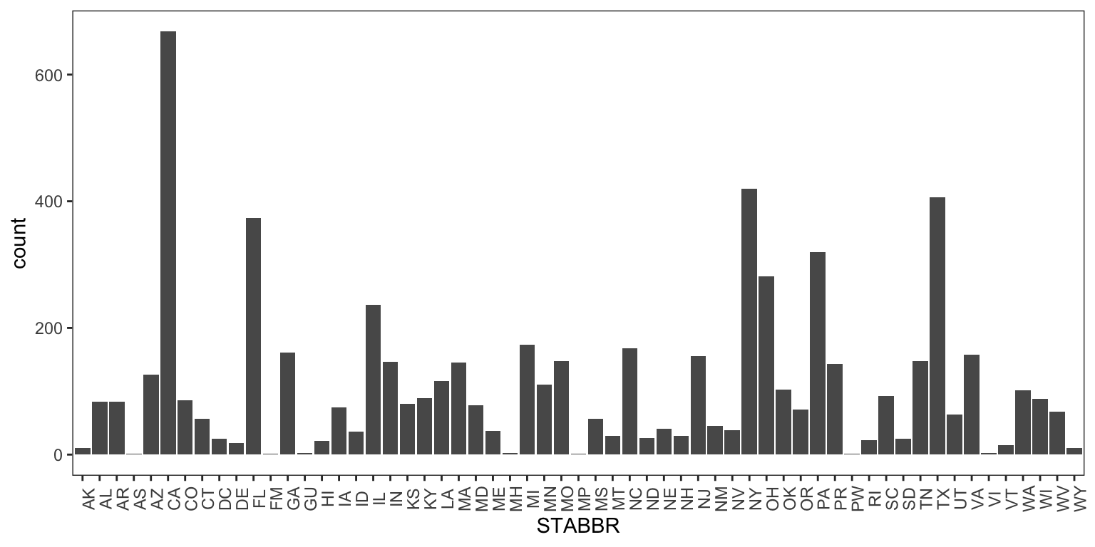
When we look at the data, we find that the STABBR variable has 59 unique state abbreviations. This is clearly outside of our expectation, which was 50 unique abbreviations. But then why are there 59 abbreviations in the data?
Developing Alternative Explanations
In our initial expectation, we assumed that the STABBR variable only contains information about U.S. states, of which there are indeed 50. However, the U.S. has other areas that are not officially states (i.e. territories or districts) but are often treated as states for the purposes of identifying the location of something like a school. It is possible that the STABBR variable contains information on some of these non-state locations. We could specify the following: Another explanation for why we observe more than 50 state abbreviations is that there is an error in the variable’s data.
At this point we can consider two alternative explanations,
The
STABBRvariable contains information about states and non-state territories, which would cause the number of abbreviations to be greater than 50;There is an error in the variable that is causing it to appear like there are more than 50 state abbreviations.
Each of the alternatives is consistent with what we have observed so far, which is that there are 59 state abbreviations in the STABBR variable. However, at this point we do not have any information to distinguish between the the two alternatives.
Developing Options For Analyzing the Data
In order to distinguish which of our two alternatives is more likely, we have to go back into our dataset and collect more information about this variable. There are is not necessarily one way that we could do this. However, what we need is to do is look at the data in a manner so that if alternative 1 is true, we observe one result and if alternative 2 is true, we observe a different result. Two possible options we could consider are
Tabulate the abbreviations in the variable and see how many of each abbreviation occur in the data; this process will also show us what the unique abbreviations are;
Make a bar plot of the variable which will show us how many of each abbreviation occur in the data (essentially a graphical representation of the tabulation).
Resetting Expectations
For either option developed above we can say that if there are abbreviations that do not correspond to any state or territory, then we might conclude that it is more likely there are some errors. For example, there are no state or territory abbreviations that contain the letter “Z”. If we see the letter “Z”, then it is likely an error. Similarly, there should not be any punctuation or non-letter characters. If there are abbreviations that correspond to territories or districts, then we might conclude that it is more likely that the variable simply includes information on non-state territories in addition to states.
Analyzing the Data (Again)
We have chosen to make a bar plot of the data for the next step here. Figure 12.1 shows the bar plot of the STABBR variable. There, we see that there are some abbreviations for non-state territories, such as PR for Puerto Rico, VI for the U.S. Virgin Islands, and DC for the District of Columbia. Therefore, it would seem that our first alternative, that the STABBR variable contains information on non-state territories, is more likely than the second alternative, which says that there is an error in the data.
At this point we have to decided whether we know enough about this particular variable or if we still have questions. We may decide to move on to other variables in the dataset and continue the iterative process there, or we may want to interrogate this variable further if there is something unexpected or if a question still lingers.
12.5.3 Example: Exploring Relationships
When exploring relationships between variables in a dataset, we often resort to graphical techniques. One advantage of graphical techniques is that they often show us unexpected features of the data beyond the central trends or tendencies. So things like scatter plots or grouped box plots can be useful tools in initial explorations when you are just getting to know the data.
For this example we will use the Zillow housing data that we first introduced in Chapter 7. This dataset shows the tax assessment value of a large number of homes around the United States. Here we will look at a small sample of the dataset and will focus on the relationship between the number of bedrooms in the house and the assessed value of the house.
Setting Expectations
When looking at the relationship between the number of bedrooms in a house and its assessed value, we might expect that houses with more bedrooms would have higher assessed values compared to houses with fewer bedrooms. Houses with more bedrooms tend to be larger and larger houses tend to be valued more than smaller houses. Therefore, if we were to look at the relationship between these two variables, we should see some form of a positive relationship. In this scenario, we are thinking of the assessed value of the house as the outcome variable and the number of bedrooms as a predictor of the assessed value.
Analyzing the Data
There are a few options for looking at the relationship between the number of bedrooms and the assessed value.
We could make a scatter plot with number of bedrooms on the x-axis (the predictor) and the assessed value of the house on the y-axis (the outcome);
We could make grouped box plots of the assessed value with one box plot for each value of the number of bedrooms.
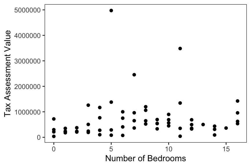
Here, we will make a scatter plot of the number of bedrooms and the assessed value of the house. That scatter plot is shown in Figure 12.2. In the scatter plot we see that there appears to be a generally increasing trend; as the number of bedrooms increases the average assessed value of the house also increases. For example, the average assessed value for 0 bedrooms is around $500,000 whereas a house with 16 bedrooms has an average assessed value around $1,000,000. There is one data point that seems far separated from the rest (a 5-bedroom house assessed at about $5,000,000) but we will leave that aside for now. So far, it would seem that data in the scatter plot and the trends that the plot shows are as-expected.
However, with any plot, there is always a question of whether we are genuinely seeing something or if we are tricking ourselves into seeing something that we want to see. This is where numerical summaries can be useful because they do not require our visual abilities to interpret a relationship. In this kind of situation, we may want to follow oup with a separate summary to confirm our initial findings, even if nothing unexpected is demonstrated by the plot.
Developing Alternative Explanations
Given that the results in the scatter plot are as-expected, there is value in developing an alternative explanation if only to ensure that we are not fooling ourselves into seeing something that is not really there. As such, we could consider the following alternatives:
There is an increasing trend between the number of bedrooms and the assessed value of a house (our original expectation);
There is no relationship between bedrooms and assessed values and we are imagining a trend by looking at the scatter plot.
Given that our visual interpretation of the scatter plot is consistent with both alternatives, we will need to develop some different options for looking at the data to determine which alternative is more likely to be true.
Developing Options For Analyzing the Data
As we suggested before, numerical summaries of the data can provide concrete evidence of trends in the data without having to rely on visual interpretations. Some options here are
We could look at a Pearson correlation coefficient as a simple summary statistic;
We could run a simple linear regression with assessed value as the outcome the number of bedrooms as the predictor and look at the slope coefficient for the regression line.
We will choose to look at the correlation coefficient here.
Resetting Expectations
Under alternative 1 (our original expectation) we would expect the coefficient to be positive and somewhere between 0.5 and 1. Under alternative 2 (no relationship) we would expect the coefficient to be near 0, say between \(-0.1\) and \(0.1\). This is not a formal statistical test and we are not evaluating the statistical significance of the correlation coefficient. For now, we are just looking at broad trends in the data.
Analyzing the Data (Again)
In computing the correlation coefficient we find that the value is 0.11, which is just outside of the range that we predicted if there was “no relationship” in the data. It is certainly not in the range of 0.5 to 1 that we predicted under our original expectation. This suggests that the alternative of “no relationship” is perhaps more likely than our original explanation.
12.6 Summary
Data analysis in the real world seldom resembles exactly what is done in a classroom setting and there is a wide variety of ways in which real world data analysis can deviate from the ideal. In particular, data analysis in the real world is done by human beings and humans often have expectations and biases about the results that will emerge from the data they are analyzing. When those expectations deviate from what the data say, then the analyst must reconcile the differences by exploring the data further. When the data coincide with an analyst’s expectations, alternative explanations must be explored in order to ensure that there are explanations that are more likely to be true compared to the original expectations. Analytic iteration, the process by which expectations are reconciled with observations and alternative explanations are explored with the data, is a key mechanism that drives data analyses forward.